Tableau Sorting / Grouping / Filtering
Sorting
Quick Ways to Sort in Ascending and Descending Order in Tableau
Select the Chart
- Make sure your bar chart is active (for example, Sales by Sub-Category).
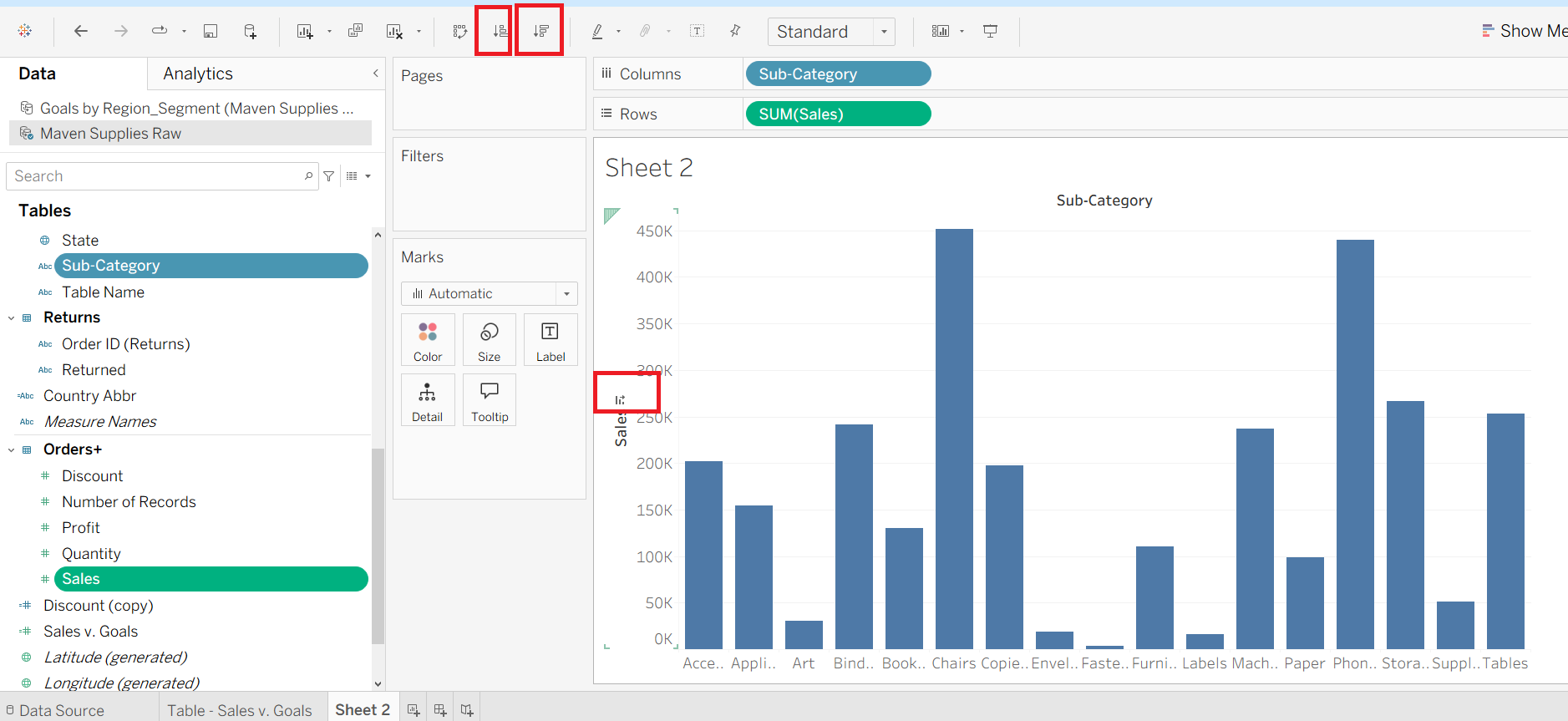
Use the Sort Buttons on the Toolbar
On the top toolbar, you’ll see two sort icons:
🔼 Ascending Sort → sorts your bars from the smallest value to the largest.
🔽 Descending Sort → sorts your bars from the largest value to the smallest.
Simply click one of these icons, and Tableau will reorder the bars accordingly.
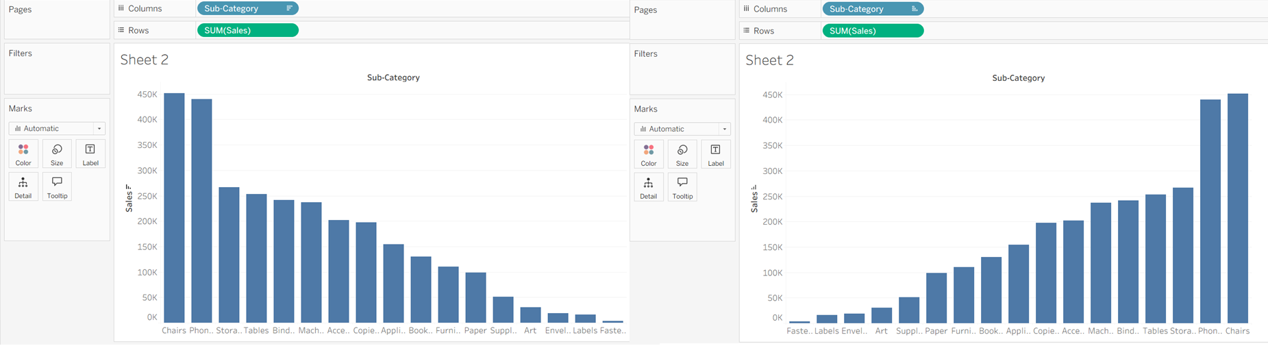
Click Directly on the Axis or Header
Another quick way: hover near the axis label (like Sub-Category) or header in your chart.
A small sort icon will appear. Click it once for descending order, click again for ascending.
Sorting Directly Using the Column Value in Tableau
Right-Click on the Field (Dimension/Measure) in Columns or Rows
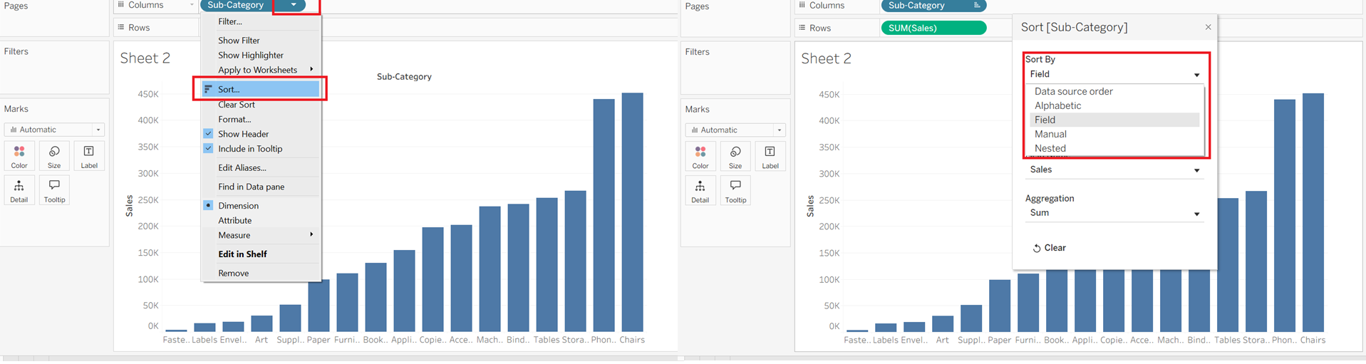
- In your chart, right-click on the field you want to sort (here it’s Sub-Category in the Columns shelf).
Choose Sort…
- From the dropdown menu, click Sort… to open the sorting dialog box.
Select the Sort By Option
In the Sort dialog box, you’ll see multiple options under Sort By:
Data Source Order → Keeps the order as it appears in the dataset.
Alphabetic → Sorts items alphabetically (A → Z or Z → A).
Field → Sorts based on the values of another field (e.g., Sales, Profit).
Manual → Lets you drag and drop items in the exact order you want.
Nested → Sorts within the context of another dimension (useful for hierarchies).
Choose Field Sorting
Select Field, then pick which measure to sort by (e.g., SUM(Sales)).
Choose Ascending (lowest to highest) or Descending (highest to lowest).
Click OK
- Tableau will immediately reorder your bars based on the chosen field values.
Grouping
How to Create a Group in Tableau
Locate the Field
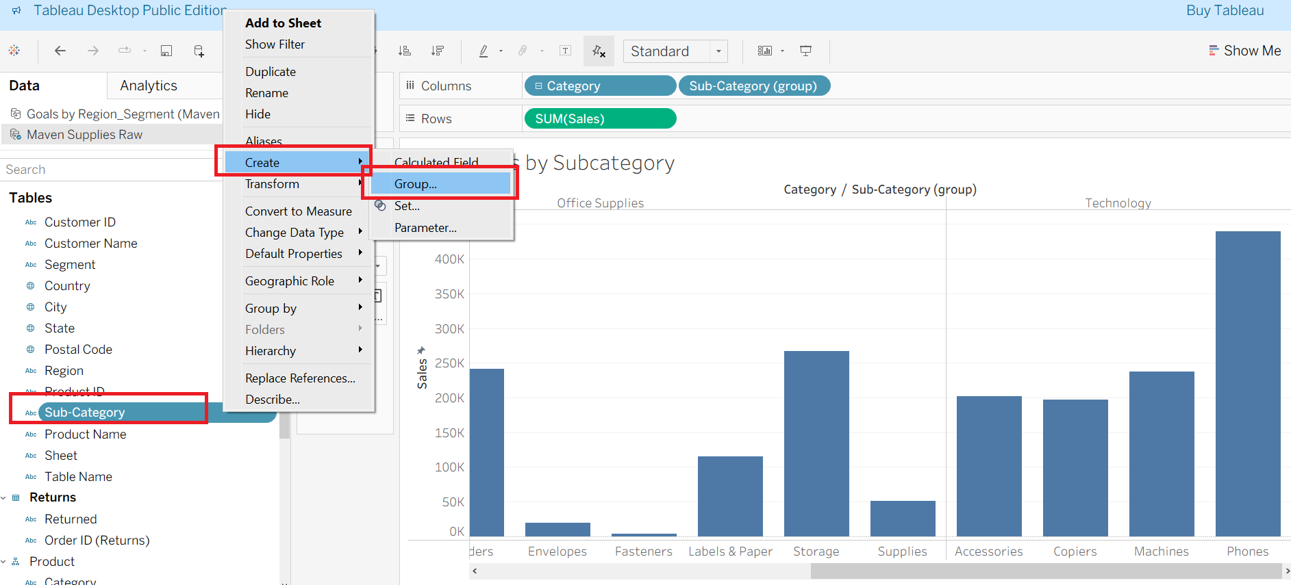
In the Data pane, right-click on the field you want to group.
In this example, you right-clicked on Sub-Category.
Create Group
From the menu, go to Create → Group.
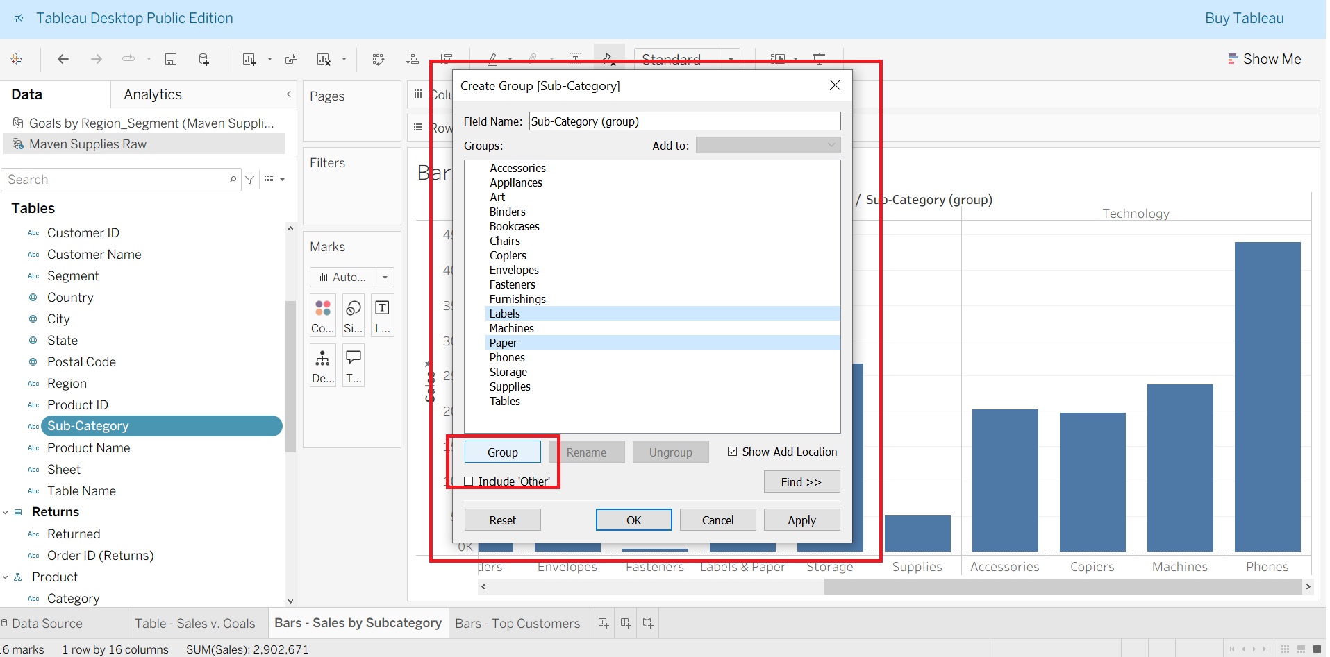
A dialog box called Create Group will open.
Select Items to Group
In the dialog, select multiple members (e.g., Labels, Paper) that you want to combine.
Click the Group button.
Tableau will now treat them as a single grouped item (e.g., Labels + Paper).
Finalize the Group
You can rename the group if needed.
Check the option Include “Other” if you want Tableau to automatically create an “Other” category for ungrouped members.
Click OK to save.
SET
How to Create a Set from the Top 10 Customers in Tableau
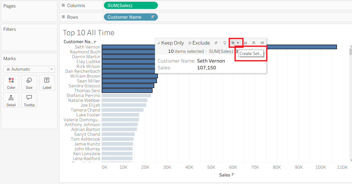
In the view, manually select the top 10 customer names (by clicking and dragging over the bars, or using Ctrl + click).
Once the top 10 are highlighted, hover over the selection menu (the small drop-down icon on the tooltip bar).
From the menu, click Create Set.
You can now use this set in other charts to compare these top customers against the rest (e.g., Top 10 vs All Others).
Customised SET
How to Create a Customized Set in Tableau (Top 10 Customers Example)
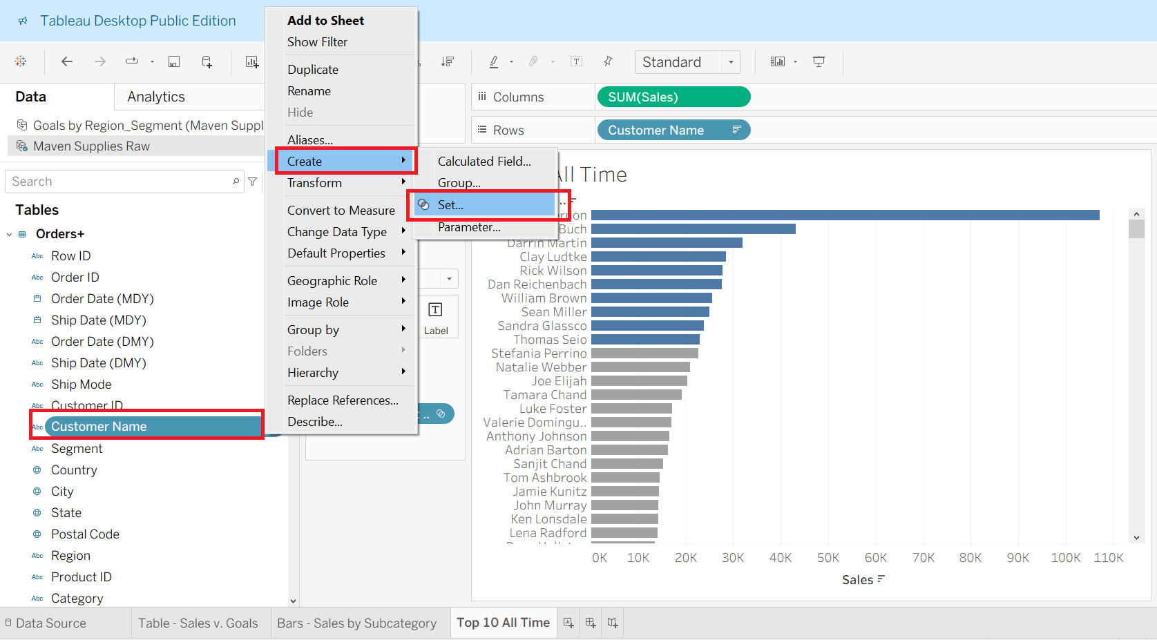
Right-click on the field you want to use for the set.
- In your case, you right-clicked on Customer Name.
Go to → Create → Set.
From the dropdown, select Set….
This opens the Create Set window.
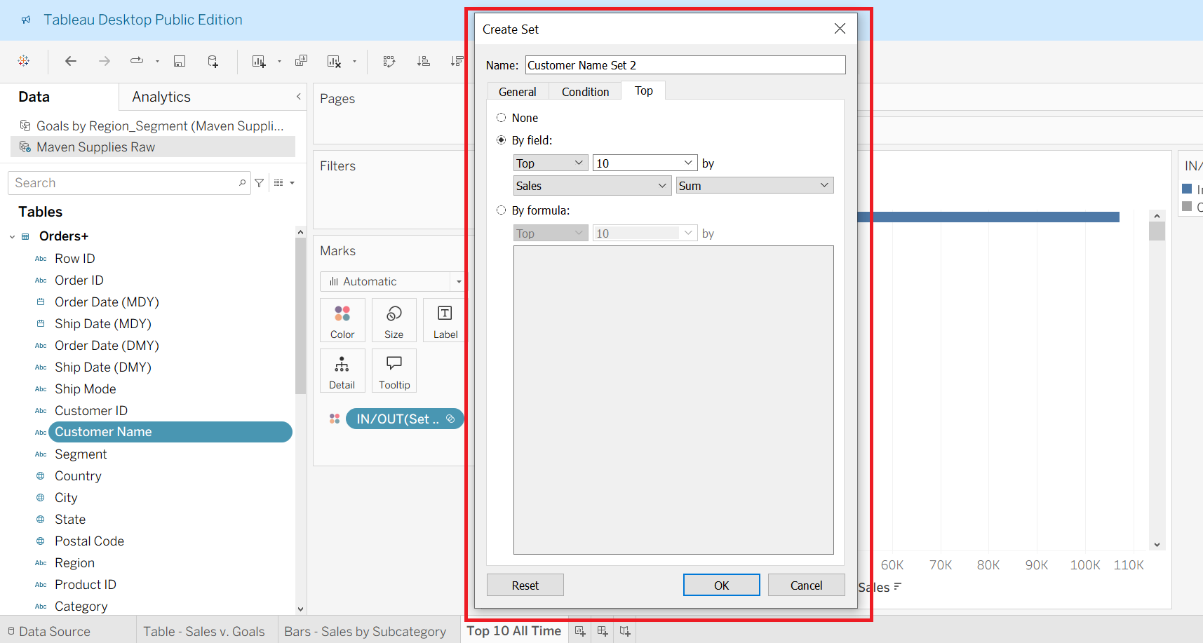
Customize the Set.
In the set dialog box, you can define rules:
General tab → Manually pick specific customers to include/exclude.
Condition tab → Apply conditions (e.g., include customers with Sales > 50,000).
Top tab → Dynamically choose Top/Bottom N customers (like Top 10 by Sales).
In your case, you selected Top 10 by Sales (SUM).
Click OK to create the set.
The new set will appear under the Sets section in the Data Pane.
You can then drag it into the view for analysis.
Separate Colour for SET
How to Apply Separate Colors for a Set in Tableau
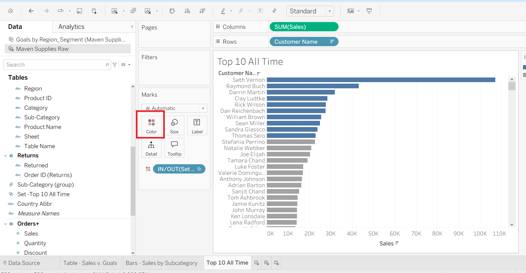
Drag the Set to the Marks Card
You already created a set (for example: Top 10 Customers by Sales).
Drag this set field onto the Color shelf in the Marks card (as shown in your screenshot).
Tableau Automatically Splits the Data
Tableau will color-code based on the set:
IN → Members inside the set (e.g., Top 10 Customers).
OUT → Members outside the set (all others).
Customize the Colors
Click on the Color legend.
Assign one color for IN (e.g., blue) and another for OUT (e.g., gray).
This makes it easy to visually distinguish the focus group (Top 10) from the rest.
Filter with SET
How to Use a Set as a Filter in Tableau
Create a Set
- First, you already created a set (example: Top 10 Customers by Sales).
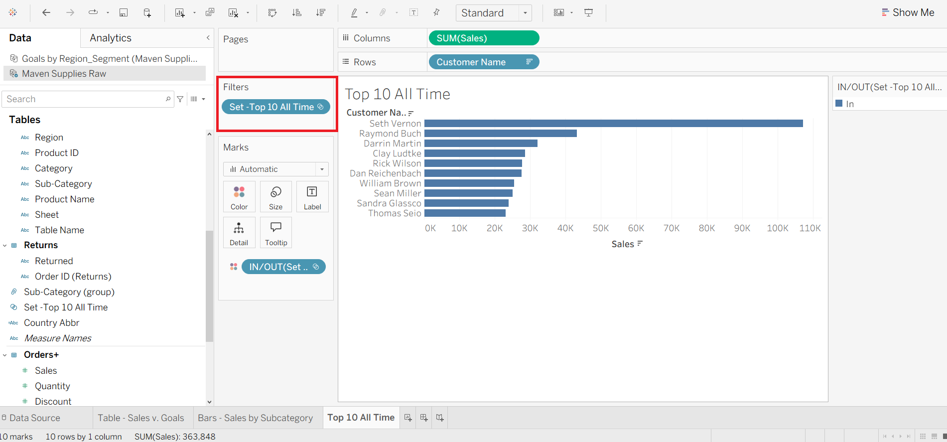
Drag the Set to the Filters Shelf
Go to the Data pane (left side).
Find your created set (e.g., Set – Top 10 All Time).
Drag it onto the Filters shelf (as shown in your screenshot).
What Happens
Tableau filters the view to show only members IN the set (in this case, the Top 10 customers).
The chart now displays only those top customers, hiding all others.
Filtering What’s IN vs OUT of a Set in Tableau
When you create a Set (like Top 10 All Time), Tableau allows you to filter your view to show:
IN the Set → members that satisfy the Set condition (e.g., Top 10 Customers by Sales).
OUT of the Set → all other members that don’t meet the condition.
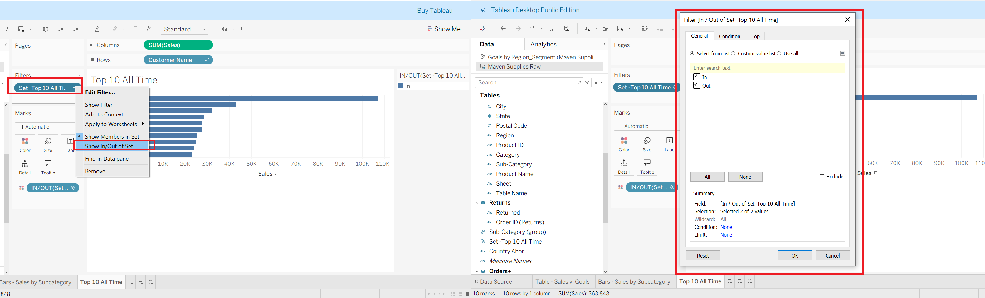
Steps (as shown in your screenshot):
Go to the Filters shelf where your Set (e.g., Set – Top 10 All Time) is placed.
Right-click on the Set and choose Show In/Out of Set.
A filter dialog appears (right side of your screenshot). Here, you can:
✅ Check In → Only members inside the Set appear (Top 10).
✅ Check Out → Only members outside the Set appear (all others).
✅ Check both → Compare “In” vs “Out” in the same visualization.
Showing the Set Filter for Easy Selection
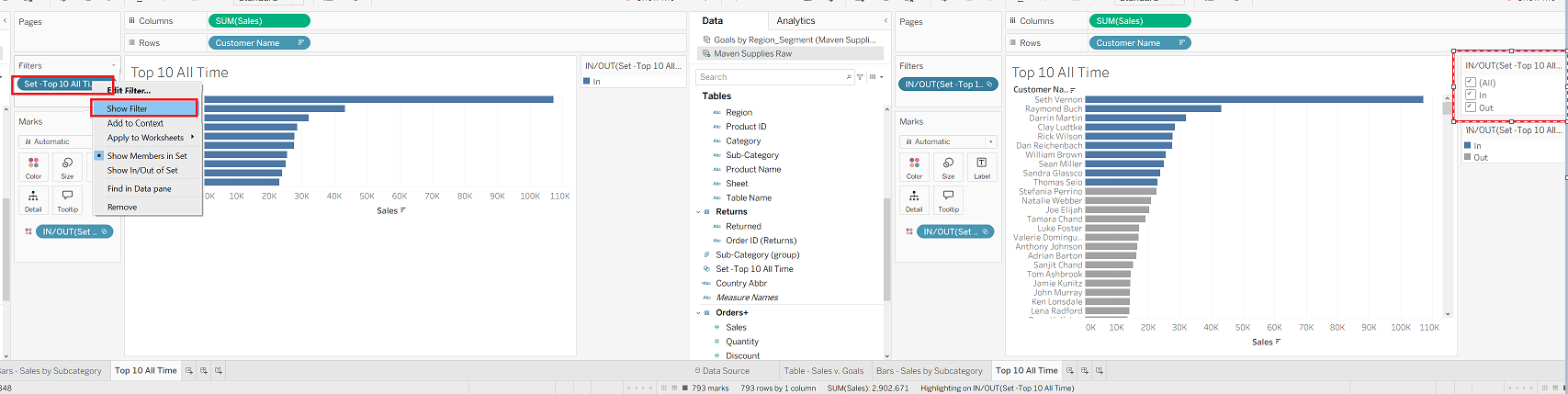
Instead of always editing the Set manually, you can make things easier by showing the filter directly on the right-hand side of the view.
Steps:
Go to the Filters shelf where your Set (e.g., Set – Top 10 All Time) is located.
Right-click on the Set and choose Show Filter.
Tableau will display a filter card on the right side of your view (as shown in your screenshot).
- ✅ You can now easily toggle between In, Out, or All without reopening the Set dialog box.
Why this is useful:
Makes it user-friendly when building dashboards.
Lets end-users quickly decide whether to see only top performers (In), the rest (Out), or everyone (All).
Saves time compared to editing the Set each time.
Creating a hierarchy
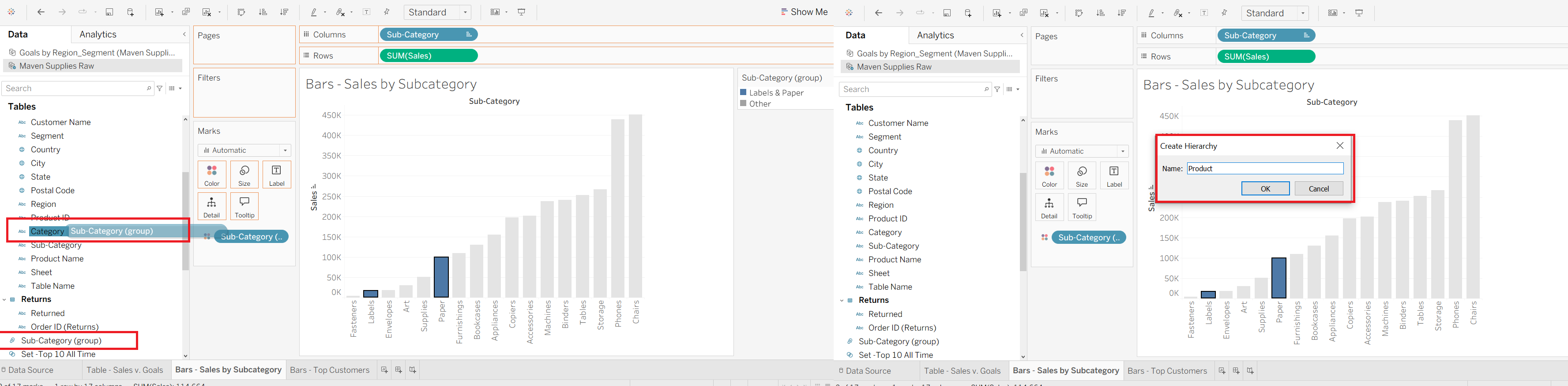
How to Create a Category → Sub-Category Hierarchy in Tableau
In the Data pane on the left, locate the fields Category and Sub-Category.
Click and drag
Sub-CategoryontoCategory.- Tableau will prompt you to create a new hierarchy.
In the pop-up window, enter a name for the hierarchy (e.g., Product).
Click OK.
🔽 Drilling Down from Category to Sub-Category
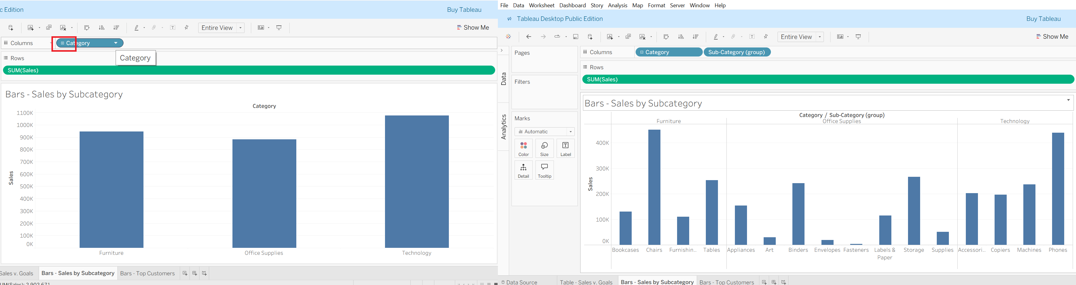
On your chart, look at the Columns shelf where you placed Category (and later grouped with Sub-Category).
Notice the small “+” icon next to Category.
Click the “+” to drill down:
First it shows the broader view (Category level: Furniture, Office Supplies, Technology).
When you press “+”, Tableau expands the hierarchy to show the Sub-Category level under each Category (e.g., Chairs, Tables, Bookcases under Furniture).
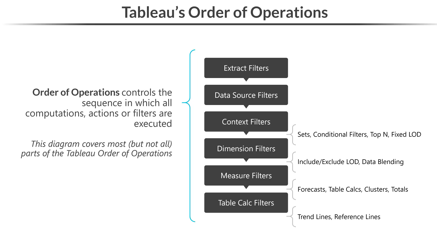
🧩 Tableau’s Order of Operations
The Order of Operations in Tableau defines the sequence in which filters, computations, and actions are applied. Understanding this is crucial because applying filters at different stages can completely change the result of your visualization.
Here’s the simplified order:
Extract Filters – Applied first, restricts the data extracted from the source.
Data Source Filters – Limit rows/columns before they reach Tableau.
Context Filters – Set the context for other filters (e.g., Top N, Fixed LOD).
Dimension Filters – Filter based on categories (e.g., Region, Product).
Measure Filters – Applied on aggregated measures (e.g., SUM(Sales) > 1000).
Table Calculation Filters – Filters after table calcs are computed (e.g., running totals).
👉 Why it matters:
Filters earlier in the order reduce the dataset more efficiently.
Filters later (like Table Calc) only affect what’s already been computed and displayed.
Misplacing filters can lead to unexpected results.
Data Source Filters
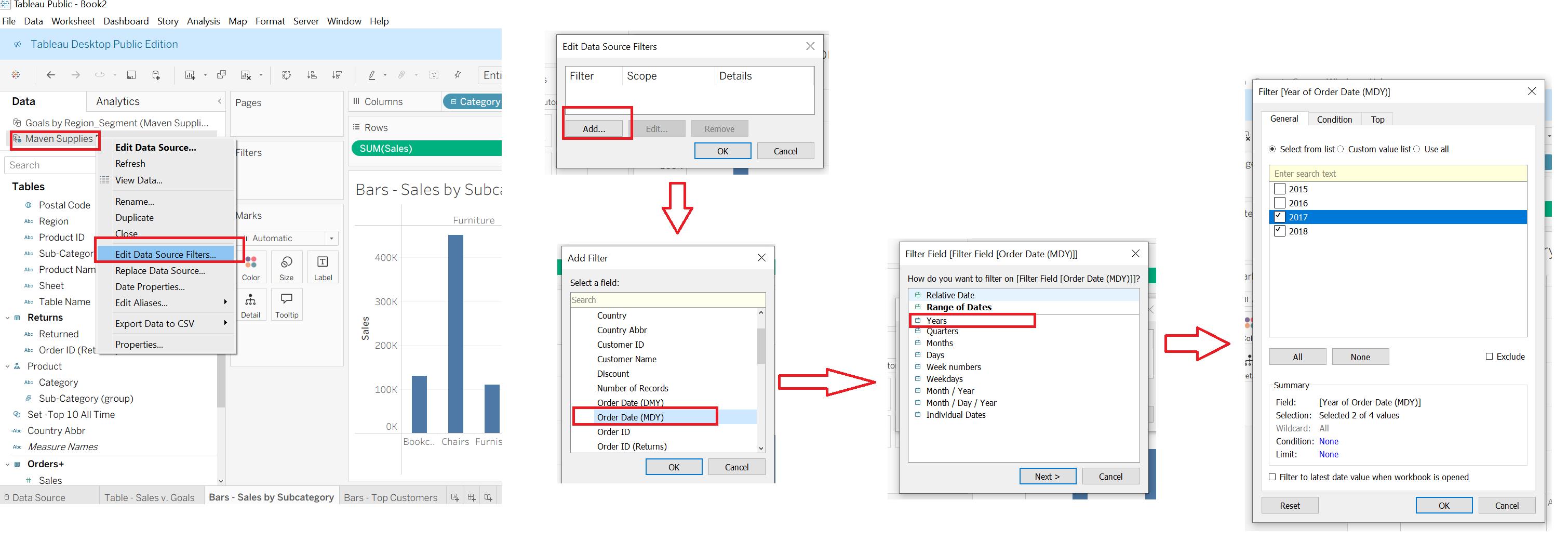
📌 How to Apply a Data Source Filter in Tableau
Right-click the Data Source (e.g., Maven Supplies) in the Data Pane.
Select Edit Data Source Filters… from the dropdown menu.
In the pop-up window, click Add….
From the field list, choose the field you want to filter on (e.g., Order Date (MDY)).
In the filter options, select Range of Dates → Years.
Choose the years you want to include (e.g., ✅ 2017, ✅ 2018).
Click OK to apply the filter.
🔑 What this does:
A Data Source Filter applies before any sheet-level filters.
It reduces the dataset at the source level, so Tableau only loads the filtered records.
This improves performance and ensures consistency across all worksheets using this data source.
Filter Shelf
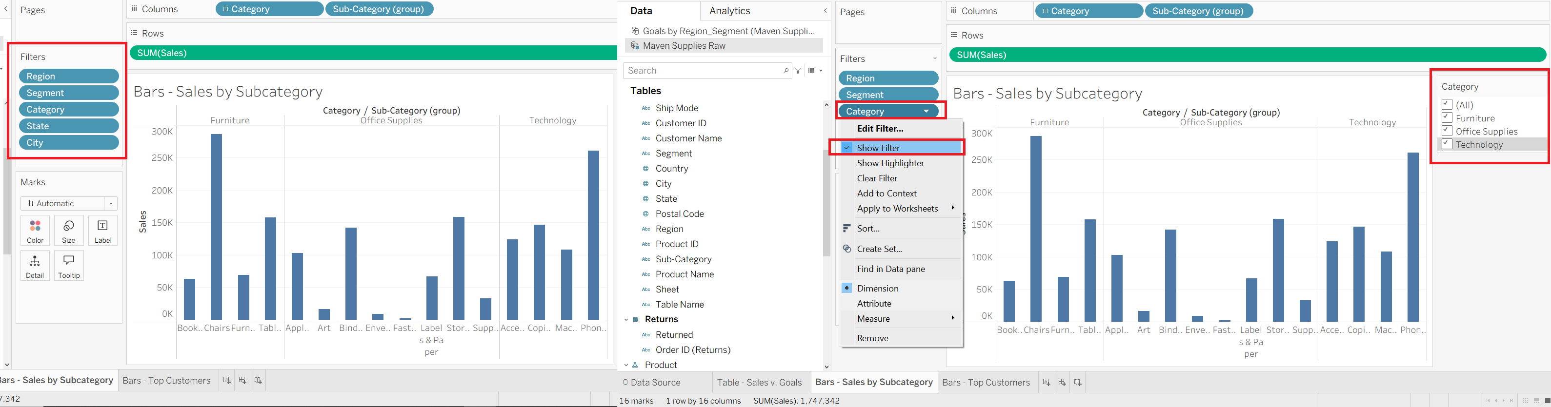
📌 How to Add and Show Worksheet Filters in Tableau
Drag a field to the Filters shelf
For example, drag
Category,Region,Segment,State, orCityinto the Filters area.This limits the data based on your chosen filter values.
Right-click the Filter (e.g., Category) → Show Filter
This makes the filter visible on the worksheet.
The filter will now appear on the right-hand side of the view (or in the Filters pane).
Interactive Filtering
Users can now check/uncheck boxes to show or hide values (e.g., Furniture, Office Supplies, Technology).
This makes your chart interactive and dynamic.
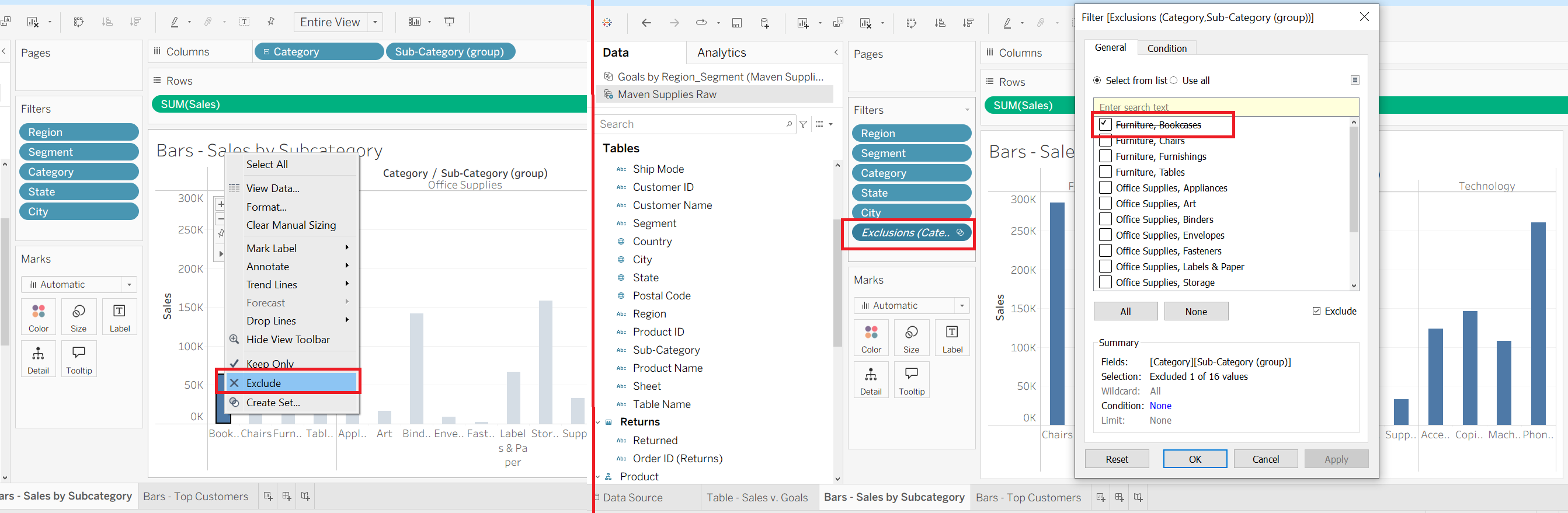
📌 Excluding Data in Tableau
Right-click on a mark (bar, point, etc.) → Select Exclude
For example, in the chart, you right-clicked on Furniture → Bookcases and selected Exclude.
Tableau immediately removes that category from the view.
Automatic Filter Creation
When you exclude an item, Tableau automatically adds a new filter called Exclusions in the Filters shelf.
This filter contains the values you excluded.
Editing the Exclusion Filter
Right-click the new Exclusions filter → Edit Filter.
You will see the list of all possible values, with excluded ones marked.
From here, you can adjust what is excluded or bring values back into the view.
📝 Dimension Filter Card Modes
Dimension filters in Tableau can be displayed in different card modes to control how users interact with them:
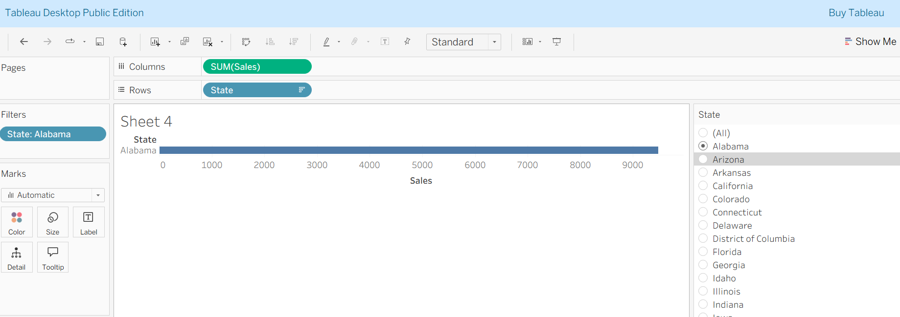
Single Value (List)
Displays as radio buttons.
Allows only one selection at a time.
Best for small lists.
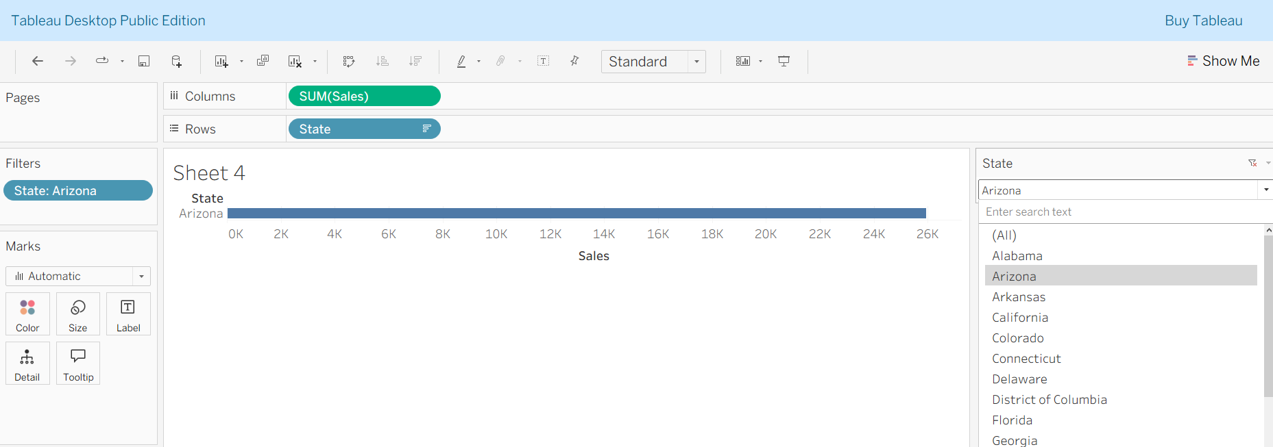
Single Value (Dropdown)
Single select, but shown as a dropdown.
- Saves space compared to list.
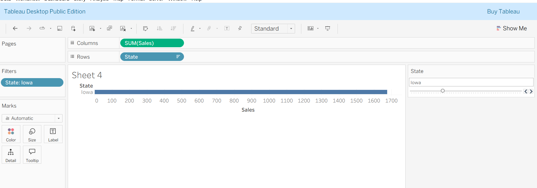
Single Value (Slider)
- Displays a slider to choose one dimension value (used when values have order, like dates).
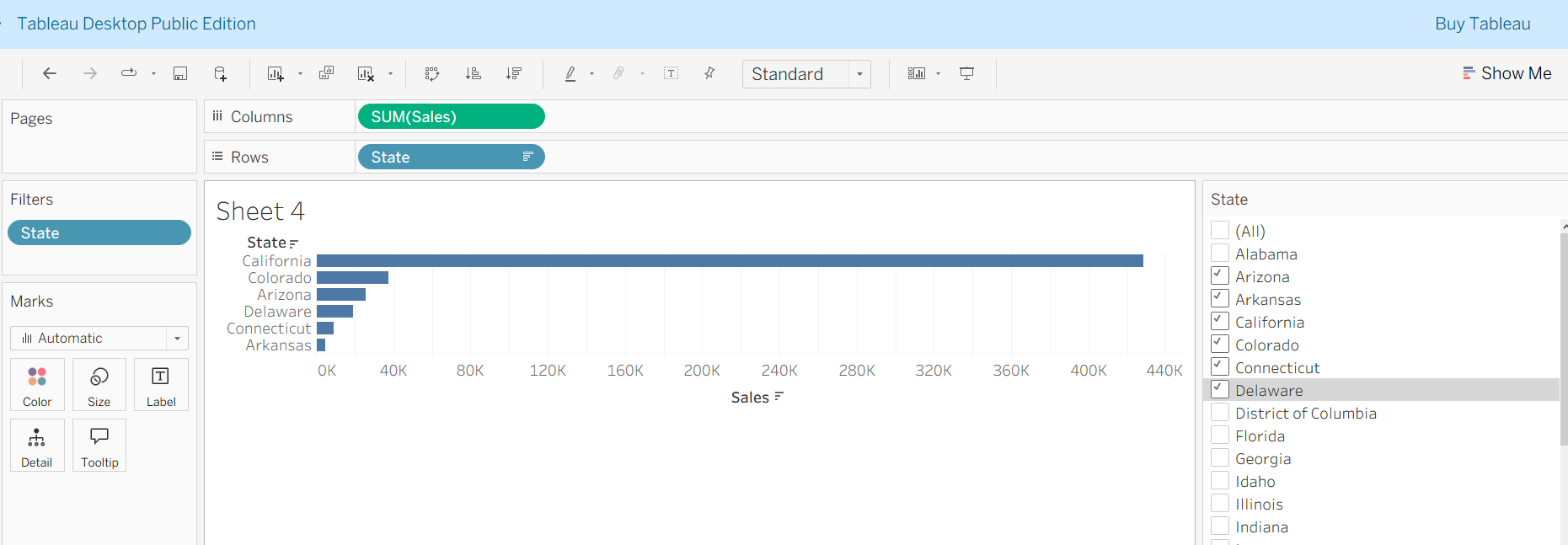
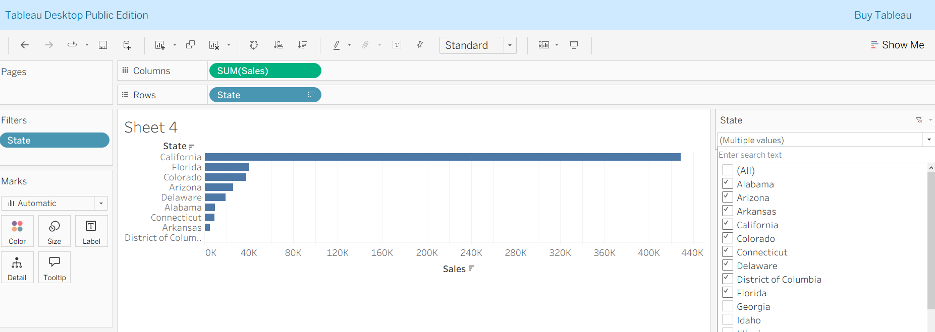
Multiple Values (List)
Checkboxes for multiple selections.
More space required, auto-updates when selection changes.
Multiple Values (Dropdown)
Same as list, but compact.
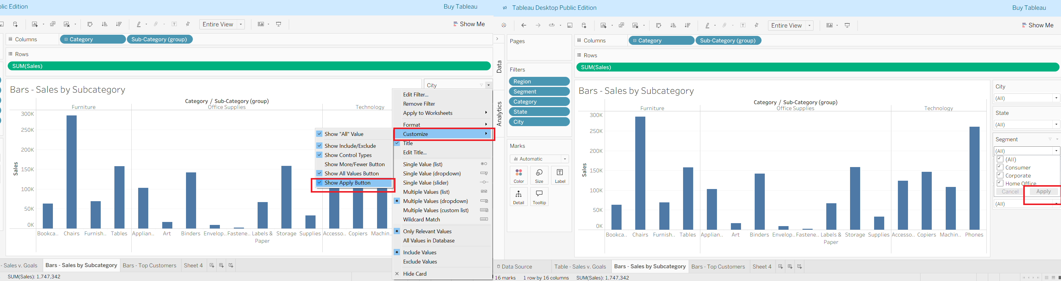
Apply button is recommended.
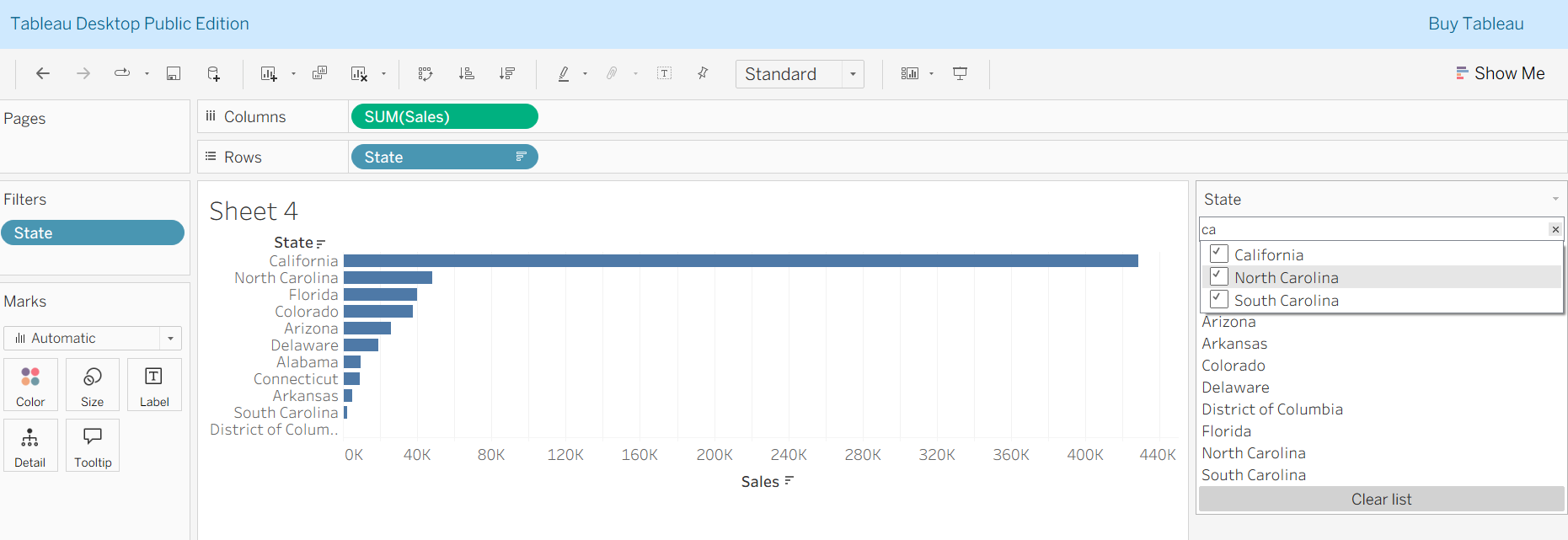
Multiple Values (Custom List)
Allows typing in values to filter.
Useful for long lists with search capability.
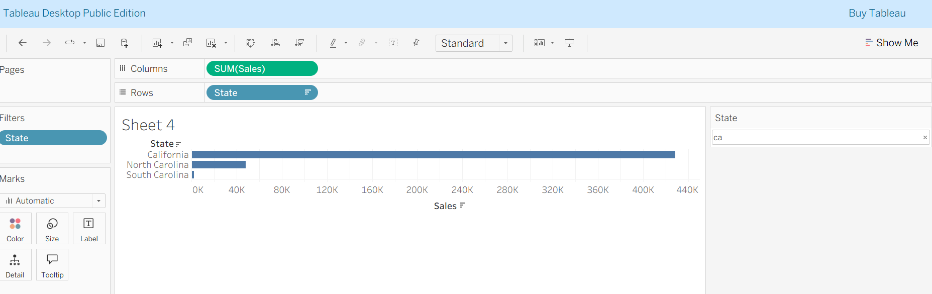
Wildcard Match
- Filters values based on a text pattern (e.g., all items containing "phone").
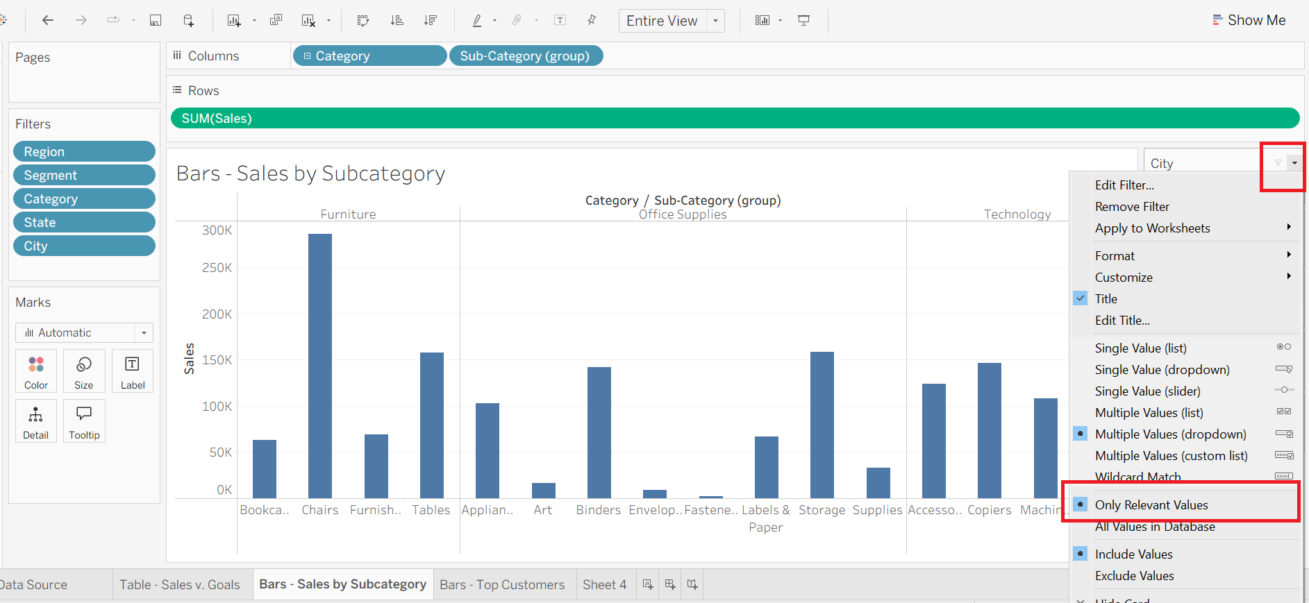
Filter options: “Only Relevant Values.”
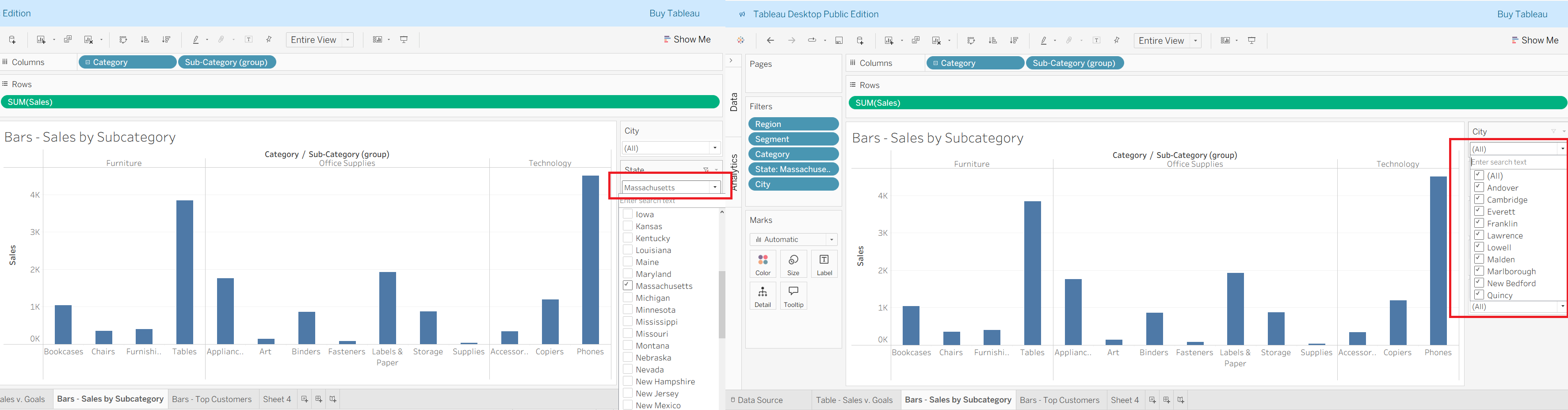
Normally, if you filter by State = Massachusetts, the City filter dropdown would still show all cities in the dataset (even those not in Massachusetts). That’s because Tableau is pulling the full field list.
But when you turn on Only Relevant Values for the City filter → Tableau dynamically updates it to show only the cities inside Massachusetts.
This keeps your filters context-aware, meaning that one filter’s selection (State) directly controls which options appear in the next filter (City).
🔹 Importance of the Apply Button
The Apply button is useful when:
You are working with large datasets → prevents Tableau from recalculating the visualization each time you tick/untick a value.
You want to make multiple selections at once before updating the view.
It improves performance and user experience in dashboards, especially with many filters.
Gives control to the user: changes are not applied until they click Apply.
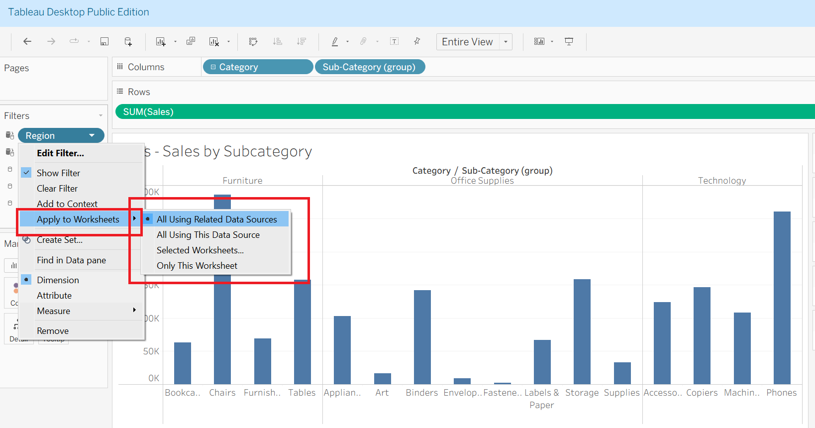
📌 Applying Filters to Sheets in Tableau
Filters in Tableau can be customized to impact specific sheets in a workbook. By default, a filter only applies to the sheet where it was created, but you can extend it to other sheets.
Options when applying filters:
Only this Worksheet → Filter applies only to the sheet where it was created.
Selected Worksheets → Filter applies to multiple chosen sheets (you manually select from a checklist).
All Using this Data Source → Filter applies to all sheets built from the same data source. Any new sheet using this data source will also get the filter.
All Using Related Data Sources → Filter applies to all sheets built from related data sources that share the same field (same name, type, and content).
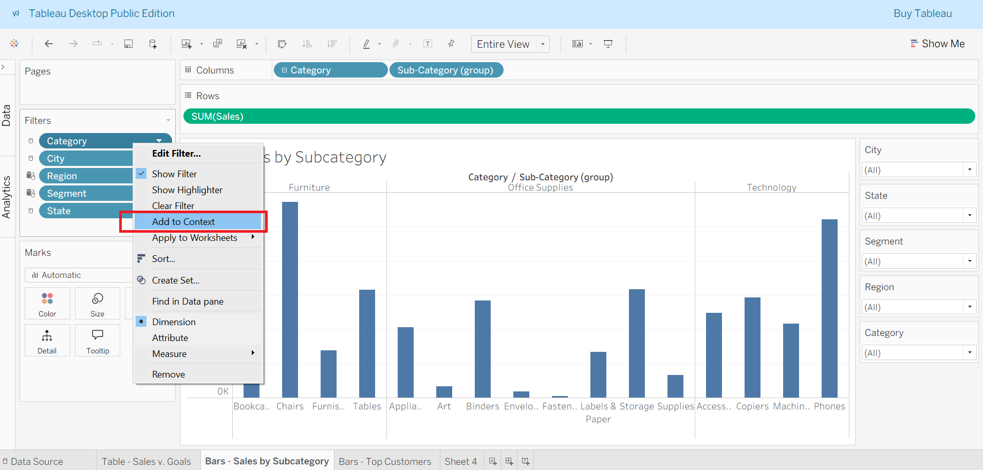
📌 Context Filters in Tableau
Definition: Context Filters are dimension filters that override Tableau’s normal order of operations.
Purpose: They allow other filters to become dependent on them, making filtering more precise.
🔹 Key Uses:
Commonly used for Dependent Top N Filters (e.g., showing Top 5 products within a selected city).
Helps improve performance by filtering out large chunks of data before applying other filters.
🔹 Difference:
Standard Top N Filter → Applies to the entire dataset first (e.g., Top 5 subcategories overall).
Dependent Top N Filter (with Context) → Applies after context (e.g., Top 5 subcategories within Akron).
⚠️ Note:
- Measures and aggregated fields cannot be placed in context filters.
📌 Measure Filters in Tableau
- Definition: Measure Filters are applied on quantitative fields (e.g., Sales, Profit, Quantity). They let you control the range of numeric values displayed in the view.
🔹 Steps to Apply
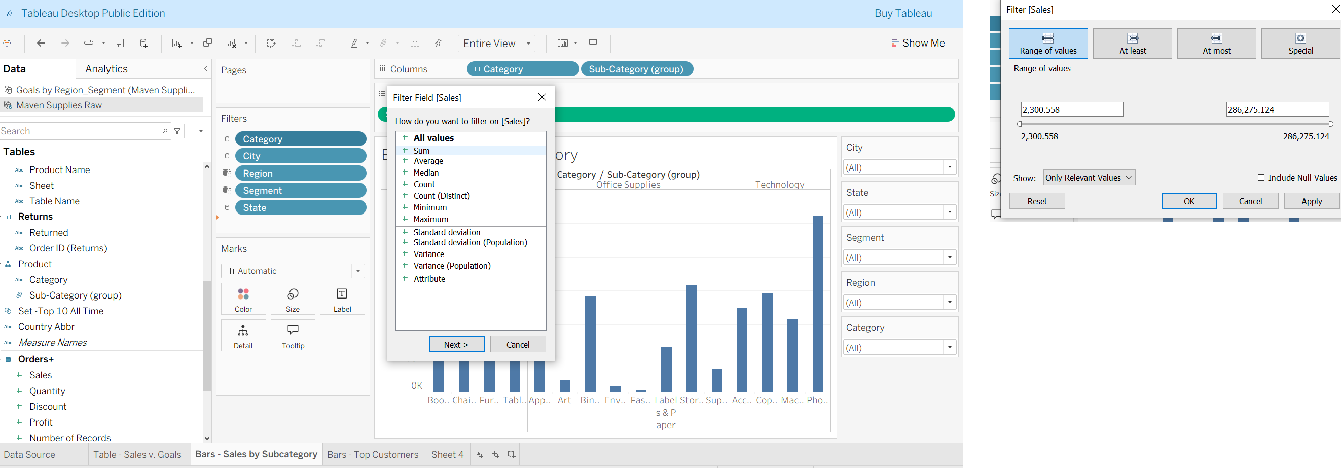
Drag a measure (e.g.,
Sales) to the Filters Shelf.Choose an aggregation type:
- Sum, Average, Median, Count, Minimum, Maximum, Standard Deviation, Variance, etc.
Select an interface for filtering:
Range of Values → Define both lower & upper limits with two sliders.
At Least → Filter values greater than or equal to a threshold.
At Most → Filter values less than or equal to a threshold.
Special → Show only Null, Non-Null, or All values.
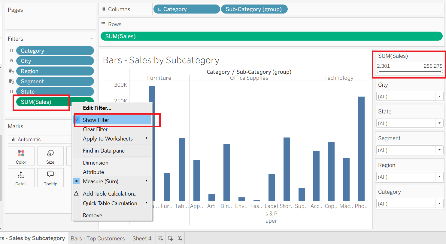
🔹 Measure Filter Card Modes
Range of Values → Two sliders (min & max).
At Least → Left slider for minimum values.
At Most → Right slider for maximum values.
Show Filter option → Displays the interactive slider on the dashboard for users.
💡 Pro Tips
Use conditional sets instead of measure filters for better performance.
Measure filters apply after Dimension Filters in Tableau’s order of operations.
Useful for dashboards where you want end-users to adjust data ranges (e.g., filter sales between 10K–50K).
📅 Date Filters in Tableau
Date Filters allow users to filter data based on date fields and can be set as continuous or discrete, each with specific options.
🔹 Types of Date Filters
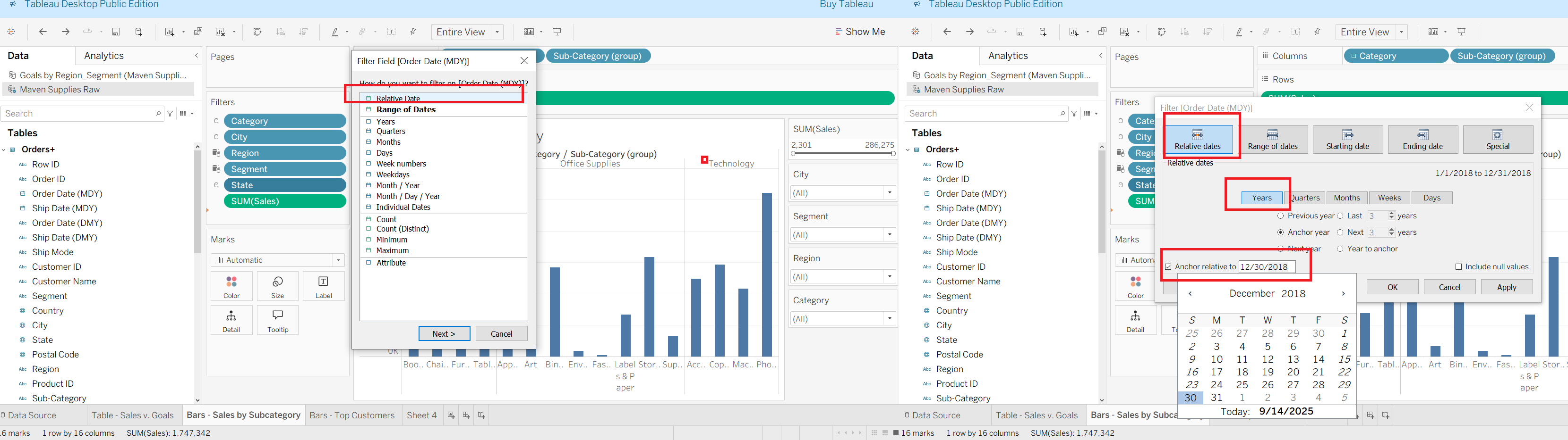
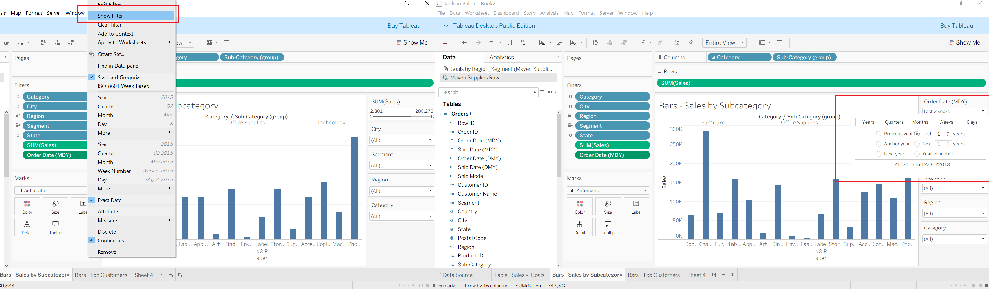
Relative Dates
Filter data by dynamic intervals like last N days, weeks, months, or years.
Example: “Last 2 years” or “Previous 6 months.”
Starting Date
Single left slider to define a start date.
Includes all records from that date onward.
Ending Date
Single right slider to define an end date.
Includes all records up to that date.
Range of Dates
- A pair of sliders to set both start and end dates for a custom date window.
Special
- Handles Null, Non-Null, or All Dates values.
🔹 Continuous vs Discrete Date Filters
Continuous
Show timelines on a continuous axis.
Best for trends (e.g., daily sales over time).
Discrete
Treat dates as categories (e.g., Years, Quarters, Months, Days).
Can be aggregated using Count, Min, Max, Attribute.
Useful for grouping or breaking down data.