Microsoft Power BI Desktop for Business Intelligence
1 Getting Started
Mastering Microsoft Power BI for Business Intelligence – Course Introduction
In today’s data-driven world, the ability to turn raw information into clear, actionable insights is one of the most valuable skills you can have. Microsoft Power BI stands at the forefront of business intelligence tools, empowering professionals to connect, analyze, and visualize data like never before.
From the very beginning, you’ll be guided through the entire Power BI workflow—from data preparation in Power Query, to building relational data models, to creating calculated measures with DAX, and finally bringing it all to life with professional-quality reports and dashboards. Along the way, you’ll also explore optimization techniques, visualization best practices, and interactive features like slicers, bookmarks, and custom tooltips.
With hands-on projects, real-world assignments, and expert guidance, this course doesn’t just teach you how to use Power BI—it equips you to think and work like a data professional. Whether you’re seeking to upgrade your career, improve your company’s reporting, or simply master one of the most in-demand BI tools on the market, this is your opportunity to gain both confidence and credibility.
2 Introduction to Microsoft Power BI Desktop
This hands-on, project-based course is designed for learners who want to build real-world Business Intelligence dashboards using Power BI Desktop.
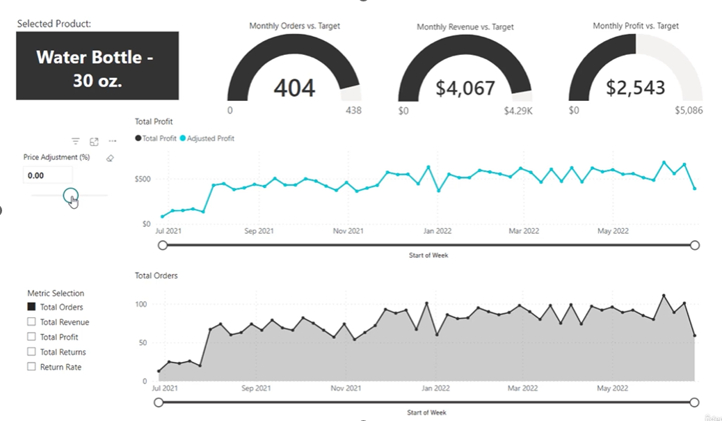
Project Summery
Welcome to your Power BI course project! In this real-world scenario, you’ll step into the role of a Business Intelligence Analyst at AdventureWorks. Your task is to transform raw data into actionable insights by building a complete BI solution—from connecting CSV files to designing an interactive dashboard that helps track KPIs, analyze trends, and identify high-value customers.
🎯 Here’s what the final result will look like — an interactive Power BI dashboard that visualizes key product performance metrics, enabling data-driven decisions at a glance.
Why Power BI?
In today’s data-driven world, Power BI has emerged as a leading self-service business intelligence tool—empowering analysts to connect, visualize, and share insights effortlessly. But what exactly makes Power BI so valuable?
✅ Connect, Transform, and Load Data
Power BI supports millions of rows from various sources like databases, flat files, cloud services, and more. It streamlines the ETL (Extract, Transform, Load) process into a seamless, automated workflow.
✅ Build Relational Models Across Sources
Blend data from multiple systems by creating table relationships—enabling holistic analysis across your entire dataset.
✅ Define Powerful Calculations with DAX
Data Analysis Expressions (DAX) allow you to create advanced metrics and perform deep-level analytics with ease and reusability.
✅ Visualize with Interactive Dashboards
Turn raw data into meaningful insights using dynamic reports and professional-quality visualizations.
✅ Grow a Versatile, In-Demand Skillset
Power BI is not just a tool—it’s a career booster. As an industry leader in BI, learning Power BI opens doors across industries and roles.
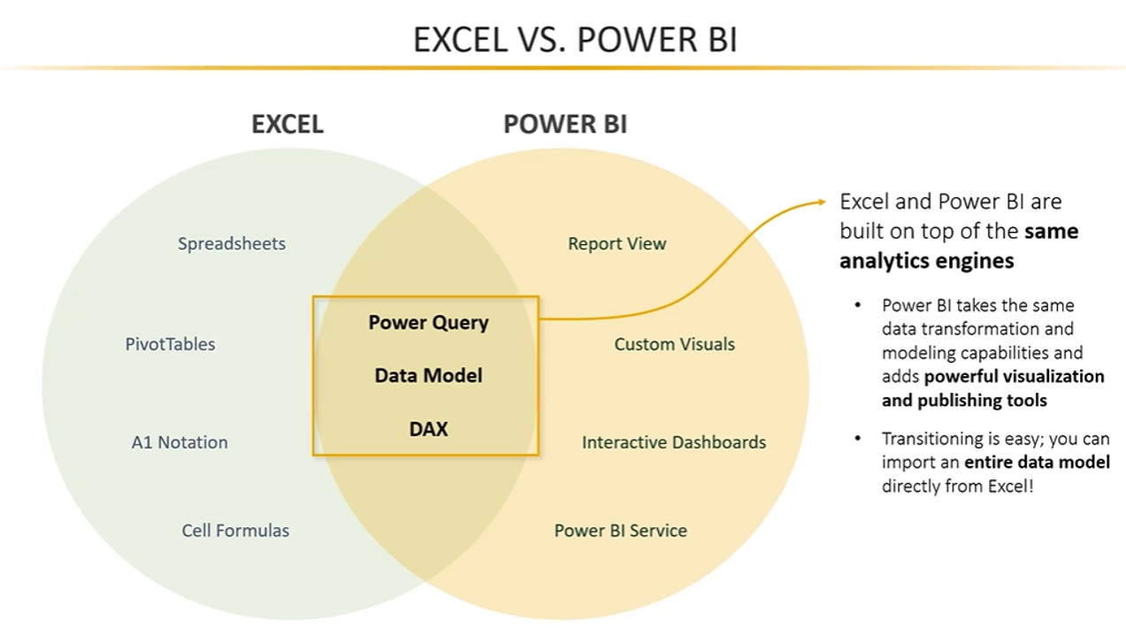
Power BI – Quick Comparison
Both tools share the same analytics engine (Power Query, Data Model, DAX).
Excel is great for manual, cell-based work.
Power BI adds powerful visuals, dashboards, and sharing options.
Transition is easy—you can import Excel models into Power BI.
ETL Workflow in Power BI (4 Stages)
Power Query Editor (Back End)
Separate window (like Excel).
Conduct ETL: Extract, Transform, Load steps.
Clean and prep data before loading it to Power BI front end.
Model View (Front End)
Define table relationships.
Design your relational data model.
Tables are treated as independent objects with defined links.
Data View (Front End)
View data in rows and columns, similar to Excel.
Add calculated columns and measures.
Uses contextual ribbons (table tools, column tools, etc.) based on what’s selected.
Report View (Front End)
Create visualizations, charts, graphs, and dashboards.
Similar to Excel with tabs for navigating between report pages.
Enables interactive reports and layout customization.
Power BI Environment Overview
Back End:
Power Query Editor
Used for data extraction and transformation.
Front End:
Three core views:
Model View (relationships and schema)
Data View (actual tabular data)
Report View (final dashboard/visuals)
Navigation & Menus:
Similar to Excel: ribbons, tabs, and contextual menus.
Menus change based on the object selected (e.g., table, column, measure).
✅ Key Reminders
Start from Get Data > Transform Data to access the query editor.
Click Close & Apply to load transformed data into the Power BI front end.
Don’t worry about every menu yet—these will be covered in detail later.
Visual design and modeling flow mirrors a logical process: Clean → Model → Analyze → Visualize.
Power BI Desktop Interface & Workflow
In this lesson, we dive into the Power BI Desktop workflow, a foundational concept that guides users through a typical business intelligence (BI) process. Whether you're new to Power BI or brushing up on core concepts, this overview sets the stage for mastering data analysis and visualization.
🛠️ The Power BI Workflow at a Glance
The Power BI workflow can be divided into four key stages, each aligned with a specific part of the interface:
Power Query Editor – Data extraction and transformation (ETL)
Model View – Data modeling and relationship building
Data View – Table inspection and calculation
Report View – Creating visuals and interactive reports
These stages represent a natural flow, starting from raw data to polished dashboards.
🧪 Step 1: Power Query Editor (The Back End)
Think of this as your data kitchen — where all the preparation happens:
Opens in a separate window (just like Excel’s Power Query).
Handles all ETL operations — Extract, Transform, and Load.
Used to clean, reshape, and organize raw data before analysis.
👉 Access it via Home > Transform Data or through the Get Data menu.
🧱 Step 2: Model View
Once your data is clean and loaded, head over to the Model View:
Build relationships between tables.
Create a relational data model for efficient analysis.
Visualize tables as objects connected by relationships (like in a database schema).
📌 This is where Power BI starts to feel like a data architect's playground.
📊 Step 3: Data View
This view lets you take a closer look at the actual data tables:
Tables are displayed in a row-column format, similar to Excel.
Great for checking calculated columns, measures, and formatting.
Contextual menus like:
🛠️ Table Tools (for selected tables)
🧮 Column Tools (for specific columns)
📏 Measure Tools (for calculated measures)
📈 Step 4: Report View
Here’s where the magic happens — the visualization layer:
Create charts, graphs, slicers, and dashboards.
Add interactivity and polish with formatting tools.
Use tabs to organize your report into multiple pages (like Excel worksheets).
🔍 This is the most visually engaging part of Power BI — and where business insights come to life.
🖥️ Understanding the Power BI Interface
The interface is split into:
Back End → Power Query Editor (ETL process)
Front End → Model View, Data View, Report View
The front end includes a dynamic ribbon that adjusts based on what’s selected — making it easier to work efficiently and contextually.
🧠 Key Takeaways
Power BI uses a four-stage workflow: Query Editor → Model View → Data View → Report View.
The Power Query Editor handles all data transformation tasks in a separate window.
The Model View is where you build relationships between tables to design your data model.
In the Data View, inspect and format data like in a spreadsheet.
The Report View helps you bring data to life through interactive visualizations and dashboards.
Contextual ribbons and menus enhance productivity by adapting to the selected object.
📘 In the next section of the course, we’ll explore the Power Query Editor in depth — so you can confidently handle raw data before modeling and reporting.
3 Connecting and Shaping data
Power BI Front-End vs. Back-End: What You Need to Know
When diving into Power BI, it's important to understand its two distinct environments: the front-end and the back-end. Each plays a unique role in the business intelligence workflow.
🖥️ Front-End vs. Back-End: A Quick Overview
| Environment | Role | Key Tools |
| Front-End | Data modeling, calculations, and report building | Data View, Model View, Report View |
| Back-End | Data extraction, transformation, and loading | Power Query Editor |
🔧 Back-End: The Power Behind Data Preparation
The Power Query Editor, also known as the back-end of Power BI Desktop, is where your data journey begins.
Here’s what you can do in the back-end:
Connect to data sources using pre-built connectors
Profile and clean your data with built-in QA tools
Shape and transform tables: add columns, modify values, sort, group, and filter
Merge and append queries to combine datasets
Write and customize M code for advanced transformations (Note: This course focuses on fundamentals and won’t dive into M code in depth)
📊 Front-End: Where Insights Come to Life
Once the data is clean and ready, it’s time to move to the front-end.
In the front-end, you:
Build data models by creating relationships between tables (using primary and foreign keys)
Use DAX (Data Analysis Expressions) to create calculated columns and measures
Design interactive dashboards with visuals like charts, cards, and slicers
Publish and share your reports via Power BI Service to collaborate with others
🎯 Course Focus
This section of the course focuses specifically on the back-end — the Power Query Editor. You’ll learn how to:
Connect to various data sources
Clean and transform raw data
Prepare it for analysis in the front-end
📌 Key Takeaways
Power BI is split into two key environments: Back-End (Power Query Editor) and Front-End (Modeling & Reporting)
Use the back-end to clean, merge, and transform raw data
Use the front-end to model data, write DAX, and build reports
Understanding both environments is crucial for mastering the full Power BI workflow
Types of Data Connectors in Power BI: A Hands-On Overview
Power BI makes it easy to connect to almost any data source you can think of. Whether it’s a simple Excel file or a complex database like Snowflake, Power BI’s Get Data experience is powerful, flexible, and user-friendly.
🧠 What Are Data Connectors?
Data connectors are built-in tools that allow you to access and import data from various platforms into Power BI. With these connectors, you can:
Pull in raw data from different systems
Standardize the connection process
Automate data refreshes
Start your ETL (Extract, Transform, Load) process using the Query Editor
🚀 Launching the Get Data Dialog
To explore available connectors:
Click the Get Data button from the Home tab in Power BI Desktop.
Or, use the quick links on the report canvas or from the right-hand pane.
You can also go via Transform Data to enter the Power Query Editor.
Regardless of how you start, all paths lead to the same unified Get Data window.
🗂️ Categories of Power BI Data Connectors
Here's a look at the major connector types:
| Category | Examples |
| 📁 Flat Files | Excel, CSV, JSON, XML, Folders |
| 🗃️ Databases | SQL Server, Oracle, PostgreSQL, MySQL, BigQuery, Snowflake |
| ⚡ Power Platform | Dataverse, Datasets, Dataflows, Datamarts |
| 🌐 Online Services | GitHub, SharePoint, Salesforce, Dynamics 365, QuickBooks |
| ☁️ Azure | Azure SQL, Databricks, Blob Storage, Analysis Services |
| 🧪 Other Sources | Webpages, R Scripts, Python, Google Sheets, ODBC, Blank Queries |
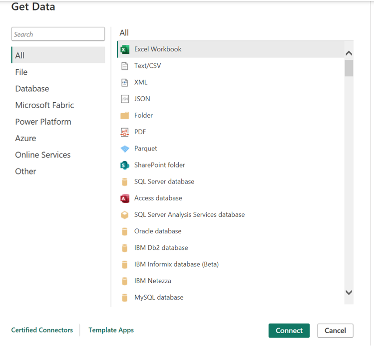
🗃️ Pro Tip: Folder Connector = Automation Gold
The Folder connector is a powerful automation tool:
It reads and appends all files in a folder.
Automatically integrates newly added files into your query.
Perfect for managing recurring reports or incremental data drops.
🔍 Searching for a Connector
Use the search bar in the Get Data window to quickly find specific connectors (e.g., “SQL”).
Or browse the All category to explore everything available.
🧪 Example: Connecting to a CSV File
Download the Territory Lookup CSV from your course resources.
From Get Data, select Text/CSV, then browse to your file.
The preview window appears, showing:
File origin
Delimiter (default: comma)
Sample data preview
Data type detection (based on first 200 rows by default)
Choose:
Load to load data into your model, or
Transform Data to clean/edit in Query Editor (recommended)
🧭 Inside the Power Query Editor
Once inside the Query Editor, you’ll see:
Queries Pane (left): Shows connected data sources
Data Preview (center): Table view of your dataset
Query Settings (right): Applied steps, name, and properties
Ribbon Tabs (top): Transform, Add Column, View, etc.
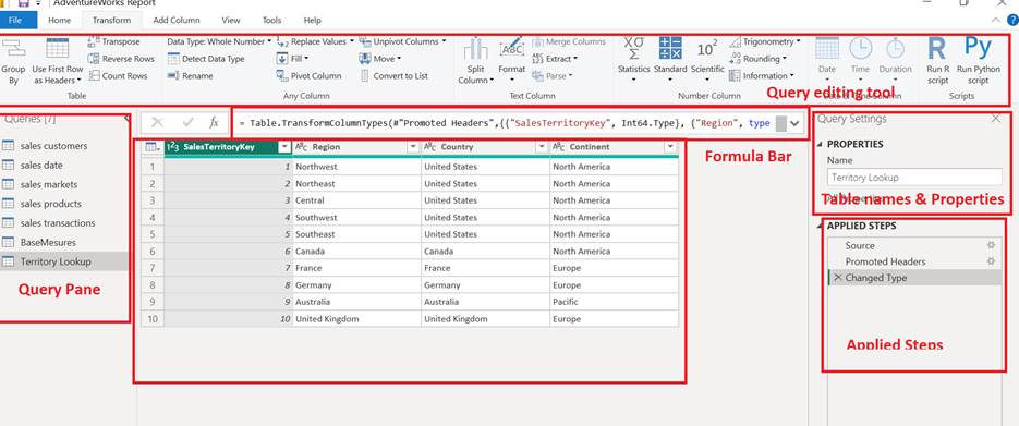
✅ In this example, we rename the query to “Territory Lookup”, remove “AdventureWorks,” then save the changes.
🧰 Power Query Editor in Power BI: Your Data Transformation Cockpit
In Power BI, the Power Query Editor is where all the data transformation magic happens. Think of it as your data preparation command center—from connecting sources to cleaning, shaping, and automating data flows.
Let’s break down this powerful interface and what you can do with it.
✈️ Query Editor: The Cockpit for ETL
From the Home tab in Power BI Desktop, clicking Transform Data launches the Power Query Editor. Here's what you’ll find inside:
🧭 Components of the Power Query Interface
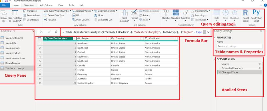
| Section | Purpose |
| 🔧 Query Editing Tools (Top Ribbon) | Includes buttons to transform, clean, and shape your data. |
| 📄 Formula Bar | Displays M Code, automatically generated as you make changes. Advanced users can edit it directly, but it’s optional. |
| 📂 Queries Pane (Left) | Lists all loaded queries. Click each to preview and modify. |
| 👀 Data Preview (Center) | Shows a sample of your dataset; allows you to change column types, headers, etc. |
| 🏷️ Properties Pane (Right) | Lets you name and manage table properties. Use human-readable names (e.g., Territory Lookup). |
| 🪜 Applied Steps (Bottom-Right) | Tracks all your transformations using M Code. Every change = a step. |
⚙️ How Applied Steps Work
Power BI records every transformation (like renaming a column or changing data type) as an Applied Step. This has two key benefits:
Repeatability – When you refresh data, Power BI replays these steps automatically.
Flexibility – You can:
Click 🔄 to revisit a step’s effect.
Click ⚙️ to edit parameters.
Click ❌ to delete a step if needed.
It’s essentially a recorded recipe for your data-cleaning process!
🧠 Do I Need to Know M Code?
Not at all. M Code (short for Power Query Formula Language) is automatically generated. You can tweak it if you’re curious, but Power BI’s UI covers 95% of your needs.
✅ For Excel power users, it’s similar to how VBA macros auto-generate code in the background.
🧰 Tabs in the Query Editor Ribbon
| Tab | What It’s For |
| Home | Access common tools: manage queries, data source settings, table properties, etc. |
| Transform | Modify columns: split, extract, transpose, group, pivot/unpivot, etc. |
| Add Column | Add new columns based on calculations, conditions, and text operations. |
📝 Pro Tip: Strategic Table Naming
Power BI lets you use spaces and full words in table names (unlike SQL). So use clear, descriptive names like Sales Region Lookup or Customer Transactions from the start.
🔧 Power BI Query Editor: Basic Table Transformations
The Power Query Editor in Power BI is your control center for shaping and transforming data before analysis. This guide covers essential transformation steps you'll use often—especially when preparing your data model.
📌 Common Transformation Options
🧩 Column & Row Selection
Keep vs Remove Columns
You can choose to remove unwanted columns or keep only the ones you need.
✅ Best practice: Select columns to keep, especially when dealing with data sources that may change structure over time (e.g., new columns get added monthly).
Example Use Case:
If your source file changes from 10 to 20 columns, but you only want 5 specific columns every time → use “Choose Columns to Keep” to future-proof your data.
🧹 Row Removal Options
Remove top/bottom rows — Great for files with headers or footers.
Remove alternate rows — Useful for skipping patterns.
Remove duplicates — Helps when building unique lookup tables (e.g., unique IDs).
Keep specific number of rows — Ideal for sampling or trimming.
🔁 Sorting, Data Types & Headers
Sort columns (A to Z, low to high).
Promote header rows manually if Power BI doesn’t auto-detect them.
Change data types (text, whole number, decimal, fixed decimal).
Tip: Right-click column headers for quick access to common options like rename, move, duplicate, or remove.
🔍 Real-World Example: AdventureWorks Product Lookup
Steps:
Connect to CSV:
Use New Source > Text/CSV in Query Editor → Choose file → Click OK.Review Applied Steps:
Source — CSV file details (path, encoding, delimiter).
Promoted Headers — Uses the first row as column headers.
Changed Type — Auto-assigns data types (editable).
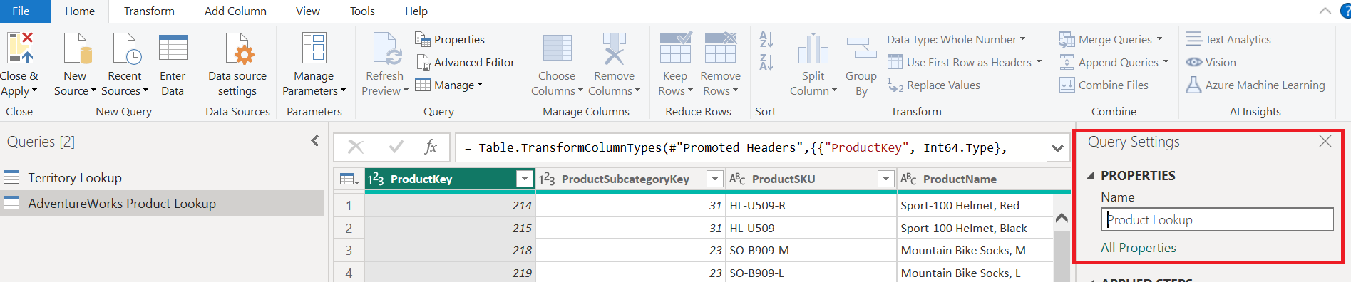
Rename Table:
Change default name (e.g., AdventureWorks Product Lookup) → Product Lookup
Naming conventions help in data modeling later.
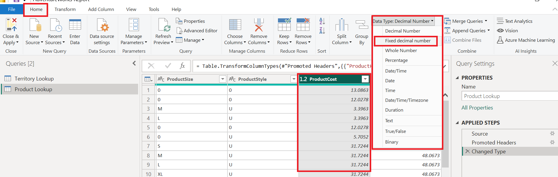
Verify & Update Data Types:
Confirm text, integer, and decimal assignments.
For currencies (e.g., ProductCost, ProductPrice) → Set data type to Fixed Decimal Number.
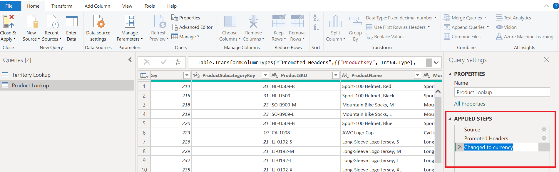
- Rename Transformation Steps:
Right-click applied steps → Use descriptive names (e.g., Changed to Currency).
- Remove Unnecessary Columns:
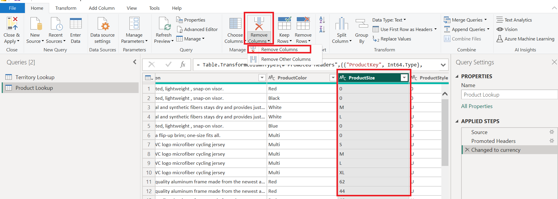
Example: Remove messy or unused fields like ProductSize via right-click or toolbar.
✅ Best Practices Checklist
✅ Rename your tables clearly (e.g., Product Lookup, Sales Data).
✅ Check and update data types — Especially for numeric and currency fields.
✅ Remove or keep columns strategically (prefer “keep these” method).
✅ Rename transformation steps for clarity.
✅ Save and apply your work before loading into the model.

🎉 Final Step: Load into Data Model
After applying transformations:
Your tables appear in both Data view and Model view.
Save your Power BI project to lock in progress.
✅ Assignment: Table Transformations
Power BI Assignment: Table Transformations
Welcome aboard! As part of our internal reporting project, we’ll be enhancing our Power BI dataset with new lookup tables and applying some important transformations to keep our data clean and analysis-ready.
Your mission: connect to new data sources, perform targeted transformations, and ensure our product table is ready for modeling.
Key Objectives & Steps
- Connect to New CSV Files
Import two new lookup tables into Power BI:
Product Category Lookup
Product Subcategory Lookup
Use the “Get Data” feature to connect to the provided .csv files.
- Rename Queries for Clarity
Once imported, rename your queries exactly as:
Product Category Lookup
Product Subcategory Lookup
Clear naming will help keep your model organized.
- Promote Headers & Verify Data Types
Ensure that:
Column headers are promoted (no generic “Column1, Column2” names).
All columns have the correct data types (e.g., text, number, date).
- Create a SKU Type Column
In the Product SKU column, extract all characters before the first dash (“-”). Name this new column:
SKU Type
- Update the SKU Type Logic
Adjust your calculation so that it returns all characters before the second dash instead of the first. This will give more accurate grouping.
- Replace Zero Values
In the Product Style column:
Replace any 0 values with "NA".
This ensures the data reads clearly in reports.
- Load to Data Model
After completing all transformations:
Close & Apply your changes
Load the cleaned tables into the data model for further analysis.
💡 Pro Tip: Always check the Applied Steps pane in Power Query to make sure your transformations are recorded in the correct order.
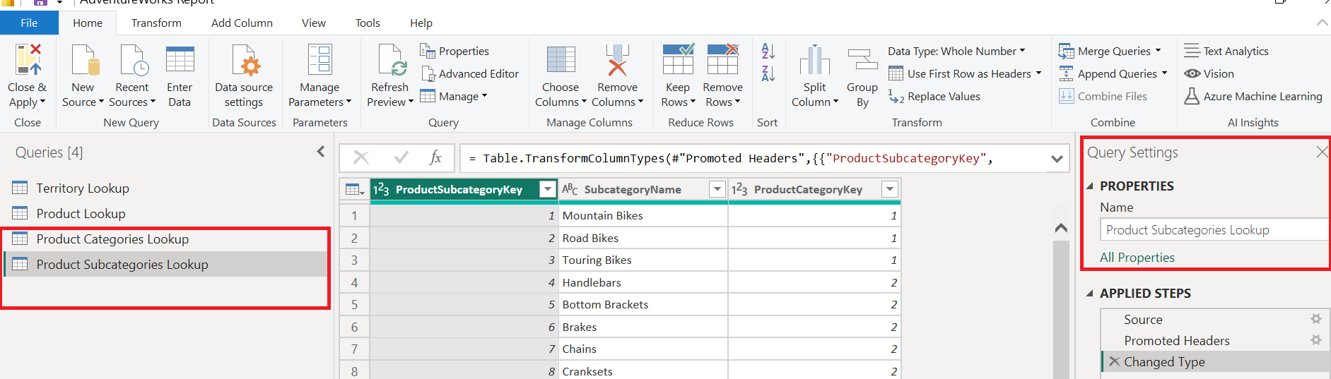
🎯 Objective 1 & 2: Connect to CSV files & Rename Queries
Open Power BI Desktop.
Go to Home > Transform Data > Transform Data → Opens Power Query Editor.
Click Home > New Source > Text/CSV.
Browse and select:
ProductCategoryLookup.csv → Load it.
Rename the query (right-click) to Product Category Lookup.
Repeat the same for:
- ProductSubcategoryLookup.csv → Rename to Product Subcategory Lookup.
🎯 Objective 3: Confirm Column Headers
For each query:
Ensure that headers are correctly promoted (they should not appear as data rows).
If not:
- Click Home > Use First Row as Headers.
🎯 Objective 4: Add "SKU Type" Column (Before First Dash)
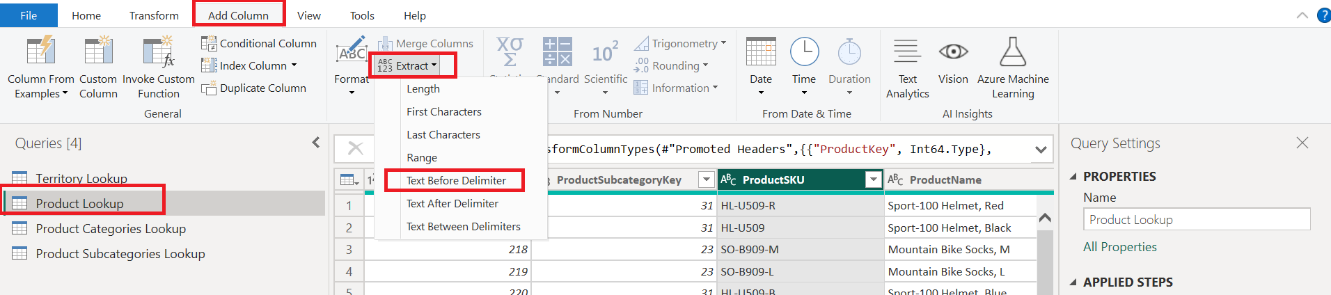
Go to the Product Lookup query.
Select the ProductSKU column.
Go to Add Column > Extract > Text Before Delimiter.
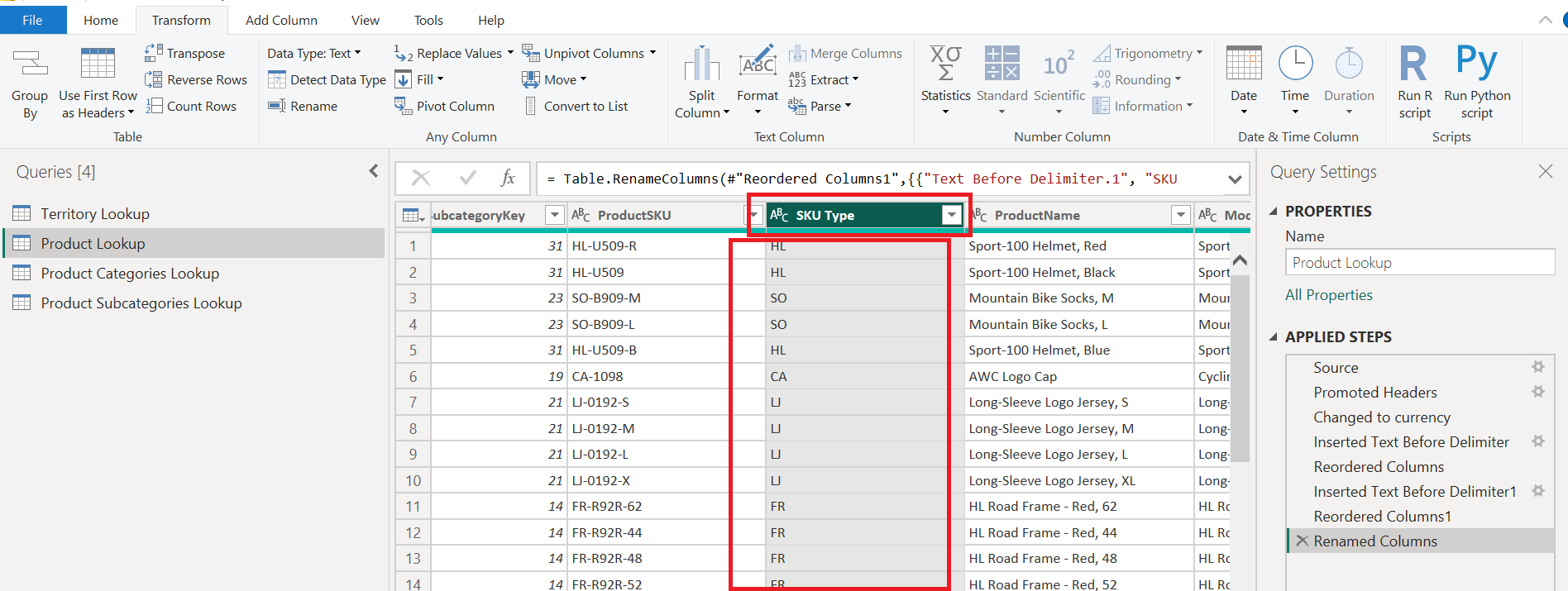
Enter - as the delimiter → Name it SKU Type.
🎯 Objective 5: Update "SKU Type" to Characters Before Second Dash
You need to use a custom column:
Select Add Column > Custom Column.
Name: SKU Type
Formula:
Text.BeforeDelimiter(ProductSKU, "-", 2)
This returns all characters before the second dash.
- Delete the previous version of the "SKU Type" column if necessary.
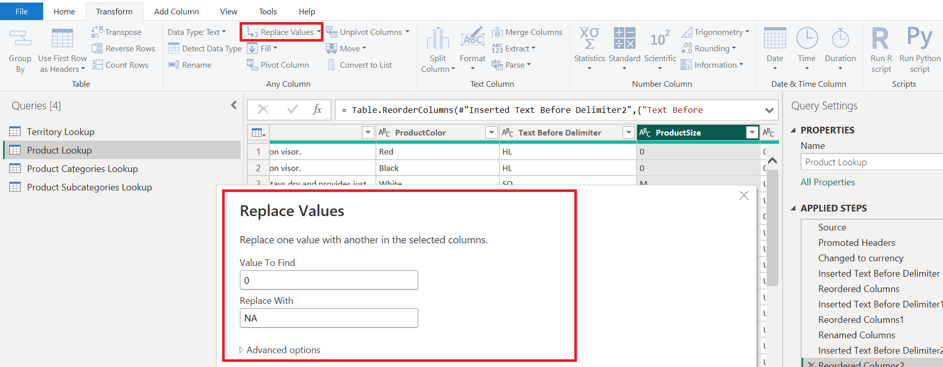
🎯 Objective 6: Replace Zeros in Product Style Column with "NA"
Go to the Product Lookup query.
Select the Product Style column.
Go to Transform > Replace Values.
Replace:
Value to Find: 0
Replace With: NA
🎯 Objective 7: Close & Load Data
Click File > Close & Apply to apply changes and return to Power BI Desktop.
The new queries and modified product table will be part of your data model.
🚀 Power BI Storage & Connection Modes Explained
In Power BI, how you connect to and store data directly impacts performance, flexibility, and governance. Let’s break down the four main storage/connection modes:
1️⃣ Import Mode (Default & Most Common)
How it works: Data is copied and compressed into Power BI’s in-memory engine.
When to use:
Fast performance is needed.
Dataset is <1GB compressed.
Source data changes infrequently.
No corporate restrictions on storing data locally.
Best for: Interactive reports, dashboards, and fast DAX calculations.
🟢 Example: A weekly sales report based on a static Excel file.
2️⃣ DirectQuery Mode
How it works: Data remains in the source system; queries are run live on demand.
When to use:
Large datasets that don’t fit in memory.
Need for real-time data.
Data import is restricted (e.g., due to security or policy).
Trade-offs:
Slower performance (depends on source).
Some DAX and modeling limitations.
🟢 Example: Live dashboard over a large SQL Server database that updates every minute.
3️⃣ Composite Models
How it works: Mix of Import + DirectQuery in the same data model.
When to use:
You want fast access to core data (imported), while keeping some tables live.
You’re combining multiple DirectQuery sources.
Benefit: Balance between performance and real-time needs.
🟢 Example: Import sales data, but use DirectQuery for live inventory.
4️⃣ Live Connection
How it works: Connects to a published dataset or Analysis Services model—no Power BI modeling allowed.
When to use:
Teams need a single source of truth (one dataset, many reports).
Collaborative model-building (shared data model).
Limitation: No new tables or data transformations in Power BI Desktop.
🟢 Example: Enterprise-grade dataset hosted in Power BI Service used by multiple report builders.
🧠 Key Considerations
| Mode | Data Location | Speed | Model Flexibility | Ideal For |
| Import | In-memory | Very Fast | High | Static, performance-first use |
| DirectQuery | At source | Slower | Medium | Real-time, secure data needs |
| Composite | Mix | Balanced | High | Hybrid models |
| Live Connect | External dataset | Depends | Low | Centralized reporting teams |
✅ Final Tip
💬 Choose the storage mode based on the business case, data size, refresh frequency, and collaboration needs.
🔌 Connecting to a Database in Power BI
Power BI isn't limited to flat files like Excel or CSV. In real-world scenarios, you'll often need to connect to databases such as SQL Server, MySQL, Oracle, or SAP. Thankfully, the connection process is consistent across most database systems.
🎯 Key Steps to Connect to a Database
1️⃣ Open the Get Data Window
Go to Home → Get Data → More...
Search and select your desired database source (e.g., MySQL, SQL Server, Oracle, etc.)
2️⃣ Enter Connection Details
Input the server name and database name
Optionally:
Set a command timeout
Write custom SQL queries to shape/filter the data before loading
3️⃣ Provide Credentials
Input your username and password
Choose the appropriate authentication method
4️⃣ Select Tables
A preview window appears showing all available tables
Click on each table to preview its contents
Choose to either:
Load the data directly into Power BI
Or click Transform Data to open the Power Query Editor
🛠️ Inside the Power Query Editor
Once tables are loaded into Power Query:
Rename tables or columns
Change data types
Perform data quality checks and transformations
👉 If you want to keep a table in Power Query but not load it into the data model, right-click the table and:
🔘 Uncheck Enable Load
This is useful for staging or intermediate transformations.
✅ Finalizing
After all changes are made, click Close & Apply
Only enabled tables will be loaded into the model
🧠 Key Takeaways
| Feature | Benefit |
| 🔄 Supports many DBs | SQL Server, MySQL, Oracle, SAP, and more |
| 🔐 Secure login | Requires credentials for access |
| 🧠 Advanced options | Custom SQL and timeout settings |
| 🧪 Transform before loading | Apply filters, rename columns, manage data types |
| 💡 Enable/disable load | Control which queries load into the final data model |
Extracting Data from the Web in Power BI
Power BI’s Web connector allows you to easily import structured tables directly from websites—such as Wikipedia—into the Power Query editor. This is a great way to enrich your data models with publicly available data.
🧭 Step-by-Step Guide
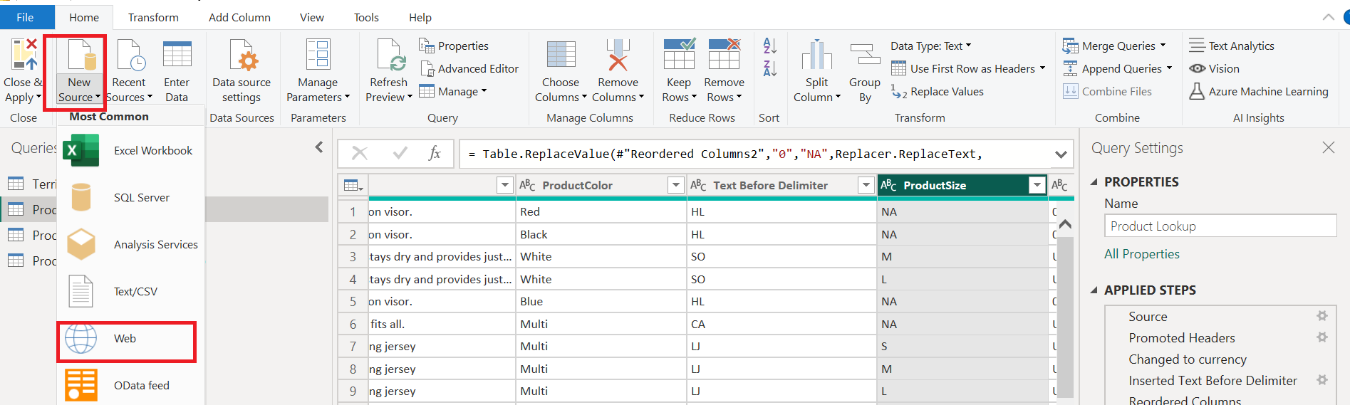
1️⃣ Open the Web Connector
Go to Home → Get Data → Web
Choose the Basic option
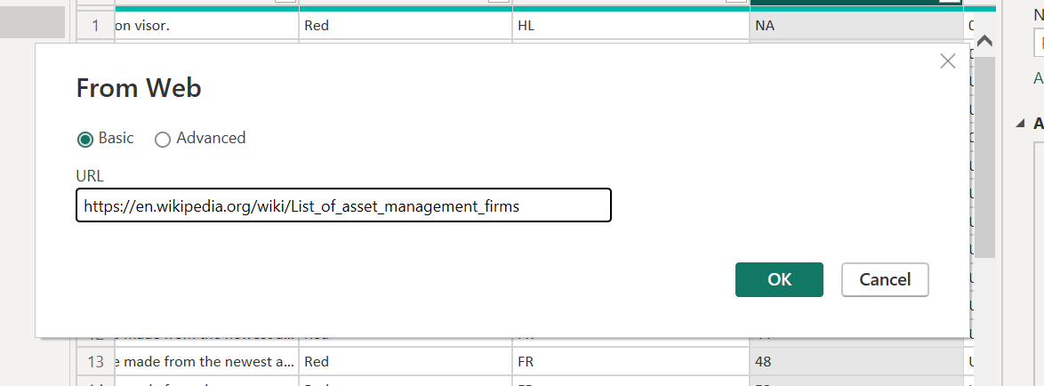
2️⃣ Paste the Web URL
Enter the full URL of the webpage you want to scrape (e.g., a Wikipedia page)
Click OK
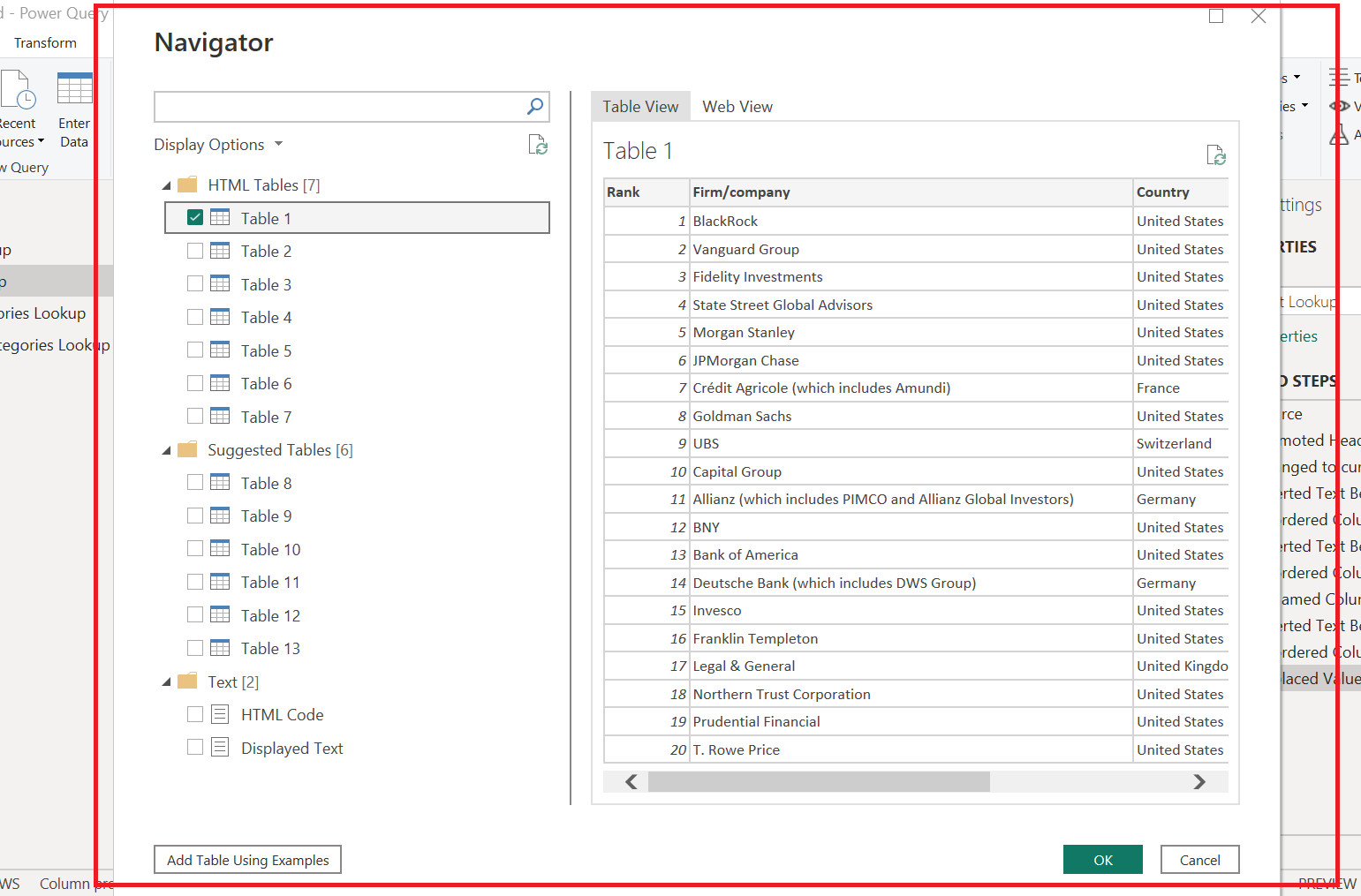
3️⃣ Browse Detected Tables
Power BI scans the page and lists all structured tables found
On the left panel: select a table to preview its content
Use Web View to see how the table looks on the actual webpage
4️⃣ Select the Desired Table
For example: A table listing “Rank, Firm, Company, Country, AUM”
Click Transform Data to open it in Power Query
🛠️ In Power Query Editor
Once loaded, you can:
Rename the query (e.g., Largest Asset Management Firms)
Validate column headers and data types:
Rank → Whole number
Firm/Company/Country → Text
AUM (Assets Under Management) → Currency (optional)
Apply additional transformations as needed
👉 Tip: If you're only staging the data, right-click the query name and disable "Enable Load" to avoid loading it into the model.
🧠 Key Takeaways
| Feature | Benefit |
| 🌍 Web connector | Imports structured data tables from web pages |
| 🔍 Preview before loading | Choose the relevant table with confidence |
| ⚙️ Adjust in Query Editor | Modify column names, data types, and values as needed |
| 📎 Basic mode is enough | Advanced options (e.g., parameters, headers) are available but optional |
This method is ideal for bringing in reference tables, rankings, lists, or publicly available statistics to enhance your Power BI reports without manual data entry.
🔍 Data Quality Assurance & Profiling Tools in Power BI
Data cleaning and validation are essential steps in any data project. In Power BI, data profiling tools within the Power Query Editor provide powerful and visual ways to explore, assess, and improve your data before analysis.
🧪 What is Data Profiling?
Data profiling helps you:
Identify empty, invalid, or duplicate values
Understand value distributions
Detect formatting errors or outliers
Make informed decisions about data cleanup
All tools are available from the View tab in the Query Editor.
🔧 Key Profiling Tools
✅ 1. Column Quality
Shows % of Valid, Error, and Empty values per column
Hover or click for a contextual menu with cleanup options like:
Remove errors
Remove empty rows
Replace values
Remove duplicates
✅ Great for quickly identifying bad data in large tables.
📊 2. Column Distribution
Displays the distinct and unique values in a column
Useful for spotting:
Duplicate records
Rare entries
Unexpected values
Example: A column with 666 distinct names and 89 unique ones means 89 appear only once.
📋 3. Column Profile
Most detailed tool: shows both statistics and value distribution
On the left: Key stats like:
- Count, Distinct, Empty, Errors, Min/Max
On the right: Bar chart of value frequency
✅ Perfect for numeric and categorical analysis.
⚠️ Tip: Enable Full Data Profiling
By default, Power BI only profiles the first 1000 rows. To detect deeper issues:
Go to View → Column Profiling → Entire Dataset
This rescans the whole table (e.g., 18,000+ rows) to catch hidden errors
🛠️ Common QA & Cleanup Steps
Check data types for each column (text, number, date, etc.)
Rename queries for clarity (e.g., customer lookup)
Review column stats using profiling tools
Remove errors with right-click or suggestions
Filter out empty rows using contextual actions
Investigate invalid values
Use "Keep Errors" to isolate them
Review messages like: Cannot convert to number
Fix values like 30--- or unexpected links
💡 Example Scenarios
| Issue | Tool to Use | Fix |
| Empty values in prefix column | Column Quality | Remove empty rows |
| Format error in ID column | Column Profile | Keep errors → inspect message |
| Unexpected lowercase in title | Manual inspection | Replace values |
| Duplicate names in customer list | Column Distribution | Keep if valid; else remove |
🧠 Key Takeaways
Power BI’s profiling tools help ensure data integrity before analysis
Use contextual menus to apply fixes without hunting through menus
Full dataset profiling reveals deeper issues than the default 1000-row scan
Clean data leads to trustworthy dashboards and insights
📅 Mastering Date Handling in Power BI: Locale Settings, Rolling Calendars & Calendar Table Enhancements
Power BI is powerful, but working with dates across different countries, refreshing reports automatically, and enriching your calendar table can be tricky. This guide covers three key techniques:
Fixing date format issues using Change Type with Locale
Creating an automatically updating rolling calendar using M code
Enhancing a calendar table with extra columns for richer analysis
1️⃣ Change Type with Locale — Fixing International Date Format Issues
The Problem
Different countries use different date formats. For example:
US → Month/Day/Year (
MM/DD/YYYY)UK → Day/Month/Year (
DD/MM/YYYY)
If you import UK dates into a US-based Power BI file without adjusting for locale, you’ll get errors from the 13th day of the month onward — because 13/01/2023 is invalid in US format.
The Fix — Change Type Using Locale
Check column consistency → Make sure all values are the same type.
Convert to Text first → This prevents Power Query from misinterpreting numbers as dates.
Change Type Using Locale:
Click the data type icon → select Using Locale
Choose Date as the type
Set the locale to match the source file (e.g., English (United Kingdom))
✅ Result: Dates are correctly recognized and converted for Power BI’s use, without parsing errors.
Key takeaway: Always match the locale to the source data’s format, not your own system’s format.
2️⃣ Rolling Calendars — Always Up-to-Date
When to Use
A rolling calendar is perfect for daily or weekly refreshing reports that need to stay current without manual updates.
Steps to Create a Rolling Calendar
1. Start with a blank query
- Enter your start date literal in M code:
#date(2023, 1, 1)
2. Generate the date list dynamically
List.Dates(
    Source,
    Number.From(DateTime.LocalNow()) - Number.From(Source) + 1,
    #duration(1, 0, 0, 0)
)
Source→ start dateDate difference → counts days between start and today (inclusive)
#duration(1,0,0,0)→ steps through 1 day at a time
3. Convert to a table & format as Date
Rename the column (e.g.,
Date)Set data type to Date
💡 Note: M code is case sensitive — List.Dates must be typed exactly as shown.
3️⃣ Calendar Table Enhancements — Assignment
Objective:
Enhance your Date table in Power BI by adding new columns that make time-based analysis easier.
Instructions:
Open the Calendar table in Power Query.
Select the Date column — all transformations will be based on this column.
Add the following columns in order:
Month Name → Go to
Date→Month→ Name of MonthMonth Number → Go to
Date→Month→ MonthStart of Year → Go to
Date→Year→ Start of YearYear → Go to
Date→Year→ Year
Ensure the column names are clear and consistent (e.g.,
Month Name,Month Number,Start of Year,Year).Confirm that the values are correct — e.g., January shows as month 1, start of year is
YYYY-01-01.
Expected Outcome:
A Calendar table with these four new columns, ready for filtering, grouping, and creating time intelligence measures in your reports.
Calendar Table Enhancements — Assignment Solution
Steps from the solution walkthrough:
Select the Date column
Add:
Month Name →
Date→Month→ Name of MonthMonth Number →
Date→Month→ MonthStart of Year →
Date→Year→ Start of YearYear →
Date→Year→ Year
✅ Result: Your calendar table now contains key fields for grouping, filtering, and building time intelligence measures.
📌 Final Key Takeaways
Change Type with Locale ensures date, decimal, and currency columns are interpreted correctly when working with international data.
Rolling Calendars use M code to automatically update with each refresh, removing the need for manual calendar table edits.
Calendar Table Enhancements enrich your model for better analysis, filtering, and time-based calculations.
With these three techniques, you can confidently manage date-related challenges in Power BI and make your reports both accurate and future-proof.
🔢 Power BI Query Editor: Mastering Index & Conditional Columns
When working with datasets in Power BI, adding Index Columns and Conditional Columns can improve your ability to uniquely identify records and derive new insights from existing data.
This guide walks you through what they are, when to use them, and best practices for keeping your queries clean and efficient.
1️⃣ Index Columns
What They Are
An Index Column is a sequential number assigned to each row in your table, usually starting at 0 or 1.
Why They’re Useful
Create a unique key for each record
Track the order of rows
Aid in joining or merging tables without an existing unique identifier
How to Add One
In Power Query, go to Add Column → Index Column
Choose:
From 0
From 1 (common for IDs)
Custom (specify start and increment)
Optionally, rename the column to something descriptive like
Order ID.Reorder columns if needed (drag header or right-click → Move).
⚠ Best Practice:
If you later remove an Index Column, also remove its related applied steps to avoid unnecessary processing during refresh.
2️⃣ Conditional Columns
What They Are
A Conditional Column lets you create new columns based on IF/THEN logic — without writing M code.
Example
Creating a Quantity Type column based on Order Quantity:
If
Order Quantity = 1→ “single item”If
Order Quantity > 1→ “multiple items”Else → “Other”
How to Add One
In Add Column → Conditional Column
Choose the column to base your logic on
Set conditions and output values
Add an Else clause for unexpected values
Click OK to apply
💡 Tip: If you see a “List may be incomplete” warning, click Load More to ensure all unique values are scanned.
3️⃣ Managing Applied Steps
Every transformation in Power Query adds an Applied Step. If you delete a column but leave related steps behind, they will still run during refresh — slowing performance.
Use the Applied Steps pane to remove unnecessary steps
Group queries into folders to keep your workspace organized
📌 Key Takeaways
Index Columns: Sequential values to uniquely identify rows
Conditional Columns: IF/THEN logic for categorizing or deriving values
Efficiency Tip: Clean up unused applied steps to improve refresh speed
Organization Tip: Group queries to avoid clutter in the Query Editor
📝 Assignment 1 : Index & Conditional Columns
Objective:
Work with a sample sales dataset to add an Index Column and a Conditional Column following best practices.
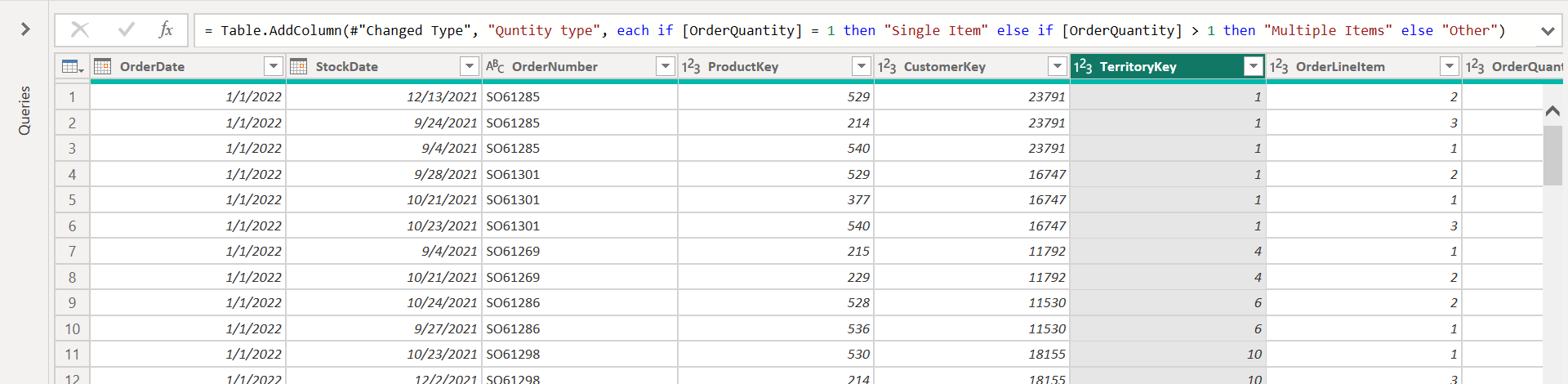
Instructions:
Import a sales dataset into Power Query (can be your own file or a sample with columns:
Order Date,Stock Date,Order Number,Order Quantity).Add an Index Column starting from 1, and rename it to
Order ID.Move
Order IDto the first column position.Create a Conditional Column named
Quantity Type:If
Order Quantity = 1→ output"single item"If
Order Quantity > 1→ output"multiple items"Else → output
"Other"
Remove any unnecessary applied steps that remain from testing.
Close & Apply the query to load changes to the model.
Expected Output:
A cleaned sales table with Order ID as the first column and Quantity Type correctly categorizing each row.
📝 Assignment 1 ✅ Solution: Index & Conditional Columns Assignment
Step-by-Step Solution:
1. Add the Index Column
Go to Add Column → Index Column → From 1
Rename the column to
Order IDMove it to the first position (
Move → To Beginning)
2. Create the Conditional Column
Go to Add Column → Conditional Column
Column Name:
Quantity TypeIf
Order Quantity=1→"single item"Else If
Order Quantity>1→"multiple items"Else →
"Other"
3. Tidy Applied Steps
Delete any unnecessary steps (e.g., moving/deleting columns from earlier tests)
Ensure only essential transformations remain
4. Load to Model
Click Close & Apply
Save the workbook
Final Table Example:
| Order ID | Order Date | Stock Date | Order Number | Order Quantity | Quantity Type |
| 1 | 2022-01-02 | 2022-01-03 | ORD-1001 | 1 | single item |
| 2 | 2022-01-02 | 2022-01-05 | ORD-1002 | 3 | multiple items |
| 3 | 2022-01-03 | 2022-01-06 | ORD-1003 | 0 | Other |
⚡ Calculated Column Best Practices in Power BI
When building data models in Power BI, where you create your calculated columns and transformations can have a huge impact on report speed and performance.
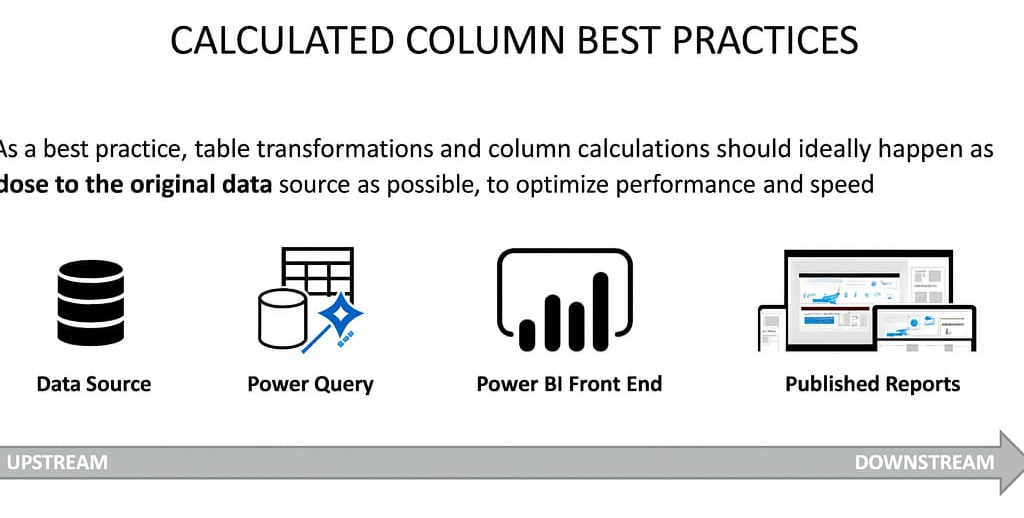
1️⃣ Why Location Matters
Calculated columns can be created at different stages of your workflow:
Data Source (SQL Server, MySQL, Excel, etc.)
Power Query (Query Editor)
Power BI Front End (DAX calculated columns)
Published Reports/Dashboards
The closer to the original data source, the better for performance.
2️⃣ Recommended Order (Upstream → Downstream)
Best → Worst (for performance):
Data Source — Do transformations in the original database or file
Uses the source system’s processing power
Most efficient, best for large datasets
Power Query — If source-level edits aren’t possible
Included in the Vertipaq engine’s query plan
Benefits from compression before loading to the data model
Power BI Front End (DAX) — As a last resort for calculated columns
Not included in Vertipaq’s pre-load compression
Can increase model size unnecessarily
Published Reports/Dashboards — Rarely recommended
Limited flexibility
May require reprocessing each time
3️⃣ Why Power Query Beats Power BI Front-End for Calculations
When you load data in Import Mode, Power BI’s Vertipaq engine:
Reads all transformation steps in Power Query
Creates an optimized query plan
Compresses data before storing it in memory
If you add calculated columns in the Power BI front end:
They’re not part of this plan
They’re stored as extra data in memory
This can slow down your model and increase file size
📌 Key Takeaways
Do calculations as far upstream as possible.
Prefer source-level transformations → then Power Query → then DAX (only if necessary).
Source or Power Query calculations benefit from Vertipaq compression and better performance.
For large or complex models, following this order can make a big difference in speed and file size.
📊 Power BI Query Editor: Grouping & Aggregating Data
In data analysis, we often need to summarize detailed datasets into higher-level overviews. Power BI’s Group By feature in the Query Editor makes this possible, allowing you to roll up transactional data and apply aggregation functions like sum, average, min, and max.
1️⃣ What is Grouping & Aggregating?
Grouping: Organizing rows that share common values into groups.
Aggregating: Applying calculations to each group (e.g., summing quantities, finding averages).
2️⃣ Where to Find It in Power BI
Location: Query Editor → Transform tab → Group By
Options:
Basic: Group by a single column
Advanced: Group by multiple columns
3️⃣ Example — Grouping by Product Key
Imagine a table with:
Order DateProduct KeyCustomer KeyOrder Quantity
Since multiple orders exist for each product, you can group by Product Key and sum the Order Quantity to see the total items ordered per product.
Result:
| Product Key | Total Quantity |
| 214 | 154 |
| 215 | 87 |
4️⃣ Advanced Group By — Multiple Columns
Using Advanced Group By, you can group by Product Key and Customer Key to see total purchases per customer-product pair.
Result:
| Product Key | Customer Key | Total Quantity |
| 214 | C101 | 45 |
| 214 | C102 | 78 |
This works like a pivot table with multiple row fields.
5️⃣ Aggregation Functions Available
Sum → Adds values in each group
Average → Mean value for each group
Min / Max → Lowest or highest value per group
Median → Middle value in sorted order
📌 Key Takeaways
Group By summarizes detailed data into digestible summaries.
Basic Group By handles one column; Advanced Group By handles multiple.
Aggregations like sum, average, and max can be applied to grouped data.
Reducing granularity means some columns will be lost — keep only what’s needed for your analysis.
📝 Assignment 2 — Grouping & Aggregating
Objective:
Practice summarizing sales data using Group By in Power Query.
Instructions:
Import a sales dataset containing at least:
Product KeyCustomer KeyOrder QuantityOrder Date
Basic Group By:
Group by Product Key
Aggregate
Order Quantity→ SumName the new column
Total Quantity
Advanced Group By:
Group by Product Key and Customer Key
Aggregate
Order Quantity→ SumName the new column
Total Quantity
Sort results by Product Key (and Customer Key for advanced).
Expected Outcome:
A product-level summary table (Basic).
A product-customer-level summary table (Advanced).
📝 Assignment 2 ✅ Solution — Grouping & Aggregating Assignment
Step 1 — Basic Group By
Transform → Group By (Basic mode)
Group by: Product Key
Operation: Sum on
Order QuantityOutput column:
Total Quantity
Result Example:
| Product Key | Total Quantity |
| 214 | 154 |
| 215 | 87 |
Step 2 — Advanced Group By
Transform → Group By (Advanced mode)
Group by: Product Key + Customer Key
Operation: Sum on
Order QuantityOutput column:
Total Quantity
Result Example:
| Product Key | Customer Key | Total Quantity |
| 214 | C101 | 45 |
| 214 | C102 | 78 |
🔄 Pivoting & Unpivoting in Power BI Query Editor
In data analysis, the shape of your table matters just as much as the numbers it contains. Power BI’s Pivot and Unpivot tools allow you to restructure data for easier filtering, aggregation, and visualization.
1️⃣ What is Pivoting?
Pivoting turns distinct row values into columns.
Example: Taking the “Region” values (
North,Central,South) from rows and creating separate columns for each.Best for: Converting long tables (vertical) into wide tables (horizontal).
2️⃣ What is Unpivoting?
Unpivoting turns columns into rows.
Example: Taking
North Region,Central Region,South Regioncolumns and creating two new columns:RegionandQuantity Sold.Best for: Creating a rectangular table with each dimension in its own column, ready for filtering and analysis.
3️⃣ Transpose vs Pivot/Unpivot
Transpose flips the entire table like a mirror — it doesn’t care about unique values or grouping.
Pivot/Unpivot intelligently reshapes data based on column headings and values.
4️⃣ Why Unpivot is Common Before Analysis
In the provided table, each row contains:
DateProduct CategorySales by
North Region,Central Region,South Region
This makes it hard to filter by Region in a report. By unpivoting the three region columns, you create a more analysis-friendly structure:
| Date | Product Category | Region | Quantity Sold |
| 7/1/2022 | Bikes | North | 10 |
| 7/1/2022 | Bikes | Central | 19 |
| 7/1/2022 | Bikes | South | 25 |
📌 Key Takeaways
Pivot → Rows → Columns (wide table)
Unpivot → Columns → Rows (long table)
Transpose → Brute-force flip (not smart about grouping)
For most BI models, unpivoting region-based columns into a
Region+Valueformat is the first step toward flexibility in filtering and analysis.
📝 Assignment 3— Pivoting & Unpivoting
Objective:
Reshape the provided sales dataset to support better regional analysis.
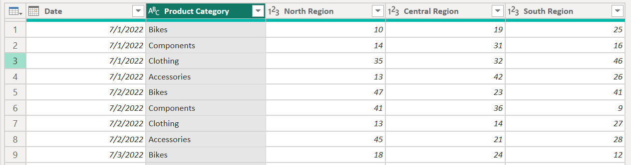
Instructions:
Load the provided dataset into Power Query.
Unpivot the columns
North Region,Central Region, andSouth Region.Rename the generated columns:
Attribute→RegionValue→Quantity Sold
Verify that each row now contains:
Date,Product Category,Region,Quantity Sold.Pivot the table back to its original form using:
Regionas the column headersQuantity Soldas the values
Compare the before and after shapes of the table.
📝 Assignment 3 ✅ Solution — Pivoting & Unpivoting Assignment
Step 1 — Unpivot
Select
North Region,Central Region,South RegioncolumnsTransform → Unpivot Columns
Rename:
Attribute→RegionValue→Quantity Sold
Result (first few rows):
| Date | Product Category | Region | Quantity Sold |
| 7/1/2022 | Bikes | North | 10 |
| 7/1/2022 | Bikes | Central | 19 |
| 7/1/2022 | Bikes | South | 25 |
Step 2 — Pivot Back
Select
RegionandQuantity SoldcolumnsTransform → Pivot Column
Use
Regionas the column nameUse
Quantity Soldas the valueThis restores the original wide format.
Merging Queries in Power BI
Merging queries in Power BI is like performing a lookup in Excel — it allows you to join data from two different tables using a common column (key) so that related information can be brought together into one place.
Where to Find the Merge Option
In the Power Query Editor, go to the Home tab. Under the Combine group, you’ll find:
Merge Queries → merges data into the current table.
Merge Queries as New → creates a new merged table, keeping the originals untouched.
Example Scenario
We have:
Sales Data 2022 — contains columns like Order Date, Order Number, Product Key, Customer Key, Quantity.
Product Lookup — contains Product Key, Product Name, Product Color, Product Description, etc.
Both tables share a ProductKey column.
Goal: Bring Product Name and Product Color from the Product Lookup table into the Sales Data table.
Steps to Merge
Open Sales Data 2022 in Power Query.
Click Merge Queries.
In the Merge dialog:
First table → Sales Data 2022.
Second table → Product Lookup.
Select ProductKey in both tables.
Check match count — in our example, all 29,481 rows from Sales Data matched.
Join Type: Use Left Outer Join (keeps all rows from the first table, adds matches from the second).
Click OK.
Expanding Merged Data
After merging, you’ll see a new column containing small “Table” links.
Click the double arrow icon.
Select only the columns you want (e.g., Product Name, Product Color).
(Optional) Keep Use original column names as prefix checked to avoid confusion.
Click OK to expand.
Now, the Sales Data table has extra columns with product details, just like an Excel VLOOKUP result.
Join Types Overview
Left Outer (default) → All rows from the first table, matching from second.
Right Outer → All rows from the second table, matching from first.
Inner → Only rows with matches in both.
Full Outer → All rows from both tables, matched where possible.
Anti Joins → Returns only unmatched rows.
Best Practices & Considerations
Efficiency: Merging makes the table wider but not longer. However, it can duplicate data and impact performance.
Data Model Relationships: Instead of merging, consider keeping tables separate and using relationships in the data model.
Selective Expansion: Only bring the columns you actually need.
Check Data Types: Ensure the matching columns have the same data type before merging.
✅ Key Takeaways
Merging Queries = Excel Lookup in Power BI.
Common column (key) is essential.
Be selective to avoid redundancy.
Relationships are often a better long-term approach.
PRO TIP: Appending Files from a Folder in Power BI
When working with multiple files that share the same structure (like yearly sales data), manually appending each one in Power Query works — but it’s not the most scalable approach. A smarter way is to connect Power BI directly to the folder containing your files.
Why Not Just Append Manually?
When you use the Append Queries tool to stack data:
✅ You get one combined dataset.
❌ But the new table depends on the individual queries.
❌ Adding a new file means reconfiguring the append.
❌ You can’t delete the original queries without breaking the dataset.
The Folder Connection Method
Step 1: Remove Old Append Queries
Delete the append query you previously created.
Delete the individual file queries (e.g., Sales_2020, Sales_2021, Sales_2022).
Keep only the main lookup tables you still need.
Step 2: Connect to a Folder
In Power BI, go to Get Data → More → Folder.
Click Connect, then browse to the folder path containing your sales files.
- Example:
Desktop > Adventure Works Raw Data > Sales Data
- Example:
Click OK to load the preview.
Step 3: Preview & Transform
The preview shows file attributes (Name, Extension, Date Modified, Folder Path, Content).
Select Transform Data to work in the Query Editor.
Click the Combine Files button in the Content column to merge them.
Step 4: Confirm the Combined Data
A sample file preview appears — check that column names & structure are consistent.
Switch between sample files to verify data alignment.
Click OK to confirm.
Step 5: Clean the Data
A Source Name column is often added — remove it if not needed.
Rename the query (e.g., “Sales Data”).
Collapse or hide behind-the-scenes helper queries to keep things tidy.
Benefits of This Method
✅ Scalable — Drop a new CSV into the folder, refresh Power BI, and the data updates automatically.
✅ No extra dependencies — One clean combined table without the clutter of multiple queries.
✅ Less maintenance — No need to edit the append step every time new data arrives.
Key Takeaways
Appending manually = Quick, but tied to specific queries.
Folder connection = Dynamic, scalable, and cleaner for ongoing reporting.
Always ensure all files in the folder have the same column structure before combining.
Data Source Settings in Power BI
When working with multiple data connections in Power BI, it’s crucial to know where and how to manage them. This is where Data Source Settings come in — allowing you to view, update, and fix data connections when something changes in your file paths or data sources.
What Are Data Source Settings?
In the Home tab of the Query Editor, you’ll find Data Source Settings.
It lists all connections in your Power BI file — such as CSV files, folders, databases, or web links.
It stores the exact file path or connection details.
💡 Important: Power BI does not automatically update file paths if you rename or move a file.
When Things Go Wrong — The Broken Path Problem
If you:
Rename a file
Move a file to another folder
Change permissions
…the connection will break, and Power BI will show an error like:
"Could not find the file"
Fixing a Broken File Path
Method 1: Using Data Source Settings
Home → Data Source Settings
Select the broken connection.
Click Change Source.
Browse for the correct file or folder.
Click Open → OK → Close.
Refresh the dataset — it will work again without losing applied steps.
Method 2: Using the Applied Steps Panel
Go to the Applied Steps pane in Query Editor.
Locate the Source step.
Click the gear icon next to it.
Select the correct file or folder path.
Confirm and refresh.
Why This Is Useful
You don’t need to rebuild your query — all transformations remain intact.
You can quickly fix broken paths without re-importing data.
Works for both local files and folder connections.
Key Takeaways
Data Source Settings lets you view and manage all data connections in one place.
File paths for local files are stored exactly — they do not update automatically.
Broken connections can be fixed by changing the source in Data Source Settings or in the Source step.
All applied transformations remain unchanged after fixing the path.
Power Query Best Practices (Connecting & Shaping Data)
Want cleaner models and faster refreshes? Here’s a tight, blog-ready guide you can drop into your notes.
1) Organize before you load
Name things well—early.
Use a clear convention so you don’t refactor DAX and relationships later.
Tables:
dim_Date,dim_Product,fact_SalesQueries (staging):
stg_SalesRaw(set Enable load = Off)Measures table:
_Measures
Keep files in a tidy structure./Data/Raw/, /Data/Processed/, /Docs/.
Add Parameters for paths (Home → Manage Parameters) so moving folders doesn’t break connections.
Pro tip: Group related queries (right-click in Queries pane → New Group) and add short descriptions in Query Properties.
2) Manage data refresh
Not everything needs to refresh.
Static lookups (e.g., country codes) → right-click query → Include in report refresh (turn off).
Staging queries used only to build final tables → Enable load (turn off) to save memory.
Push filters/aggregations upstream to the source whenever possible to reduce refresh time.
Clicks: Power Query → right-click a query → Properties
Uncheck Enable Load for staging.
Uncheck Include in report refresh for static sources.
3) Load only what you need
Don’t import hourly when daily will do.
Filter early (apply Date/Product filters before other steps).
Remove unused columns (Home → Choose Columns).
Aggregate at source (SQL/native query or folding) to shrink data volume.
Prefer Import for speed; use DirectQuery only when you truly need live data.
Query folding tip: Place filters and projections before non-folding steps (like custom functions) so Power Query can push work to the source.
4) Clean, readable step logic
Combine repeated Changed Type steps; set data types once near the top.
Use Reference (not Duplicate) when branching transformations off the same source.
Name steps (gear icon/Advanced Editor) so future you understands what happened.
Quick checklist
Tables and queries follow a clear naming convention
Folder paths parameterized; queries grouped
Staging queries: Enable load = Off
Static tables: Include in report refresh = Off
Only required rows/columns loaded; filters applied early
Data types set once; steps tidy; folding preserved
Key takeaways
Organize names and folders before loading to avoid rewiring later.
Disable refresh for static data and disable load for staging queries.
Import only the granularity and columns you actually need—filter early to keep models lean.
Next up: relationships, star schema, and polishing the model view—where these choices really start to pay
Normalization for Power BI: a clear, hands-on guide (with example tables)
Normalization sounds academic, but it’s really about organizing tables so your model stays lean, accurate, and easy to analyze.
What is normalization?
Normalization is the process of structuring tables and columns in a relational database to reduce redundancy and preserve data integrity.
Why it matters
Less duplication → smaller, faster tables
Fewer update/insert/delete anomalies
Cleaner analytics (simpler DAX and queries)
The core idea
Give each table one job:
Fact table(s) store events/transactions
Dimension tables store attributes you slice/filter by (Product, Store, Date, Customer, etc.)
A concrete example
Before: a non-normalized “everything” table
(attributes repeat on every row)
| TransID | Date | ProductID | ProductName | Brand | SKU | WeightKg | Store | Qty | UnitPrice |
| 1001 | 2025-01-01 | 101 | Road Helmet | Contoso | RH-01 | 0.35 | Colombo | 1 | 50 |
| 1002 | 2025-01-01 | 102 | Trail Helmet | Contoso | TH-02 | 0.40 | Colombo | 2 | 60 |
| 1003 | 2025-01-02 | 101 | Road Helmet | Contoso | RH-01 | 0.35 | Kandy | 3 | 50 |
| 1004 | 2025-01-03 | 103 | Bottle 750ml | Fabrikam | BT-750 | 0.08 | Kandy | 4 | 10 |
| 1005 | 2025-01-03 | 101 | Road Helmet | Contoso | RH-01 | 0.35 | Colombo | 2 | 50 |
| 1006 | 2025-01-04 | 102 | Trail Helmet | Contoso | TH-02 | 0.40 | Kandy | 1 | 60 |
Problem: ProductName/Brand/SKU/WeightKg repeat constantly. Updating “Trail Helmet” weight means fixing many rows (risk of errors).
After: a normalized star schema
Fact table — transactions only
| TransID | Date | ProductID | StoreID | Qty | UnitPrice |
| 1001 | 2025-01-01 | 101 | 1 | 1 | 50 |
| 1002 | 2025-01-01 | 102 | 1 | 2 | 60 |
| 1003 | 2025-01-02 | 101 | 2 | 3 | 50 |
| 1004 | 2025-01-03 | 103 | 2 | 4 | 10 |
| 1005 | 2025-01-03 | 101 | 1 | 2 | 50 |
| 1006 | 2025-01-04 | 102 | 2 | 1 | 60 |
Dimension — products (one row per product)
| ProductID | ProductName | Brand | SKU | WeightKg |
| 101 | Road Helmet | Contoso | RH-01 | 0.35 |
| 102 | Trail Helmet | Contoso | TH-02 | 0.40 |
| 103 | Bottle 750ml | Fabrikam | BT-750 | 0.08 |
Dimension — stores
| StoreID | StoreName | Region |
| 1 | Colombo | Western |
| 2 | Kandy | Central |
Dimension — dates (tiny excerpt)
| Date | Year | Month | Day |
| 2025-01-01 | 2025 | Jan | 1 |
| 2025-01-02 | 2025 | Jan | 2 |
| 2025-01-03 | 2025 | Jan | 3 |
| 2025-01-04 | 2025 | Jan | 4 |
Relationships (one-to-many):
DimProduct[ProductID]→FactSales[ProductID]DimStore[StoreID]→FactSales[StoreID]DimDate[Date]→FactSales[Date]
What you gain
Update a product attribute once (in
DimProduct)A skinny fact table that refreshes and aggregates faster
Intuitive slicing: filter by Brand/Region/Month without duplication
The classic normal forms (30-second skim)
1NF: Each column is atomic; no repeating groups.
2NF: In 1NF, and every non-key column depends on the whole (composite) key.
3NF: In 2NF, and non-key columns depend only on the key (no transitive dependencies like Brand → Category in the same table).
For analytics, aiming for 3NF inside dimensions and then arranging facts+dimensions into a star schema is a sweet spot.
Normalization vs. Power BI pragmatism
OLTP systems (apps/ERPs) normalize aggressively to protect integrity.
Analytics models (Power BI) prefer a star schema:
1 fact table (or a few) + several dimension tables
Dimensions can be lightly de-normalized (flatten hierarchies) to make slicing easy.
Rule of thumb: normalize to avoid duplication and anomalies; don’t over-normalize dimensions if it hurts usability/performance.
How to build this in Power Query (quick workflow)
Load the “everything” table as
SalesRaw.Create
DimProductRight-click
SalesRaw→ ReferenceKeep
ProductID, ProductName, Brand, SKU, WeightKgRemove Duplicates → rename to
DimProduct
Create
DimStoreReference
SalesRawKeep
StoreID/StoreName/Region(or deriveStoreID)Remove duplicates → rename to
DimStore
Create
FactSalesReference
SalesRawKeep
TransID, Date, ProductID, StoreID, Qty, UnitPrice(Optional) Add
Revenue = Qty * UnitPrice
Tidy up
Turn Enable load = Off for
SalesRaw(staging only)Close & Apply, relate facts ↔ dimensions in Model view
A couple of DAX starters
DAXCopyEditRevenue = SUMX(FactSales, FactSales[Qty] * FactSales[UnitPrice])

Total Qty = SUM(FactSales[Qty])

Revenue by Brand =
CALCULATE([Revenue], VALUES(DimProduct[Brand]))
Common pitfalls (and fixes)
Repeating attributes in the fact table → move them to a dimension.
Text keys for relationships → use integer surrogate keys (faster joins).
Snowflaked dimensions (Product → Brand → Category) → consider flattening into one
DimProductunless there’s a strong reason not to.No Date table → add a proper
DimDateand mark as Date table for time intelligence.
Checklist
Facts: only keys + numeric measures
Dimensions: one row per business entity (Product/Store/Customer/Date)
Relationships: single-direction, star shape (avoid many-to-many unless needed)
No duplicated attributes in facts
Clear names and data types; hide surrogate keys in report view
Key takeaways
Normalization reduces redundancy and protects integrity.
For analytics, land on a star schema: skinny facts + friendly dimensions.
The result is smaller models, faster refreshes, and simpler DAX.
Fact & Dimension Tables
Data models usually have two kinds of tables: fact (a.k.a. data) and dimension (a.k.a. lookup). Use facts for numbers you summarize; use dimensions for descriptive fields you slice and filter by. Together they form the classic star schema.
What each table type does
Fact tables — the numbers you aggregate
Hold events or measurements: sales, orders, page views, quantities, amounts.
Are typically long and skinny: many rows, few columns.
Contain foreign keys that point to dimensions.
Example metrics:
Quantity,SalesAmount,Cost,Discount.
Dimension tables — the context you group by
Hold descriptive attributes: product names, brands, dates, customers, stores.
Are wide and short: more columns, fewer rows.
Each row represents one business entity (one product, one date, one customer).
Carry the primary key used by fact tables.
Synonyms you’ll hear: fact = data, dimension = lookup. Same idea.
example
Fact — transactions
| date | product_id | quantity |
| 1/1/1997 | 869 | 1 |
| 1/1/1997 | 1672 | 3 |
| 1/1/1997 | 176 | 5 |
| 1/1/1997 | 340 | 4 |
| 1/1/1997 | 932 | 2 |
Numbers live here (quantity), plus keys (date, product_id).
Dimension — calendar lookup
| date | day_of_month | month | year | weekday | week_of_year | month_name | quarter |
| 1/1/1997 | 1 | 1 | 1997 | Wednesday | 1 | January | Q1 |
| 1/2/1997 | 2 | 1 | 1997 | Thursday | 1 | January | Q1 |
| 1/3/1997 | 3 | 1 | 1997 | Friday | 1 | January | Q1 |
One row per date with rich attributes for grouping.
Dimension — product lookup
| product_id | brand | product_name | sku | price | cost | weight_kg |
| 1 | Washington | Washington Berry Juice | WJ-0001 | 2.49 | 1.24 | 0.32 |
| 2 | Washington | Washington Mango Drink | WJ-0002 | 2.39 | 1.18 | 0.34 |
| 3 | Washington | Washington Orange Soda | WJ-0003 | 1.99 | 0.95 | 0.33 |
One row per product with attributes like brand, SKU, price, cost, weight.
How the model fits together
Shared fields (keys) connect tables:
Fact[date]→DimDate[date]Fact[product_id]→DimProduct[product_id]
In each relationship:
Dimension key = primary key (unique, no blanks)
Fact key = foreign key (can repeat many times)
Once related, you can answer: “Total quantity by Month?”, “Quantity by Brand?” — all from the fact while slicing with dimension fields.
Design principles to remember
Define the grain of your fact table (e.g., one row per product per day). Never mix grains.
Keep facts skinny: keys + numeric measures. Put text attributes in dimensions.
Dimensions should be unique on their key. No duplicates, no null keys.
Prefer a star (facts connected to flat dimensions) over snowflaking (chained lookups) for Power BI usability/performance.
Hide surrogate keys in Report view; expose friendly names for users.
Why this matters in Power BI
Smaller, consistent tables → faster refresh and simpler DAX
Clean relationships → reliable filters and intuitive visuals
Clear separation of concerns → easier maintenance and fewer data errors
Primary & Foreign Keys
The big picture
A fact table stores numbers you add up (sales, quantity, amount).
A dimension table stores labels you slice by (Product, Customer, Date, Territory).
We connect facts to dimensions with keys.
Two kinds of keys
Primary Key (PK) – lives in a dimension.
Must be unique (no duplicates) and not blank.
Example:
ProductKeyin DimProduct.
Foreign Key (FK) – lives in a fact.
Can repeat many times.
Points to a primary key in a dimension.
Example:
ProductKeyin FactSales.
Excel idea: FK = the value you “look up”; PK = the list you look it up in.
AdventureWorks: what’s the key?
DimTerritory → PK:
SalesTerritoryKeyDimCustomer → PK:
CustomerKeyDimDate → PK:
DateDimProduct → PK:
ProductKeyDimProductCategory → PK:
ProductCategoryKeyDimProductSubcategory → PK:
ProductSubcategoryKeyFactSales → FKs only (
CustomerKey,ProductKey,TerritoryKey,OrderDate…)
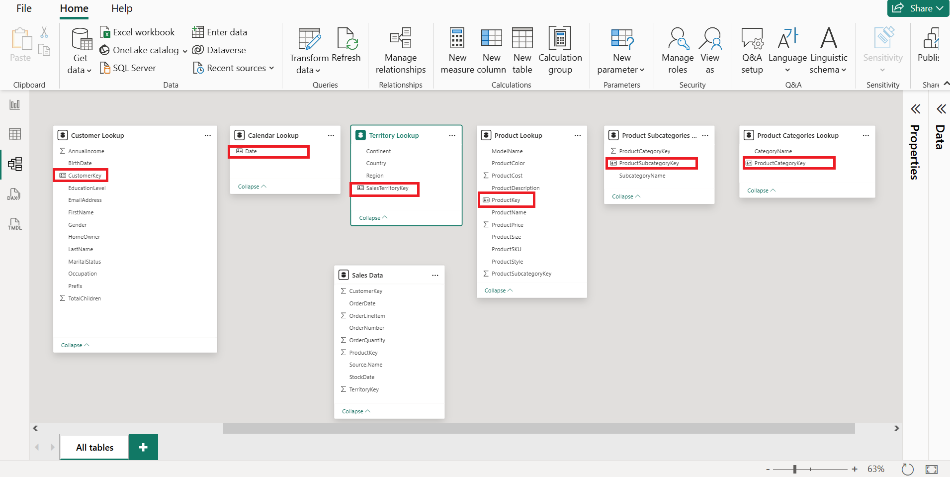
Marking the key in Power BI (Model view)
Click the table.
In Properties → Key column, choose the PK field.
You’ll see a small ID-card icon next to that column.
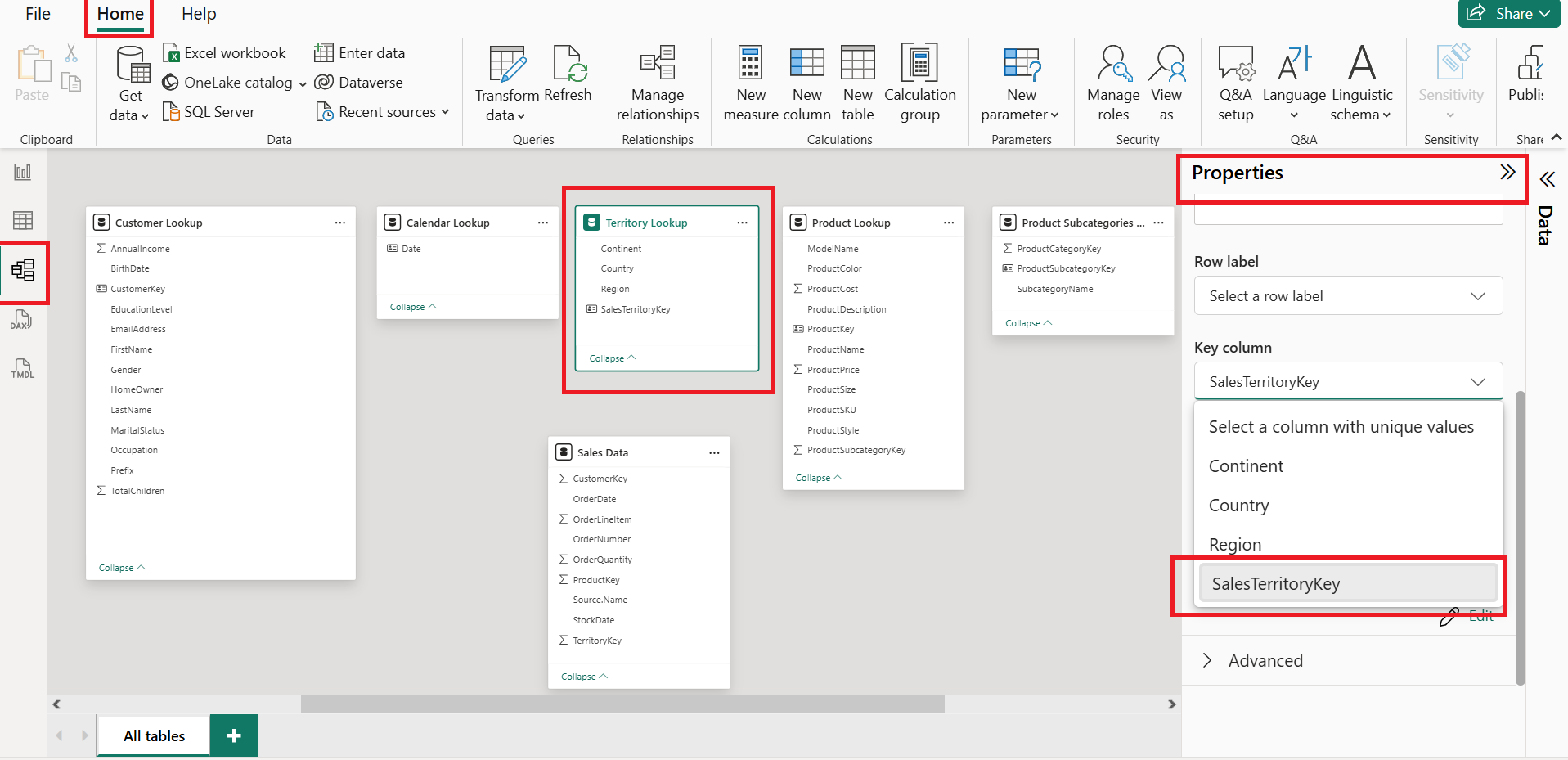
If Power BI shows an error
The column has blanks or duplicates. Fix in Power Query:
Remove blanks (filter out
(null)or replace with an Unknown key like-1and add that row in the dimension).Remove duplicates (Home → Remove Duplicates on the key).
If no good key exists, add Index Column to create a new surrogate key and use that.
Tiny example
FactSales (FKs repeat):
| Date | ProductID | CustomerID | Qty |
| 1997-01-01 | 869 | 10001 | 1 |
| 1997-01-01 | 1672 | 10002 | 3 |
DimProduct (PK is unique):
| ProductID | Brand | Name |
| 869 | Washington | Washington Berry Juice |
| 1672 | Washington | Washington Mango Drink |
Connect DimProduct[ProductID] (1) → FactSales[ProductID] (*).
Relationships vs. Merged Tables — the easy, practical guide
The idea in one line
Don’t mash everything into one giant table. In Power BI, keep a star schema (facts + dimensions) and connect them with relationships. It’s faster, smaller, and easier to maintain.
Two ways to model the same data
1) Merge into one “Frankentable” (inefficient)
You join Date + Product columns into the fact so every sale row repeats attributes like Month, Brand, SKU, Price, etc.
Cons: huge duplication → bigger model, slower refresh, harder to change.
2) Use relationships (recommended)
Keep one narrow fact and separate dimension tables. Connect by keys.
Pros: no repeated attributes, smaller memory footprint, faster, more flexible.
Why relationships beat merging
Memory & speed: store attributes once in dimensions; facts stay skinny.
Maintenance: change
Brand/Priceonce inDimProduct, not in millions of rows.Clean DAX: slice with dimension fields; aggregate with measures in the fact.
Scales well: more data and tables without exploding size.
When a merge is actually okay
To flatten a small dimension (e.g., Category → Product) once.
As temporary staging before splitting to fact/dims.
For exports that require a single table.
For true 1:1 joins with minimal duplication.
📊 Managing & Editing Relationships in Power BI
In Power BI, relationships define how tables connect and interact with each other. Once relationships are created, you can easily manage, edit, or delete them as your data model evolves.
🔹 Accessing Relationship Management
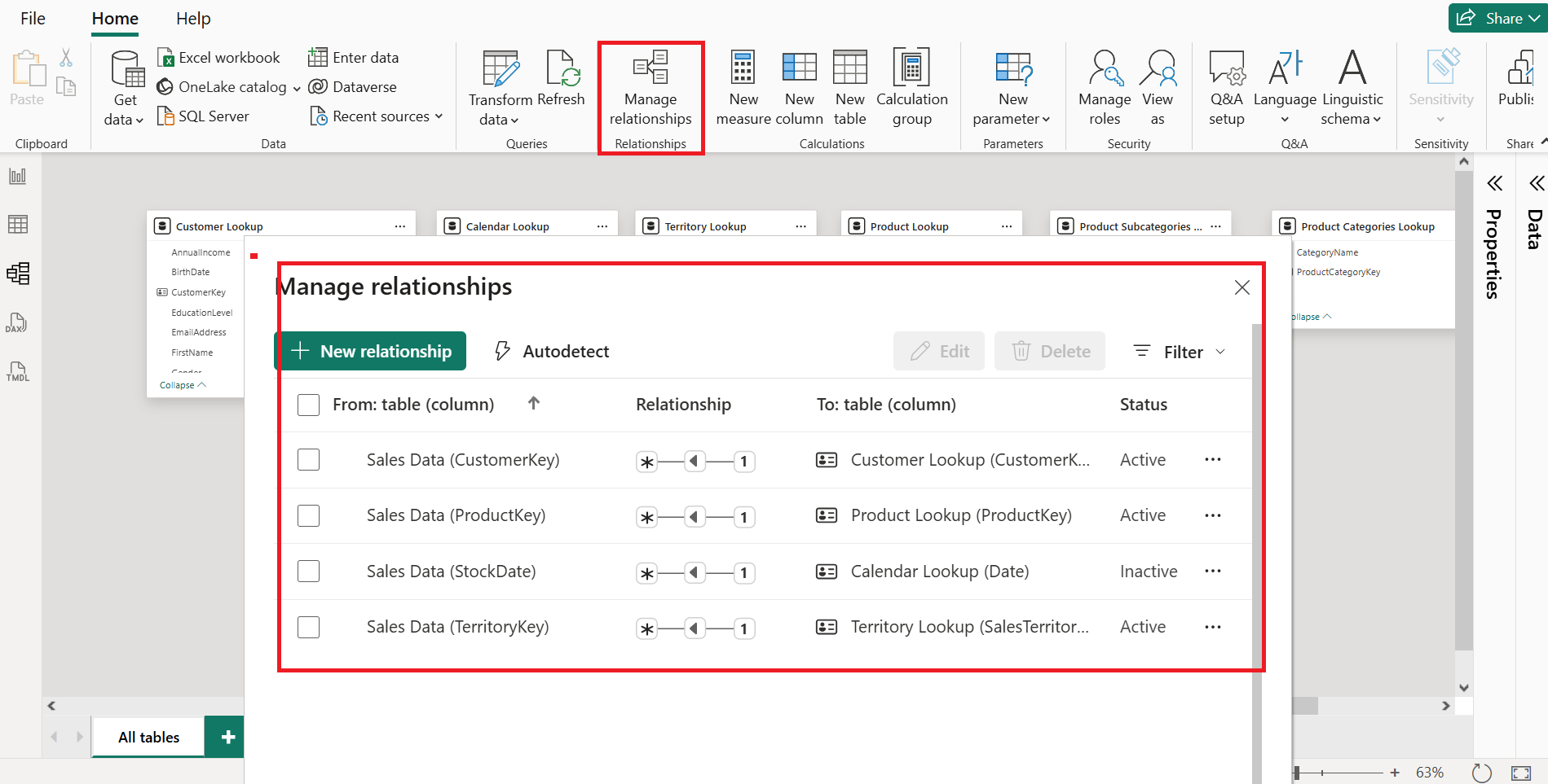
From the Home tab, click Manage relationships to open a dialog listing all existing connections in your model.
Here, you can:
Create new relationships.
Autodetect potential connections.
Edit or delete existing relationships.
💡 Tip: You can also double-click a relationship line in Model view to jump directly into editing.
🔹 Editing Relationships
When editing a relationship, you can adjust:
Primary key → Select a different field to define the connection.
Cardinality → cardinality describes the type of relationship between two tables, based on how many values from one table can match values in the other. Choose between 1:1, 1:*, or : relationships.
Cross filter direction → Single or both directions.
Activation → Set a relationship to active or inactive.
🔹 Deleting Relationships
To delete a relationship:
- Right-click the relationship line in Model view → Delete → Confirm.
🔹 Recreating Relationships
To recreate:
Drag the related key from one table to the matching key in another table.
Power BI automatically builds the connection.
🌟 Star & ❄ Snowflake Schemas in Power BI
When building a Power BI data model, the way you organize and connect your tables is called the model schema. Two of the most common schema types are Star and Snowflake.
🔹 Star Schema – Simple & Popular
A Star Schema is the simplest and most widely used model design.
Key characteristics:
One central fact table (e.g., Sales Data).
Surrounded by dimension tables (e.g., Calendar, Product, Territory, Customer).
The layout resembles a star when viewed in Model view.
💡 Tip: The visual layout doesn’t have to be a perfect star — what matters is that the fact table connects directly to each dimension without extra layers.
Advantages:
Simple to understand.
Fast query performance.
Ideal for reporting and analytics.
🔹 Snowflake Schema – Extended Structure
A Snowflake Schema builds on the star schema by adding relationships between dimension tables and their sub-dimensions.
How it works:
The fact table (e.g., Sales Data) connects to a dimension table (Product Lookup).
That dimension table contains a foreign key linking to a sub-dimension table (Product Subcategory).
The sub-dimension table might link further to another table (Product Category).
Key characteristic:
- Dimensions are normalized into multiple related tables, forming a branching or “snowflake” pattern.
📊 Star vs Snowflake
| Feature | Star Schema | Snowflake Schema |
| Structure | Fact table directly connected to all dimensions | Fact table connected to dimensions, which connect to sub-dimensions |
| Complexity | Low | Higher |
| Query Performance | Faster (fewer joins) | Slower (more joins) |
| Storage | More redundant data | Less redundant data (normalized) |
✅ Key Takeaways
Star Schema: Central fact table + dimension tables → resembles a star.
Snowflake Schema: Adds relationships between dimension tables and sub-dimensions → branches out like a snowflake.
Snowflake reduces redundancy but increases query complexity.
Choosing the right schema depends on performance needs and data organization goals.
📄 Assignment 4: Rebuilding Customer Orders Data Model
Scenario
Ravi Kumar, a BI developer for Global Sports Gear, sends you this message:
"Hey, I need your help! I was cleaning up the data model in Power BI and accidentally deleted all the relationships. We have an important presentation tomorrow, and I need you to rebuild the relationships. We have 6 tables, and they must be set up correctly so the report works as expected. Can you rebuild both the star schema and a snowflake schema for the products? I owe you coffee for life! — Ravi"
Objectives
Create a star schema connecting
Orders,Customers,Products,CalendarCreate a snowflake schema for products using
Products → Subcategories → Categories.Verify the model by building a Matrix visual to filter
OrderQuantityusing fields from each dimension table.
📊 Sample Tables
Orders (Fact Table)
| OrderID | CustomerID | ProductID | OrderDate | Quantity |
| 101 | C01 | P001 | 2024-01-15 | 3 |
| 102 | C02 | P003 | 2024-02-10 | 2 |
| 103 | C01 | P002 | 2024-02-15 | 5 |
| 104 | C03 | P005 | 2024-03-20 | 1 |
| 105 | C04 | P004 | 2024-03-25 | 4 |
Customers (Dimension)
| CustomerID | Name | RegionID | Occupation |
| C01 | Alice | R01 | Engineer |
| C02 | Bob | R02 | Doctor |
| C03 | Carol | R01 | Teacher |
| C04 | David | R03 | Lawyer |
Regions (Dimension)
| RegionID | Country |
| R01 | USA |
| R02 | Canada |
| R03 | Germany |
Products (Dimension - Lowest Level)
| ProductID | ProductName | SubcategoryID |
| P001 | Mountain Bike | SC01 |
| P002 | Road Bike | SC01 |
| P003 | Helmet | SC02 |
| P004 | Gloves | SC03 |
| P005 | Water Bottle | SC04 |
Product Subcategories
| SubcategoryID | SubcategoryName | CategoryID |
| SC01 | Bicycles | CAT01 |
| SC02 | Safety Gear | CAT02 |
| SC03 | Accessories | CAT02 |
| SC04 | Hydration | CAT03 |
Product Categories
| CategoryID | CategoryName |
| CAT01 | Bikes |
| CAT02 | Gear |
| CAT03 | Equipment |
Calendar (Dimension)
| Date | Year | Month |
| 2024-01-15 | 2024 | Jan |
| 2024-02-10 | 2024 | Feb |
| 2024-02-15 | 2024 | Feb |
| 2024-03-20 | 2024 | Mar |
| 2024-03-25 | 2024 | Mar |
✅ Solution
Step 1 – Delete Existing Relationships
Open Model view in Power BI.
Delete all existing relationship lines.
Step 2 – Build Star Schema
Orders → Customers:
CustomerID(1:*)Orders → Products:
ProductID(1:*)Orders → Calendar:
OrderDatetoDate(1:*)
Step 3 – Build Snowflake Schema for Products
Products → Product Subcategories:
SubcategoryID(1:*)Product Subcategories → Product Categories:
CategoryID(1:*)
Step 4 – Verify in Matrix Visual
Add Calendar[Year] to Rows.
Add Product Categories[CategoryName] to Rows below Year.
Add Order[Quantity] to Values.
Apply filters from Regions and Customers to confirm filtering works.
If filtering works for all dimension tables, the model is correct.
🔗 Understanding Relationship Cardinality in Power BI
When working with data models in Power BI, relationship cardinality describes how values in one table relate to values in another. It’s all about how unique those values are — and how many matches can occur between the two sides of a relationship.
1️⃣ One-to-Many (1:*) – The Ideal Setup
This is the most common and preferred cardinality in a well-designed model.
Example:
Product Lookup table: Each
ProductKeyappears once (one side).Sales Data table: The same
ProductKeycan appear many times (many side).
You’ll see a “1” symbol on the lookup (dimension) side and an asterisk (*) on the fact (data) side.
💡 This setup ensures clean filtering and accurate aggregations.
2️⃣ One-to-One (1:1) – Merge When Possible
Here, each value appears only once in both tables.
Example:
Product Lookup and Price Lookup both have unique
ProductID.Every product exists only once in each table.
Tip: Often, you can merge one-to-one tables into a single table.
Why? It avoids unnecessary relationships and keeps the model simple, without breaking normalization rules.
3️⃣ Many-to-Many (:) – Handle With Care
This occurs when duplicates exist in both tables for the same key.
Example Problem:
ProductID 4appears twice in the Product Lookup table (two different product names).The same
ProductID 4appears multiple times in Sales Data.Now, Power BI can’t tell which product matches which sale — causing ambiguity.
Best Practice: Avoid many-to-many unless absolutely necessary, and fix duplicates in your data.
🔍 Checking Cardinality in Power BI
You can confirm relationship cardinality in two ways:
Visual inspection in Model View – Look for the “1” → “*” pattern.
Properties pane – Select a relationship and check its Cardinality setting.
📌 Key Takeaways
One-to-Many is ideal for most reporting scenarios.
One-to-One can often be merged for simplicity.
Many-to-Many introduces ambiguity — avoid when possible.
Always check your model to ensure relationships are clean and accurate.
🔄 Connecting Multiple Fact Tables in Power BI
In small projects, we often work with one fact table (e.g., Sales Data).
But in real life, models can be more complex — you might have multiple fact tables, such as Sales Data and Returns Data.
📌 Why Fact Tables Don’t Connect Directly
Fact tables usually can’t be connected to each other:
No primary–foreign key relationship exists between them.
Foreign keys in both tables often have duplicates, which causes many-to-many issues.
Instead, each fact table connects to its own related dimension (lookup) tables.
If two fact tables share a dimension (like Product Lookup), you can filter both tables using that dimension.
🛠 Example: Sales & Returns
Sales Data: Linked to Product Lookup, Calendar, Customer Lookup, Territory Lookup.
Returns Data: Linked to Product Lookup, Calendar, Territory Lookup (no customer key).
Because Returns Data lacks a Customer Key, you can’t break down returns by customer fields like Gender or Occupation — but you can still filter returns by Product or Territory.
✅ Best Practice
Connect fact tables through shared dimensions (e.g., Products, Dates, Territories).
Avoid linking fact tables directly.
Accept that some fact tables will connect to fewer dimensions depending on available keys.
📊 In Action
In a Matrix Visual:
Filtering by Country (from Territory Lookup) shows correct breakdowns for both Sales and Returns.
Filtering by Product Style works for both tables (shared Product Lookup).
Filtering by Customer Education only works for Sales (since Returns has no customer link).
🔍 Key Takeaways
Multiple fact tables work well when linked through shared dimensions.
Missing foreign keys limit filtering options.
Proper relationships ensure accurate aggregations across fact tables.
🔍 Filter Context & Filter Flow in Power BI
One of the most important concepts in Power BI data modeling is filter context and filter flow.
Think of it as how filters travel through your model to return correct results.
📌 What is Filter Context?
Filter context is the set of filters applied to a visual, page, or report in Power BI.
Filters can come from slicers, visual interactions, or relationships between tables.
📌 How Filter Flow Works
In Power BI relationships, the arrow shows the filter direction.
Filters flow from dimension (lookup) tables → to fact tables (one-to-many direction).
They don’t flow backward from fact tables to dimensions.
💡 Think of relationships as filter wires — they send filters downstream in the arrow’s direction, not upstream.
🗂 Example Tables
Territory Lookup (Dimension)
| TerritoryKey | Region |
| 1 | Australia |
| 2 | Canada |
| 3 | France |
Sales Data (Fact)
| OrderID | TerritoryKey | OrderQuantity |
| 101 | 1 | 500 |
| 102 | 2 | 300 |
| 103 | 3 | 200 |
Returns Data (Fact)
| ReturnID | TerritoryKey | ReturnQuantity |
| R1 | 1 | 50 |
| R2 | 3 | 20 |
✅ Correct Filtering – Using Territory Lookup
If you filter using TerritoryKey from Territory Lookup,
both Sales and Returns get filtered because the filter flows downstream to both fact tables.
| TerritoryKey | OrderQuantity | ReturnQuantity |
| 1 | 500 | 50 |
| 2 | 300 | 0 |
| 3 | 200 | 20 |
❌ Wrong Filtering – Using Territory Key from Sales Data
If you filter using TerritoryKey from Sales Data:
Sales numbers are correct.
Returns column shows repeated grand totals because filter context is stuck in Sales and can’t flow to Returns.
| TerritoryKey (Sales) | OrderQuantity | ReturnQuantity |
| 1 | 500 | 70 |
| 2 | 300 | 70 |
| 3 | 200 | 70 |
❌ Wrong Filtering – Using Territory Key from Returns Data
If you filter using TerritoryKey from Returns Data:
Returns numbers are correct.
Sales column repeats totals.
Missing territories with no returns (e.g., Territory 2).
| TerritoryKey (Returns) | OrderQuantity | ReturnQuantity |
| 1 | 1000 | 50 |
| 3 | 1000 | 20 |
📌 Key Takeaways
Always filter from dimension tables to ensure accuracy.
Filter context flows from lookup → fact tables only.
Fact table filters don’t pass back upstream.
Place lookup tables above fact tables in Model View for clarity.
🔄 Bi-Directional Filters & Ambiguity in Power BI
In Filter Context & Filter Flow, we learned that filters normally travel one way — from dimension (lookup) tables → fact tables.
But what if we allow them to travel both ways? That’s where bi-directional filtering comes in.
📌 What is Bi-Directional Filtering?
Normally, filter context flows in one direction (Single).
Bi-directional filtering changes the relationship so filters can travel both ways.
This is done by setting Cross-filter direction to Both in the relationship settings.
It turns a one-way street into a two-way street for filters.
🗂 Example Model
We’ll use 3 tables:
Territory Lookup (Dimension)
| TerritoryKey | Region |
| 1 | Australia |
| 2 | Canada |
| 3 | France |
Sales Data (Fact)
| OrderID | TerritoryKey | OrderQuantity |
| 101 | 1 | 500 |
| 102 | 2 | 300 |
| 103 | 3 | 200 |
Returns Data (Fact)
| ReturnID | TerritoryKey | ReturnQuantity |
| R1 | 1 | 50 |
| R2 | 3 | 20 |
✅ Without Bi-Directional Filtering
Filter from Territory Lookup → Works for both Sales & Returns.
Filter from Sales table → Returns column shows repeated totals (context is trapped).
Filter from Returns table → Sales column shows repeated totals & missing territories.
🔄 With Bi-Directional Filtering (Sales ↔ Territory)
Filter from Territory Lookup → Still works as before.
Filter from Sales table → Now works! Filter goes up to Territory Lookup and then down to Returns.
Filter from Returns table → Still broken, because that relationship is one-way.
🧠 Hidden Risk: Missing Data
If we set Returns ↔ Territory to Both:
Filtering from Returns table can exclude territories with no returns, even if they have sales.
Example: Territories 2 & 3 have no returns, so they disappear entirely from Sales view.
⚠ Ambiguity Problem
When multiple bi-directional filters exist, you can create conflicting filter paths.
Example:
Product Lookup → Returns (two-way)
Product Lookup → Sales (active)
Territory Lookup is connected to both Sales & Returns.
If both relationships are active:
Filtering on a product can send two different filter contexts to Territory Lookup (via Sales & via Returns).
Power BI throws an ambiguity error because it can’t decide which filter path to use.
📌 Key Takeaways
Use bi-directional filters only when absolutely necessary.
They can fix filter trapping issues but may:
Hide rows if keys are missing in one table.
Cause ambiguity errors with multiple two-way paths.
Default to one-way filters with 1:many relationships for most models.
💡 Tip: If you ever enable bi-directional filters, double-check:
If any rows are disappearing unexpectedly.
If Power BI warns about ambiguous paths.
If you can solve the issue instead with a DAX measure or bridge table.
👀 Hiding Fields from Report View in Power BI
When building a Power BI report, it’s easy to make mistakes—like filtering on a foreign key from a fact table instead of the correct primary key from a lookup table.
Luckily, Power BI gives us a tool to prevent these mistakes: Hide in Report View.
📌 What Does “Hide in Report View” Do?
Makes a field invisible in the Report View (where visuals are built).
Keeps the field available in Data View and Model View.
Prevents accidental use of wrong fields in visuals.
Helps reduce clutter in the field list.
💡 Important: You’re not deleting the field—just hiding it from visual creation.
🗂 Example – Adventure Works Data Model
Sales Data (Fact Table)
| OrderNumber | OrderDate | ProductKey | TerritoryKey | OrderQuantity |
| 1001 | 2023-01-01 | 101 | 1 | 500 |
| 1002 | 2023-01-02 | 102 | 2 | 300 |
Foreign keys to hide:
CustomerKey
OrderDate
ProductKey
StockDate
TerritoryKey
Returns Data (Fact Table)
| ReturnID | ReturnDate | ProductKey | TerritoryKey | ReturnQuantity |
| R1 | 2023-02-01 | 101 | 1 | 50 |
| R2 | 2023-02-03 | 102 | 3 | 20 |
Foreign keys to hide:
ProductKey
ReturnDate
TerritoryKey
Product Snowflake Schema
Product table → Hide SubcategoryKey
Product Subcategory table → Hide ProductCategoryKey
🔧 How to Hide Fields
You can hide a field in three ways:
Right-click the field → Hide in Report View.
Hover & click the eye icon → It gets a slash through it.
Properties Pane → Select the field → Toggle Is Hidden.
📌 You can also hide entire tables using the same options.
🎯 Why Hide Foreign Keys?
Ensures filtering is always done via primary keys in dimension tables.
Avoids wrong filter context issues (like mismatched totals).
Keeps your field list clean for end users.
🖥 Before & After Example in Report View
Before Hiding:
- Sales Data table shows all columns, including keys users shouldn’t filter on.
After Hiding:
Only essential columns remain visible (e.g., Order Line Item, Order Number, Order Quantity).
Keys like TerritoryKey and ProductKey are hidden to avoid misuse.
📌 Key Takeaways
Hide in Report View = safer, cleaner reports.
Hidden fields are still available in Data and Model views.
Best practice: Hide foreign keys in fact tables.
Multiple hiding methods: Right-click, Eye icon, or Properties pane.