Microsoft Power BI Power Query Editor: A Complete Guide to Every Button and Icon
Home Tab
The Home tab in Power Query Editor is your command center for data preparation. It brings together essential tools for loading, transforming, sorting, filtering, grouping, and combining data — all in one place. Whether you're starting a new query or applying the final touch before loading data into Power BI, this tab is where most of the action happens.
1 Close & Apply
When working with data in Power BI, the Power Query Editor acts as the central workspace for transforming and cleaning data before it’s loaded into the data model. But once your transformations are done, how do you finalize them?
That’s where the “Close & Apply” options come into play.

Let’s break it down:
✅ 1. Close & Apply
Closes the Power Query Editor.
Applies all the pending changes you’ve made.
Loads the transformed data into Power BI’s data model for further analysis or visualization.
👉 Use this when you’re done with all your transformations and ready to move back to the report view.
✅ 2. Apply
Applies the changes to the data model.
Keeps the Power Query Editor open.
👉 Ideal when you want to apply changes and continue working inside the Query Editor.
✅ 3. Close
Simply closes the Power Query Editor.
Does not apply any changes made during the current session.
⚠️ Warning: You’ll lose all unsaved transformations if you select this.
💡 Best Practice Tip
Always Apply or Close & Apply your changes before exiting the Query Editor unless you're sure you don’t need those modifications. This avoids unintentional data loss.y understanding how these options work, you can better manage your data workflow and avoid accidental data loss or confusion while working in Power BI.
2 New Source
One of the most powerful features of Power BI is how easily you can bring in data from multiple sources—and it all starts from the Power Query Editor.
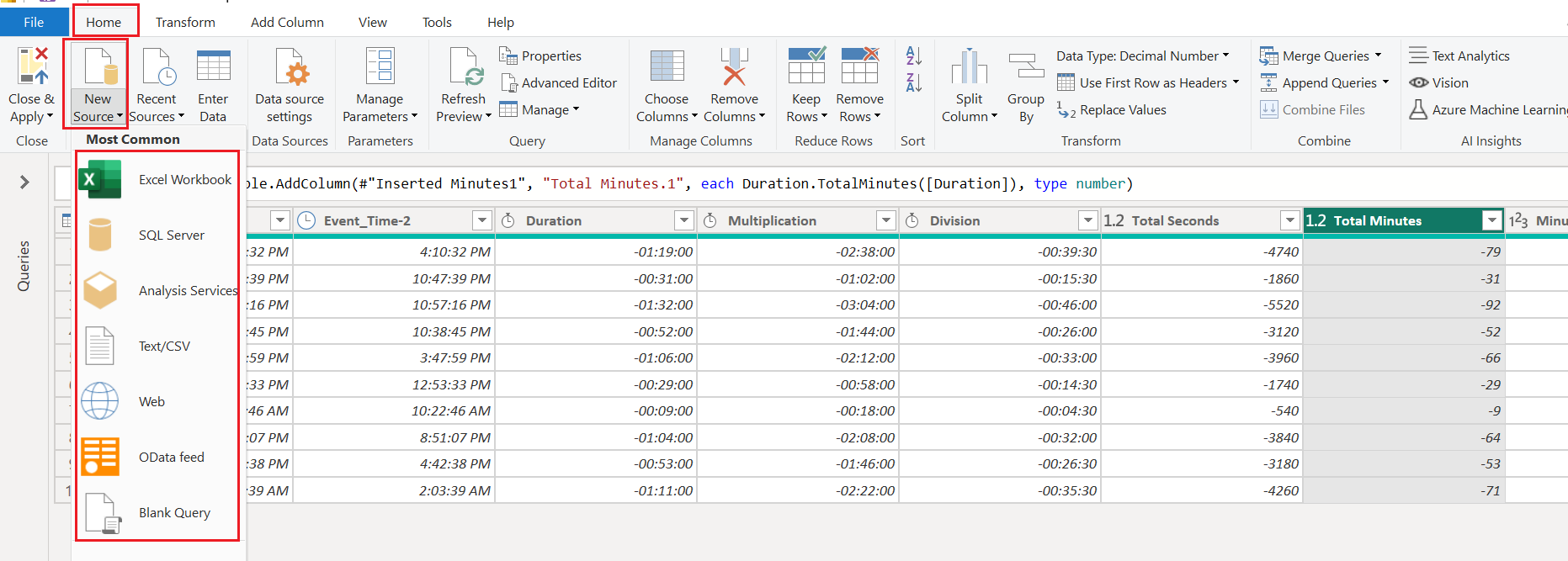
🧭 Navigation: Where to Find the “New Source” Option
Inside the Power Query Editor, go to the Home tab and locate the New Source button. Clicking this dropdown reveals several most common data source options, such as:
🟢 Excel Workbook
🟤 SQL Server
🟧 Analysis Services
📄 Text/CSV
🌐 Web
🔶 OData Feed
📃 Blank Query
More
More Option
🔍 The “Get Data” Window – A Closer Look
When you select New Source > More…, it opens the Get Data window, where you’ll find an even broader range of connectors, grouped by category:
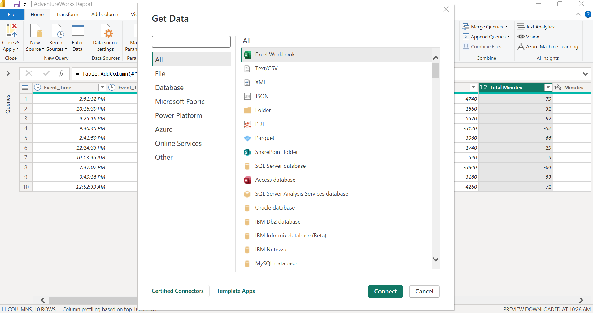
| Category | Example Sources |
| File | Excel, Text/CSV, XML, JSON, PDF |
| Database | SQL Server, MySQL, Oracle, IBM Db2, Access |
| Microsoft Fabric | Data Warehouse, Lakehouse, KQL DB |
| Power Platform | Dataverse, Power BI datasets |
| Azure | Azure SQL, Blob, Data Lake, Synapse |
| Online Services | SharePoint, Salesforce, Dynamics 365 |
| Other | OData, Web, R/Script, Blank Query |
After selecting a data source, simply click Connect, then follow the authentication or path prompts to access your data.
💡 Pro Tip:
Use Blank Query when you want to manually write M code or fetch data via advanced scripts (e.g., calling APIs).
📌 Summary Table
| Feature | Description |
| New Source | Adds new data sources to your current Power BI project |
| Most Common List | Quick access to Excel, SQL, CSV, Web, and other top connectors |
| Get Data Window | Full list of categorized connectors (file, cloud, database) |
| Blank Query | Start from scratch or use M code for advanced queries |
Bringing in the right data is the first step to powerful insights, and Power BI makes that process seamless with a rich variety of connectors built right into the Power Query Editor.
3 Recent Sources
📂 Working with Recent Sources in Power BI (Power Query Editor)
Once you’ve connected to a data source in Power BI, you don’t have to go hunting for the file path every time you need to reuse it. Thanks to the Recent Sources feature, accessing your previously connected files is quick and effortless.
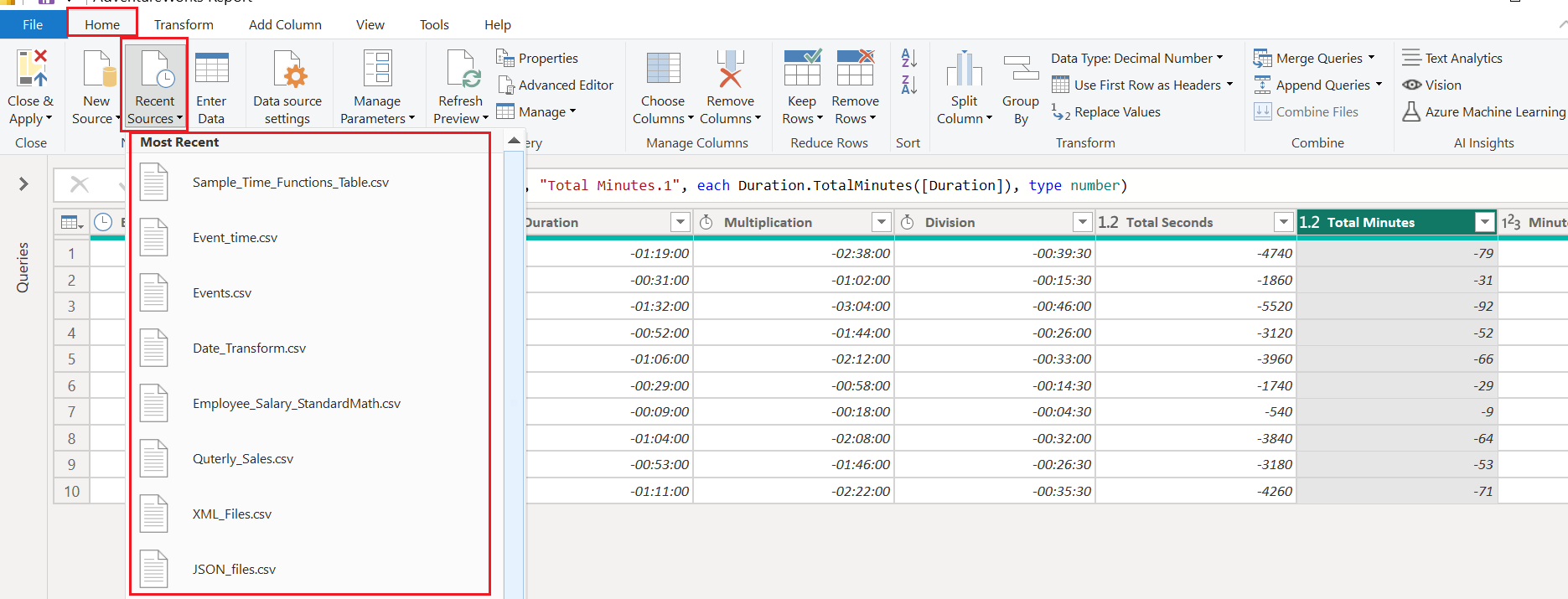
What Does It Show?
When you click Recent Sources, a list labeled Most Recent appears—displaying the names of files or connections you’ve recently used.
Some examples from the screenshot:
📁
Sample_Time_Functions_Table.csv📁
Employee_Salary_StandardMath.csv📁
Quarterly_Sales.csv📁
JSON_files.csv
These entries represent a wide variety of file formats: .csv, .json, .xml, and more.
⚙️ Why Is This Useful?
Speed: Reconnect to recent files instantly without browsing through folders.
Consistency: Reduces the chance of selecting the wrong file or version.
Workflow Efficiency: Especially useful when switching between multiple datasets during report development.
4 Enter Data
✍️ Creating Tables Manually in Power BI: The “Enter Data” Option
Not all data comes from files or databases—sometimes, you just need to create a quick lookup table or manually enter a few values for testing. That’s where Power BI’s Enter Data feature comes in handy.

What Does “Enter Data” Do?
Clicking Enter Data opens a blank table editor window where you can manually:
Add column headers
Type in rows of data
Rename the table
After you click OK, Power BI creates a new query with your manually entered data
💡 Pro Tip:
You can modify this table later just like any other query—add columns, merge it, apply filters, and more.
📌 Summary Table
| Feature | Description |
| Enter Data | Manually input data into Power BI as a new table |
| Use Cases | Lookup tables, filters, testing data |
| Editable Later | Yes – behaves like a regular query table |
| Location | Home tab → Power Query Editor |
Power BI is not just for connecting to external data—it also gives you the flexibility to create your own tables on the fly. Whether you need a quick fix or a functional supporting table, Enter Data is your go-to option.
5 Data Source Settings
⚙️ Managing Data Connections in Power BI: The “Data Source Settings” Window
In Power BI, working with multiple data sources is common. But what happens if a file path changes or you need to adjust permissions?
That’s where Data Source Settings comes in.
This powerful feature lets you manage, edit, and reset data connections—making your report both dynamic and secure.

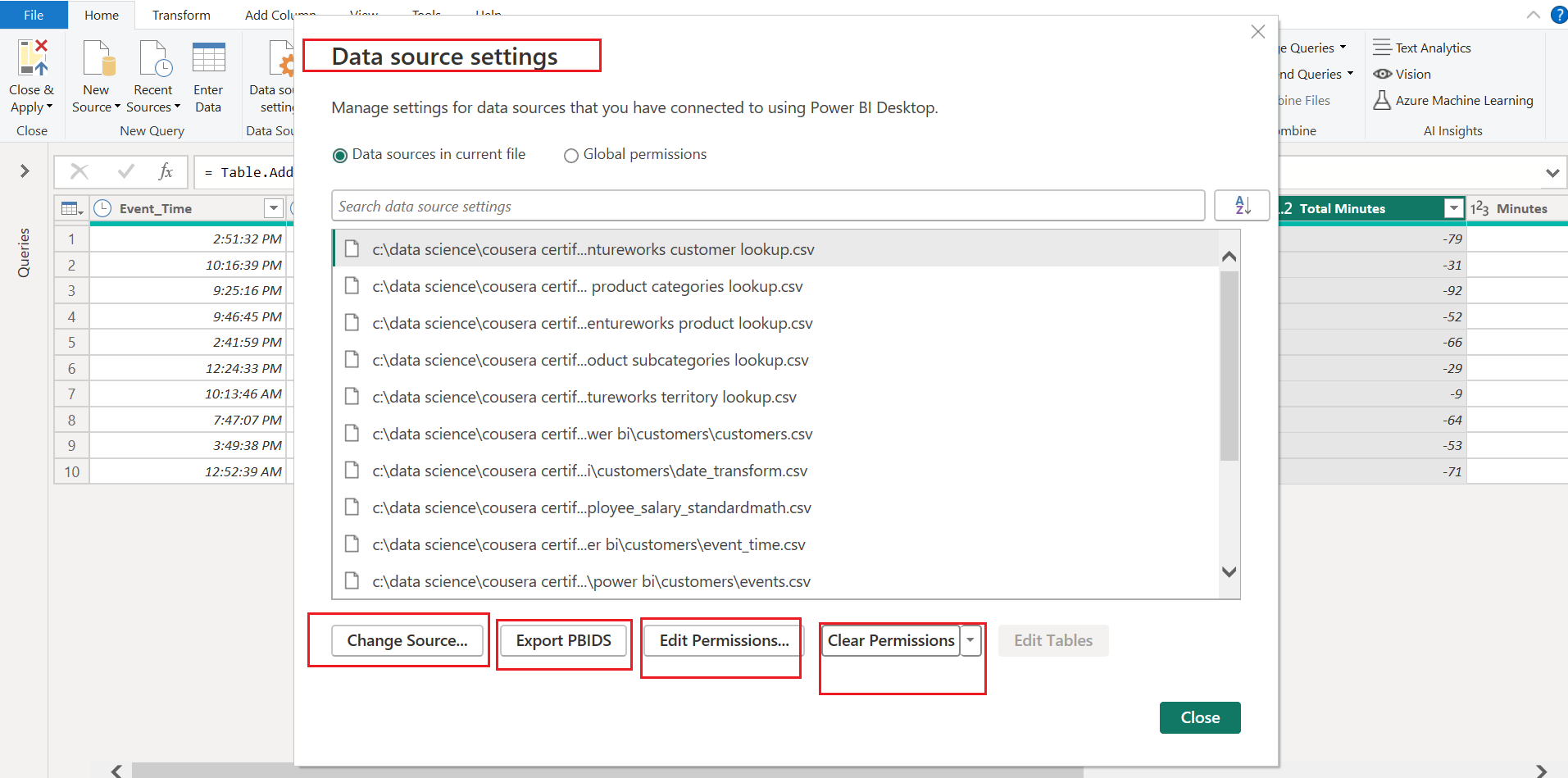
🗂️ What You’ll See
The Data Source Settings window displays a list of all sources you’ve connected to in the current report. You can choose between:
Data sources in current file (default)
Global permissions (across all Power BI files)
🛠️ Available Actions
At the bottom of the window, you’ll find a set of controls to manage these connections:
| Button | Function |
| Change Source | Update the file path, server, or location of the connected data |
| Export PBIDS | Export your connection info into a .PBIDS (Power BI Data Source) file |
| Edit Permissions | Modify authentication method (e.g., Anonymous, Windows, OAuth) |
| Clear Permissions | Reset credentials and remove stored authentication details |
✅ Use Cases
🔁 Migrating projects across environments or file locations
🔐 Resetting access tokens or login methods
🛡️ Reviewing and managing data privacy levels
🔗 Fixing broken links to local or cloud data sources
💡 Pro Tip:
If you're collaborating on a report, it’s good practice to clear permissions before sharing your .pbix file to avoid exposing sensitive login data.
6 Manage Parameters
🎛️ Dynamic Data Handling in Power BI: Using “Manage Parameters”
Parameters in Power BI are powerful tools that allow you to build dynamic, reusable, and flexible queries. Whether you want to filter data by date, file path, or region—you can create a parameter and reuse it across multiple queries.

➕ How to Create a Parameter
Click New Parameter
Give your parameter a name (e.g.,
RegionFilter)Choose a data type (Text, Decimal Number, Whole Number, etc.)
Select the Allowed Values (List, Any value, or Query)
Define a default value and optionally a current value
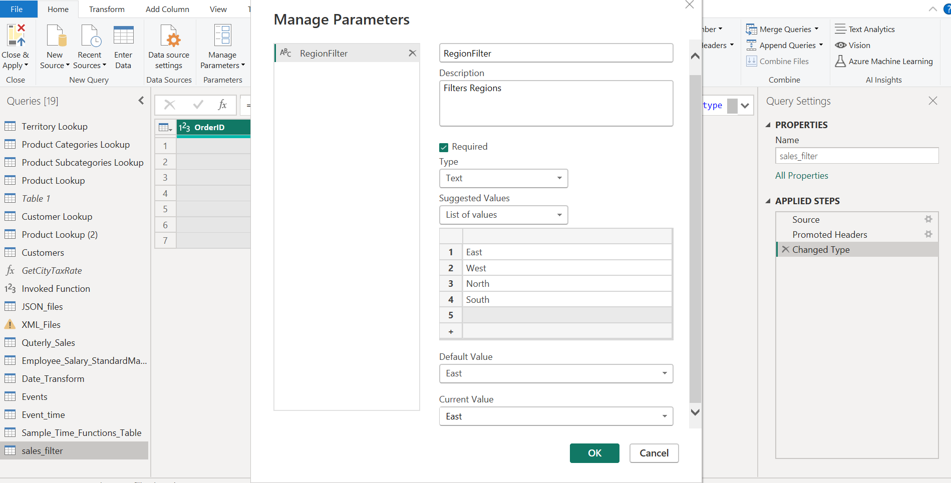
Once created, the parameter will appear in the Queries pane, and you can reference it inside other queries.
🧪 Use Case Examples
📁 Dynamic file paths: Let users select different data sources
🌍 Region filters: Filter a query by region using a drop-down
📅 Date filtering: Only import rows after a given date
⚙️ Query tuning: Toggle between different modes or environments (e.g., dev/prod)
🔁 Reusability
The true power of parameters lies in reuse. Once defined, a parameter can be:
Used in filters
Referenced in M code
Linked to dropdown slicers (via What-If parameters in Power BI Desktop)
📌 Summary Table
| Option | Purpose |
| New Parameter | Create a new dynamic input (number, text, etc.) |
| Edit Parameters | Modify existing parameters and values |
| Use Cases | File paths, filters, query switching, etc. |
| Visibility | Appears in Queries pane for reference |
7 Refresh Preview
🔄 Understanding "Refresh Preview" Options in Power BI
These options are found under the Home tab → Refresh Preview dropdown.

🔁 Available Options:
| Option | What It Does |
| Refresh Preview | Reloads data only for the currently selected query. Useful after parameter updates. |
| Refresh All | Refreshes all queries in the Power Query Editor. Good for full dependency updates. |
| Cancel Refresh | Stops an in-progress refresh. Useful if something is taking too long. |
🧪 When to Use It:
After editing a parameter value (like
RegionFilter)After changing source files or filters
To preview results before applying changes with Close & Apply
8 Properties
🏷️ Rename and Document Your Queries: Using the “Properties” Option in Power BI

As your Power BI project grows, managing your queries effectively becomes essential. That's where the Properties option comes in—it helps you rename and document each query clearly.
✍️ What You Can Do with Properties
When you click Properties, a dialog box opens where you can:
| Field | Description |
| Name | Rename the query (e.g., from Table1 to sales_filter) |
| Description | Add helpful notes for yourself or teammates |
💡 Why It Matters
✅ Clean naming helps during modeling and visualization
🧠 Descriptions act as mini-documentation
🤝 Useful for teamwork or handovers
🧪 Example Use Case:
| Before | After |
| Table1 | sales_filter |
| Table2 | customer_lookup |
✅ Pro Tip:
Use camelCase or snake_case for consistency, especially if you’ll be referencing queries in M code or DAX. By using Properties to rename and document your queries, you build a cleaner, more maintainable Power BI project.
9 Advanced Editor
🧬 Writing and Editing M Code: Using the “Advanced Editor” in Power BI
Power BI gives you a rich graphical interface to transform data, but if you want more control, automation, or custom logic, the Advanced Editor is your go-to tool.

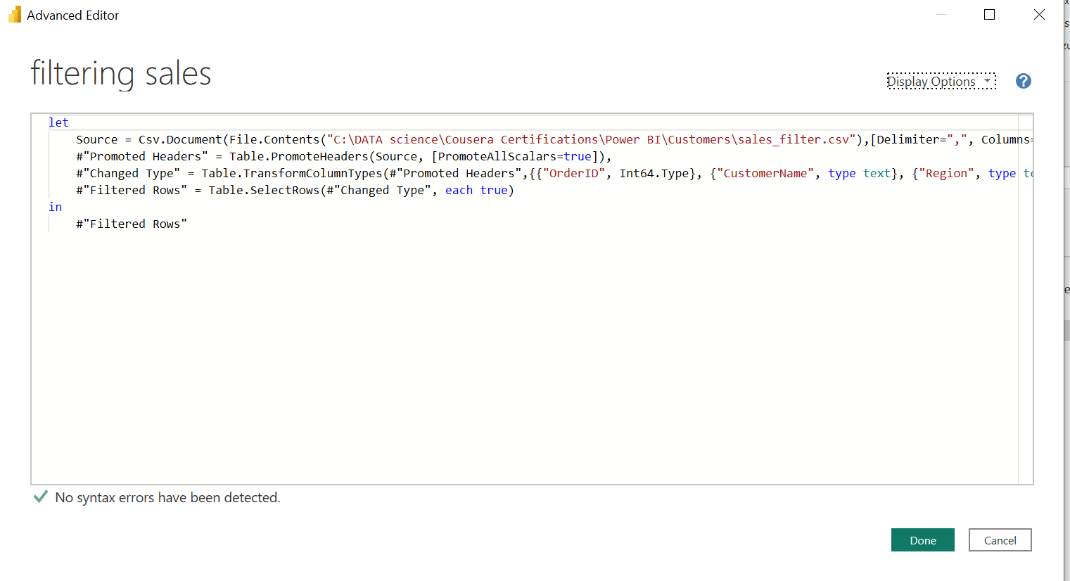
🔍 What It Does
The Advanced Editor opens a window where you can view and edit the M code behind your query. This is the actual code Power BI generates every time you apply a transformation (like filter, rename, or merge).
✍️ When to Use It
🔁 To copy/paste query logic across files
🔍 To understand or modify step-by-step logic
⚙️ To manually define advanced steps (like dynamic filters, looping, or conditional logic)
🧪 To insert a parameter like
RegionFilterin code
📌 Summary Table
| Feature | Description |
| Advanced Editor | Opens the M code behind your Power Query steps |
| Language | Power Query M Language |
| Use Cases | Custom logic, debugging, reuse, automation |
| Location | Home tab → Advanced Editor |
With Advanced Editor, you step beyond the GUI into the true engine room of Power BI—where everything becomes flexible and powerful.
10 Manage
🔁 Managing Queries in Power BI: Delete, Duplicate, and Reference
As you build and refine your Power BI project, you’ll often want to reuse, branch, or clean up queries. That’s where the Manage options — Delete, Duplicate, and Reference — come into play.

🧰 1. Delete
❌ Permanently removes the selected query.
⚠️ Warning: This cannot be undone inside Power Query Editor unless you cancel changes or revert.
Useful for cleaning unused or test queries.
📄 2. Duplicate
📋 Creates a copy of the entire query.
The duplicated query is independent of the original.
Good when you want to create a slightly different version without altering the original.
Example:
Duplicate
sales_table→ rename itsales_last_monthand apply date filters separately.
🔗 3. Reference
🔁 Creates a linked query that depends on the original.
It uses the original query as its data source, keeping the original untouched.
Changes in the base query affect the reference query too.
Example:
Create a reference of
all_salescalledhigh_value_sales, then filter it to only include orders > $1000.
11 Choose Column
🧲 Focusing on the Right Data: Choose Columns in Power BI
When working with large tables in Power BI, you often don’t need every single column from the source. The Choose Columns tools help you quickly select or find the columns you care about — keeping your query lean and focused.

Choose Columns option
Opens a checklist of all columns in your current query.
You can tick/untick to include or remove columns.
Very handy when you only need a few columns out of dozens.
💡 Tip: Hold Ctrl to select multiple columns quickly.
Go to Column option
Opens a searchable list of all columns.
Helps you jump directly to a specific column, especially in wide tables.
Doesn't remove columns — it just scrolls you into view.
🧪 Use Case Example
Imagine you’ve imported a wide table with 50+ columns, but you only need:
CustomerIDOrderDateTotalAmount
Use Choose Columns to quickly uncheck the rest and keep only the necessary fields.
📌 Summary Table
| Feature | Description | Action Type |
| Choose Columns | Keep only selected columns from the dataset | Structural |
| Go to Column | Jump to a column by name, useful for navigation | Navigational |
12 Remove Columns
🧹 Clean Up Your Data: Using “Remove Columns” in Power BI Power Query
When you’re prepping data in Power BI, not all columns are useful. Some are redundant, others are just noise. The Remove Columns tool helps you quickly trim down your dataset.

✂️ Two Main Options:
| Option | What It Does |
| Remove Columns | Deletes the selected columns only |
| Remove Other Columns | Deletes everything EXCEPT the columns you selected |
🧪 Use Case Examples
🗑️ Remove Columns: You imported a table with
FirstName,LastName,Email,SSN, and you want to removeSSN.🎯 Remove Other Columns: You only need
ProductIDandSalesAmountfrom a wide 40-column Excel sheet.
⚠️ Caution:
Removing columns is irreversible in the current query step unless you undo or delete the step manually.
🧼 Undo Step: In the Applied Steps pane, delete the "Removed Columns" step to restore all removed columns.
🧬 Advanced Editor: Edit the M code to remove or adjust the
Table.RemoveColumnsline.🔁 Go Back to Source: Revisit an earlier step (like
Source) and use Choose Columns to include the one you removed.
📌 Summary Table
| Feature | Description | Use Case |
| Remove Columns | Deletes selected columns only | Hide/remove sensitive or unused fields |
| Remove Other Columns | Keeps selected ones, deletes the rest | Focus on specific key fields |
Use Remove Columns wisely to reduce noise, improve performance, and focus only on what your report truly needs.
13 Keep Rows
🔎 Focus on the Right Data: Using “Keep Rows” in Power BI
When you're working with raw data in Power BI, you often need to trim the dataset to focus only on specific parts — like keeping only the first 100 records, a certain range, or rows with duplicates. Power Query makes this easy with the Keep Rows tools.

🧰 1. Keep Top Rows
Keeps only the first N rows from the table.
✅ Use it when:
You're sampling the first 100 records for a preview.
Your data is sorted and you only need the latest entries (e.g., recent transactions).
🧰 2. Keep Bottom Rows
Keeps only the last N rows from the table.
✅ Use it when:
- You need to examine trailing data like recent logs or end-of-month entries.
🧰 3. Keep Range of Rows
Lets you keep a specific subset of rows starting from a chosen index.
✅ Use it when:
You want rows from position 10 to 30.
Useful for paginated analysis or testing a segment of your data.
🧰 4. Keep Duplicates
Keeps only the rows that have duplicate values in the selected column(s).
✅ Use it when:
You’re identifying duplicate transactions, customer records, or IDs.
Helpful in data quality checks and deduplication analysis.
🧰 5. Keep Errors
Keeps only the rows that contain errors (e.g., failed type conversions or missing values).
✅ Use it when:
You’re auditing or debugging problematic data.
You want to isolate and fix rows with issues.
How to undo
🧼 Undo the Step: Go to the Applied Steps pane and delete the "Kept Rows" step — this will restore all rows.
🧑💻 Advanced Editor: Manually edit or remove the M code related to
Table.FirstN,Table.Range, etc.
🧠 Tip:
Use Keep Rows carefully if you may need those rows again later — or create a duplicate query before filtering.
By mastering the Keep Rows options, you gain precise control over your data — helping you clean, validate, and optimize your dataset before building reports.
14 Remove Rows
🧹 Clean and Refine Data: Using “Remove Rows” in Power BI
Cleaning messy data is one of the most important steps in building accurate Power BI reports. The Remove Rows menu in Power Query gives you several powerful options to eliminate unnecessary or problematic rows from your dataset.

🧰 1. Remove Top Rows
Removes a set number of rows from the top of the table.
✅ Use it when:
Your file has header info or metadata in the top rows.
You want to skip initial rows that aren’t actual data.
🧰 2. Remove Bottom Rows
Removes a set number of rows from the bottom of the table.
✅ Use it when:
There are summary totals or footer notes in the last few rows.
You want to exclude closing remarks from text exports.
🧰 3. Remove Alternate Rows
Removes every other row (or based on a pattern you define).
✅ Use it when:
You're cleaning sensor logs, testing patterns, or skipping staggered data entries.
Useful for sampling alternate entries in structured formats.
🧰 4. Remove Duplicates
Removes all duplicate rows based on selected column(s).
✅ Use it when:
You want each entry (e.g., customer, invoice) to appear only once.
Useful in cleansing repeated rows from Excel exports or merged tables.
🧰 5. Remove Blank Rows
Deletes rows where all columns are empty.
✅ Use it when:
Cleaning imports with large blank gaps.
Improving data compactness for modeling.
🧰 6. Remove Errors
Removes rows that contain errors in any column.
✅ Use it when:
You want to ignore data conversion or formula issues.
Great for skipping problematic records instead of fixing them (when acceptable).
📌 Summary Table
| Option | Purpose | When to Use It |
| Remove Top Rows | Deletes rows from the top | Skip headers, intro lines |
| Remove Bottom Rows | Deletes rows from the end | Skip footnotes, summaries |
| Remove Alternate Rows | Deletes in a pattern (e.g., every 2nd) | Sampling, staggered data |
| Remove Duplicates | Deletes repeating rows | Ensure data uniqueness |
| Remove Blank Rows | Deletes empty rows | Clean up structure |
| Remove Errors | Deletes error-containing rows | Avoid loading broken records |
15 Sorting Data
🔃 Sorting Data in Power Query Editor – Power BI
Sorting is one of the simplest yet most effective data transformation tools in Power BI’s Power Query Editor. With just a click, you can reorder your data to make it easier to understand, analyze, and clean.

🔼 Sort Ascending (A → Z)
This option sorts the selected column in ascending order:
For text: A to Z
For numbers: Smallest to largest
For dates: Oldest to newest
🔽 Sort Descending (Z → A)
This option sorts the selected column in descending order:
For text: Z to A
For numbers: Largest to smallest
For dates: Newest to oldest
Sorting may seem like a small step, but in Power Query, it sets the foundation for cleaner, more meaningful data transformations.
16 Split Column
✂️ Splitting Columns in Power Query – A Smart Way to Reshape Your Data
When cleaning or preparing data in Power BI’s Power Query Editor, one common task is to break a single column into multiple parts. That’s where the “Split Column” tool comes in — a flexible and powerful feature under the Home tab.
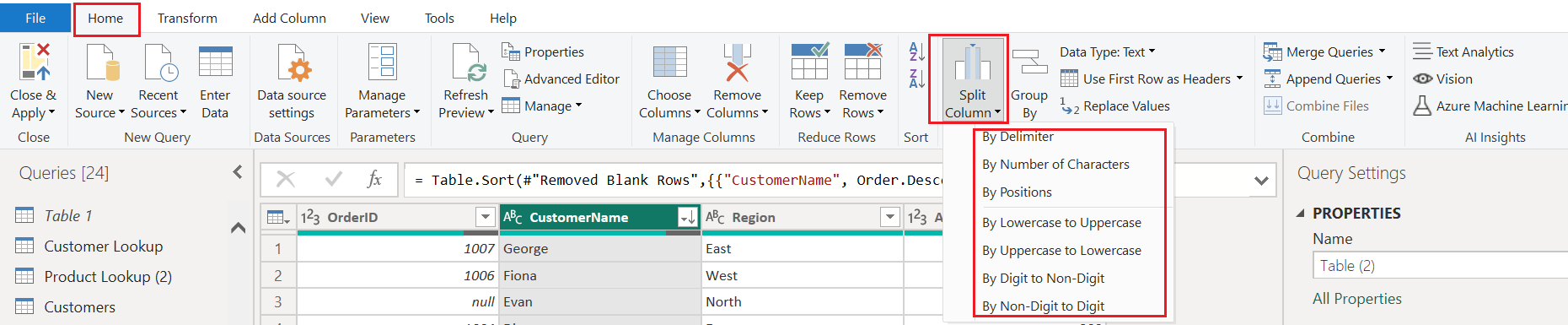
1️⃣ By Delimiter
Splits the column wherever a specific character appears (e.g., comma, space, hyphen).
📌 Example: "John,Smith" ➜ John | Smith
✅ Best for:
Full names
Addresses
CSV-style data in one cell
2️⃣ By Number of Characters
Splits the column every n characters.
📌 Example (every 3 characters): "ABCDEF" ➜ ABC | DEF
✅ Best for:
Fixed-format codes (like account numbers)
Batch IDs
3️⃣ By Positions
Splits the column at defined character positions.
📌 Example (at positions 2 and 4): "123456" ➜ 12 | 34 | 56
✅ Best for:
Structured data strings
Phone numbers or ID codes
4️⃣ By Lowercase to Uppercase
Splits when a lowercase letter is followed by an uppercase one.
📌 Example: "dataScience" ➜ data | Science
✅ Best for:
- CamelCase or mixed-format words
5️⃣ By Uppercase to Lowercase
Splits when an uppercase letter is followed by a lowercase letter.
📌 Example: "JSONData" ➜ JSON | Data
✅ Best for:
- Acronym + word combinations
6️⃣ By Digit to Non-Digit
Splits at the boundary where digits end and letters start.
📌 Example: "123ABC" ➜ 123 | ABC
✅ Best for:
- Product codes (e.g., "456XTV")
7️⃣ By Non-Digit to Digit
Opposite of the above: splits where letters end and digits start.
📌 Example: "XYZ789" ➜ XYZ | 789
✅ Best for:
- Alphanumeric strings
🎯 Final Thoughts
The Split Column feature is more than just a basic tool — it's a data preparation essential. Whether you’re parsing names, breaking apart structured codes, or untangling mixed content, these split options offer a fast and customizable solution.
✏️ Clean data = better reports. Use “Split Column” to make your tables smarter and more structured.
17 Group By
📊 Power Query's “Group By” Feature – Summarize and Simplify Your Data
In Power BI’s Power Query Editor, the Group By tool is a powerful way to aggregate and summarize data. Whether you're analyzing sales by region, counts by category, or totals by date, this feature helps reduce large datasets into meaningful insights — before they even reach your report visuals.

🧩 What Does “Group By” Do?
The Group By function lets you:
Group rows based on one or more columns
Aggregate values using built-in operations like count, sum, average, min, max, etc.
This is similar to using GROUP BY in SQL or pivoting data in Excel.
📌 Example Scenario
You have this table:
| Region | Sales |
| East | 100 |
| West | 200 |
| East | 150 |
If you apply Group By Region with a Sum of Sales, you get:
| Region | Total Sales |
| East | 250 |
| West | 200 |
⚙️ Steps to Use "Group By" in Power Query
Select the column(s) you want to group by (e.g., Region)
Click Group By in the Home tab
In the popup:
Choose the column to group
Add an aggregation (e.g., sum, count, average)
Click OK
🎛️ You can also add multiple aggregations or group by more than one column using Advanced mode.
🛠️ Common Aggregation Types
| Operation | Description |
| Sum | Total of values |
| Count | Number of rows in each group |
| Average | Mean value |
| Min/Max | Smallest or largest value |
| All Rows | Keeps all rows in a nested table |
🧠 Pro Tips
Use Group By early in your query steps to reduce data size
Combine with Sort to control which records appear first
Use All Rows when you want to apply custom logic after grouping
✅ Final Thoughts
The Group By tool is more than just a way to summarize — it’s a gateway to building efficient and clean data models. Whether you're counting customers, summing revenue, or isolating records by condition, mastering this feature gives you a major edge in Power BI data prep.
18 Data Type
🔠 Power BI Power Query: Understanding Data Types – Clean Data Starts Here
In Power BI’s Power Query Editor, one of the most fundamental steps in data preparation is assigning the correct data type to each column. Why? Because data types directly affect sorting, filtering, calculations, visualizations, and performance.
You can define data types using the “Data Type” dropdown (as highlighted in your screenshot). Let’s explore each option and when to use it.
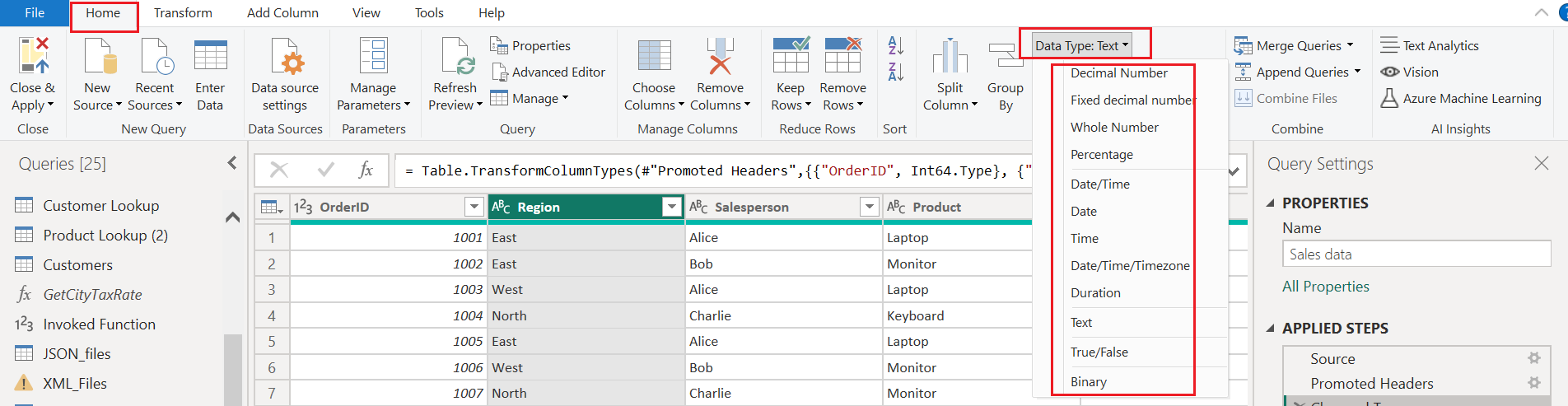
📊 List of Data Types in Power Query
| Data Type | Description |
| Decimal Number | Supports floating-point numbers (e.g., 99.99). Ideal for precise values. |
| Fixed Decimal Number | Stores numbers with fixed decimal places — useful for currency values. |
| Whole Number | For integers only (e.g., 1, 100, -25). |
| Percentage | Converts numbers like 0.75 into 75%. |
| Date/Time | Combines both date and time. Useful for timestamps. |
| Date | Stores only the calendar date (e.g., 2025-08-06). |
| Time | Stores only the time portion (e.g., 14:30:00). |
| Date/Time/Timezone | Includes timezone offset for global date tracking. |
| Duration | Represents time intervals (e.g., 5 days, 4 hours). |
| Text | For strings, like names, codes, and descriptions. |
| True/False | Boolean values: true or false only. |
| Binary | Stores binary files like images or documents — rarely used in simple ETL. |
🧪 Why Setting the Right Data Type Matters
✅ Accurate calculations: Dates calculate date differences; numbers compute sums.
✅ Efficient sorting/filtering: Numeric vs text sorting behaves differently.
✅ Prevents errors: Many Power BI functions rely on correct data types.
✅ Better visuals: Data types determine chart axes and aggregations.
💡 Pro Tips
Always check data types right after importing data.
Power BI often guesses types, but it’s not always correct — verify!
Use "Detect Data Type" option for auto-assignment, but always double-check.
19 Use First Row as Headers
📊 Power BI Desktop Study Note: Mastering the "Use First Row as Headers" Feature
🔍 Overview
When working with raw data in Power BI Desktop, especially from sources like Excel or CSV files, it's common to encounter datasets where the first row contains column names rather than actual data. Power BI provides a simple yet powerful tool to handle this: "Use First Row as Headers", found under the Transform tab.
🛠️ What Does "Use First Row as Headers" Do?
This feature promotes the first row of your dataset to become the column headers. It’s especially useful when:
You import data and Power BI doesn’t automatically recognize the headers.
Your dataset starts with descriptive labels like "Name", "Date", "Sales", etc., but they’re treated as data rows.
✅ Example:
Suppose your table looks like this:
| Row | Column1 | Column2 | Column3 |
| 1 | Date | Sales | Region |
| 2 | 2025-01 | 1000 | West |
After clicking "Use First Row as Headers", it becomes:
| Date | Sales | Region |
| 2025-01 | 1000 | West |
🔄 Bonus: "Use Headers as First Row"
This adjacent option demotes the current headers back into the first row. It’s useful when:
You want to temporarily treat headers as data.
You’re restructuring or pivoting your dataset.
🧠 Why It Matters
Proper headers are crucial for:
Accurate data modeling.
Clear visualizations.
Smooth transformations and filtering.
Using these options ensures your dataset is structured correctly before diving into deeper analysis.
📝 Final Thoughts
The "Use First Row as Headers" tool is a small but mighty feature in Power BI Desktop. It’s part of the essential data preparation toolkit that helps you turn messy imports into clean, analyzable tables. Whether you're a beginner or a seasoned analyst, mastering this feature will save you time and headaches.
20 Replace Values
🔄 Power BI Study Note: Mastering the "Replace Values" Tool in the Transform Tab
When working with real-world data, inconsistencies and unwanted values are inevitable. Whether it's typos, placeholder text, or outdated labels, cleaning your data is a crucial step before analysis. Power BI Desktop offers a powerful feature to help with this: "Replace Values", located in the Transform tab.
🛠️ What Does "Replace Values" Do?
The "Replace Values" feature lets you:
Find and replace specific entries in a column.
Standardize inconsistent data.
Remove unwanted placeholders or errors.
✅ Example:
Imagine a column with values like:
["N/A", "Completed", "In Progress", "n/a", "Complete"]
You can use "Replace Values" to:
Replace "N/A" and "n/a" with "Not Available"
Replace "Complete" with "Completed"
This ensures consistency and improves the quality of your analysis.
💡 Pro Tips
Use case-sensitive matching carefully—Power BI treats "N/A" and "n/a" as different unless specified.
Combine with "Remove Rows" or "Filter" for deeper cleaning.
Use "Replace Errors" if you're dealing with error values instead of regular text.
📝 Final Thoughts
The "Replace Values" feature in Power BI Desktop is simple yet powerful. It empowers analysts to clean and standardize data efficiently, ensuring that downstream reports and dashboards are built on a solid foundation. Mastering this tool will save you time and elevate the quality of your insights.
21 Merge Queries
🔗 Power BI Study Note: Demystifying the "Merge Queries" Feature
In Power BI Desktop, combining data from multiple tables is a common and essential task. Whether you're working with sales data from different regions or customer information spread across systems, "Merge Queries" is your go-to tool for joining datasets efficiently.

🔄 What Does "Merge Queries" Do?
"Merge Queries" allows you to join two tables based on a common column, similar to SQL joins. You can choose the type of join (e.g., Left, Right, Inner, Full Outer) depending on your data needs.
✅ Example:
Suppose you have:
A Sales table with
CustomerID,Date, andAmount.A Customers table with
CustomerID,Name, andRegion.
Using "Merge Queries," you can join these tables on CustomerID to enrich your sales data with customer details.
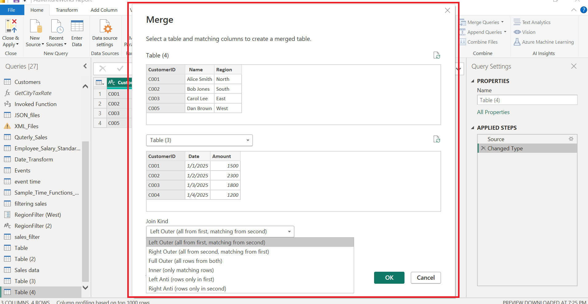
🖼️ Visual Walkthrough: Merge Dialog Box
The Merge dialog box in Power BI’s Power Query Editor allows you to:
Select the tables and columns to merge.
Choose from various Join Kinds:
Left Outer: All rows from the first table, matched rows from the second.
Right Outer: All rows from the second table, matched rows from the first.
Full Outer: All rows from both tables.
Inner: Only rows with matches in both tables.
Left Anti: Rows only in the first table.
Right Anti: Rows only in the second table.
🔍 Advanced Feature: Fuzzy Matching
Sometimes, data entries don’t match exactly due to typos or formatting differences. Power BI offers Fuzzy Matching to help with this.
Fuzzy Matching Options:
Similarity Threshold: Set a value (e.g., 0.80) to define how closely values must match.
Ignore Case: Checked by default to treat "ABC" and "abc" as equal.
This is especially useful when merging datasets with inconsistent naming conventions or human-entered data.
📝 Final Thoughts
The "Merge Queries" feature in Power BI Desktop is a powerful tool for data integration. Whether you're building dashboards or performing deep analysis, mastering this feature will help you create more meaningful and connected insights.
22 Append Queries
➕ Power BI Study Note: Understanding the "Append Queries" Feature
In Power BI, data often comes from multiple sources or files that share the same structure—like monthly sales reports or regional customer lists. To analyze this data as a single dataset, you can use the "Append Queries" feature in Power BI Desktop.

🔄 What Does "Append Queries" Do?
Appending queries means stacking tables vertically—adding rows from one table to another. This is different from merging, which joins tables side-by-side based on a key column.
✅ Example:
You have two tables:
Sales_January
| Date | Region | Sales |
| 2025-01-01 | North | 1000 |
| 2025-01-02 | South | 1200 |
Sales_February
| Date | Region | Sales |
| 2025-02-01 | North | 1100 |
| 2025-02-02 | South | 1300 |
Using Append Queries, you get:
Combined_Sales
| Date | Region | Sales |
| 2025-01-01 | North | 1000 |
| 2025-01-02 | South | 1200 |
| 2025-02-01 | North | 1100 |
| 2025-02-02 | South | 1300 |
🧠 Why It Matters
Appending is ideal for:
Combining data from multiple periods (e.g., monthly reports).
Consolidating regional datasets.
Preparing unified data for analysis and visualization.
It’s a clean and efficient way to build a comprehensive dataset without altering the original sources.
📝 Final Thoughts
The "Append Queries" feature in Power BI is a powerful tool for data consolidation. Whether you're working with time-series data, departmental reports, or multi-source inputs, appending queries helps you streamline your workflow and prepare your data for meaningful insights.
23 Combine Files
📁 Power BI Study Note: Unlocking the Power of "Combine Files"
When working with data from multiple files—especially those stored in folders—Power BI Desktop offers a powerful automation tool: "Combine Files". This feature is a game-changer for analysts who regularly deal with structured data spread across multiple Excel sheets, CSVs, or text files.
In this study note, we’ll explore what Combine Files does, how to use it, and why it’s ideal for scalable, repeatable data preparation.

📂 What Does "Combine Files" Do?
Combine Files automates the process of:
Reading multiple files from a folder.
Applying a consistent transformation to each file.
Stacking the results into a single, unified table.
It’s especially useful when all files share the same structure—like monthly reports or daily logs.
✅ Example Scenario
Imagine you have a folder with these CSV files:
Sales_Jan.csvSales_Feb.csvSales_Mar.csv
Each file contains:
| Date | Region | Sales |
| 2025-01-01 | North | 1000 |
| 2025-01-02 | South | 1200 |
Using Combine Files, Power BI will:
Read all files in the folder.
Apply the same transformation steps (e.g., promote headers, change data types).
Append them into one table called something like
Combined_Sales.
📋 How to Use It
In Power BI, choose Get Data > Folder.
Browse to the folder containing your files.
Click Combine & Transform Data.
Power BI opens the Combine Files wizard.
Review the sample file and transformation steps.
Click OK to generate a query that processes all files.
Power BI automatically creates helper queries:
Transform Sample File: Defines the transformation logic.
Combine Files: Applies the logic to all files.
Parameter: Stores the sample file name.
📝 Final Thoughts
The "Combine Files" feature in Power BI Desktop is a must-know tool for anyone dealing with structured data across multiple files. It simplifies your workflow, enhances consistency, and prepares your data for powerful analysis—all with just a few clicks.
Transform Tab
1 Transpose
🔄 Transpose in Power Query (Transform Tab)
In Power BI's Power Query Editor, Transpose is a powerful tool under the Transform tab used to flip your table's rows into columns and columns into rows.

🧠 What It Does:
Transpose changes the orientation of your data:
Rows become columns
Columns become rows
🎯 Use Case Example:
Imagine you have data like this:
| Year | Q1 | Q2 | Q3 | Q4 |
| 2024 | 100 | 150 | 130 | 120 |
After Transpose, it becomes:
| Column1 | Column2 |
| Year | 2024 |
| Q1 | 100 |
| Q2 | 150 |
| Q3 | 130 |
| Q4 | 120 |
⚠️ Important Notes:
Transpose works on the entire table, not on selected columns.
It’s useful when you receive data in the wrong orientation from Excel or other sources.
2 Reverse Rows
🔁 Reverse Rows in Power Query (Transform Tab)
Sometimes the order of rows matters—especially in time-series data or ordered categories. Power BI offers a simple but powerful tool called Reverse Rows under the Transform tab.

🧠 What It Does:
Reverse Rows flips the order of your entire table from bottom to top:
The last row becomes the first
The first row becomes the last
🎯 Use Case Example:
You start with:
| Index | Value |
| 1 | A |
| 2 | B |
| 3 | C |
After applying Reverse Rows, it becomes:
| Index | Value |
| 3 | C |
| 2 | B |
| 1 | A |
💡 When to Use:
To reverse chronological order (e.g., showing latest dates first).
After sorting if you want to flip the result.
In data preparation for visualizations or custom logic.
⚠️ Note:
It affects the entire table, not a single column.
There's no setting panel—it's a one-click transformation.
3 Count Rows
🔢 Count Rows in Power Query (Transform Tab)
When working with large datasets, it's often useful to quickly determine the number of rows in a table. Power BI’s Power Query provides a simple one-click solution for this: Count Rows.

🧠 What It Does:
Count Rows calculates the total number of rows in the current query and returns that count as a new single-row table with one column.
🎯 Example:
Suppose your table has 250 rows of customer records.
After clicking Count Rows, Power Query will output:
| Count |
| 250 |
This result replaces your original table, turning it into a single summary row.
4 Detect Data Type
🧠 Detect Data Type in Power Query (Transform Tab)
Power Query often tries to guess the data type of each column when you load a dataset—but sometimes, you’ll need to do it manually or recheck. That’s where the Detect Data Type feature comes in handy.

🎯 Example:
If a column looks like this:
| Value |
| 01/01/2024 |
| 05/03/2024 |
Power Query might detect and convert it to Date type.
Or if you have:
| Value |
| 100 |
| 200 |
It could detect this as a Whole Number or Decimal Number.
💡 Use Cases:
After importing data from Excel, CSV, or web, especially when data types are not automatically assigned.
To quickly correct “Any” typed columns to their actual data type.
When copying data from mixed sources with inconsistent formatting.
⚠️ Notes:
It applies automatically to all columns unless you select a specific column first.
If detection fails or is incorrect, you can manually change the data type using the Data Type dropdown next to column headers.
5 Rename
Rename in Power Query (Transform Tab)
When preparing data, clear and meaningful column names are crucial. The Rename feature in Power Query lets you quickly update column headers to improve readability and context.

🧠 What It Does:
Rename allows you to change the name of the currently selected column.
You can also do this by:
Double-clicking the column name directly, or
Right-clicking the column header and selecting “Rename”.
🎯 Use Case Example:
You import a dataset and see:
| Column1 | Column2 |
| John | 200 |
| Sarah | 180 |
After renaming:
| Name | Score |
| John | 200 |
| Sarah | 180 |
⚠️ Tip:
If you rename a column that is used in later steps, Power Query automatically updates all dependent steps using that new name—no need to worry about breaking your query.
6 Replace Values
🔁 Replace Values & Replace Errors in Power Query (Transform Tab)
Cleaning up messy data is a common part of any data transformation workflow. Power Query gives you handy tools to quickly replace specific values or fix error cells in your dataset.

🔄 Replace Values
🧠 What It Does:
Lets you find and replace specific values within the selected column.
🧪 Example:
| Value |
| Yes |
| No |
| Yes |
➡ After replacing “Yes” with “1” and “No” with “0”:
| Value |
| 1 |
| 0 |
| 1 |
✅ Use Cases:
Standardizing values (e.g., “Y” → “Yes”, “N” → “No”).
Correcting typos or inconsistent entries.
Preparing binary or numeric values for analysis.
⚠️ Replace Errors
🧠 What It Does:
Allows you to replace all error values in a column with a custom value (e.g., 0, “Unknown”, “N/A”).
🧪 Example:
| Sales |
| 200 |
| Error |
| 350 |
➡ Replace Errors with “0”:
| Sales |
| 200 |
| 0 |
| 350 |
✅ Use Cases:
Handling missing data or calculation errors.
Preventing errors from breaking downstream steps.
Displaying user-friendly alternatives to error messages.
💡 Pro Tip:
Always verify why errors exist before replacing them. You can use “Keep Errors” or “Remove Errors” (under the Home tab) to investigate.
7 Fill
⬇️⬆️ Fill Down & Fill Up in Power Query (Transform Tab)
When working with tabular data, especially exported or semi-structured files, you may encounter missing values in cells that should carry down or up from previous/next rows. Power Query solves this with the Fill tool.

🔽 Fill Down
🧠 What It Does:
Copies the value from the row above into blank (null) cells below it in the same column—until it hits the next non-null value.
🧪 Example:
Before:
| Category | Value |
| Fruits | 10 |
| (null) | 20 |
| (null) | 30 |
| Veggies | 15 |
After Fill Down:
| Category | Value |
| Fruits | 10 |
| Fruits | 20 |
| Fruits | 30 |
| Veggies | 15 |
🔼 Fill Up
🧠 What It Does:
Copies the value from the row below into blank (null) cells above it in the same column—until it hits the next non-null value.
🧪 Example:
Before:
| Category | Value |
| (null) | 10 |
| (null) | 20 |
| Fruits | 30 |
After Fill Up:
| Category | Value |
| Fruits | 10 |
| Fruits | 20 |
| Fruits | 30 |
💡 Use Cases:
Clean datasets from merged Excel cells (headers only shown once).
Prepare grouped data for filtering, pivoting, or analysis.
Ensure consistent category or label propagation in reports.
⚠️ Tips:
Fill only affects null/blank cells, not zero or text like "N/A".
Works per column, so apply separately if needed.
8 Pivot Column
📊 Pivot Column in Power Query (Transform Tab)
Need to turn row values into column headers? That’s exactly what the Pivot Column feature does in Power BI’s Power Query Editor—perfect for reshaping and summarizing data.

🧠 What It Does:
Pivot Column transforms distinct values in a selected column into new column headers, and fills the table with related values from another column.
🎯 Example:
Original table:
| Month | Category | Sales |
| Jan | Fruits | 100 |
| Jan | Veggies | 80 |
| Feb | Fruits | 120 |
| Feb | Veggies | 90 |
You pivot the Category column using Sales as values:
| Month | Fruits | Veggies |
| Jan | 100 | 80 |
| Feb | 120 | 90 |
✅ Use Cases:
Convert tall/narrow data into wide format.
Create summary tables (e.g., months as rows, product types as columns).
Better structure your data for reporting or charting.
⚠️ Notes:
You must specify the values column to fill the pivoted headers.
If multiple values exist for the same combination, Power Query will prompt you to aggregate (e.g., sum, average, count).
Best used on categorical columns with repeating labels.
9 Unpivot Columns
🔄 Unpivot Columns in Power Query (Transform Tab)
While pivoting turns rows into columns, Unpivoting does the opposite—it helps normalize wide tables by turning column headers into row values. Power Query provides three flexible unpivoting options.

🔽 Options Explained:
1️⃣ Unpivot Columns
Unpivots only the selected columns.
Ideal when you manually choose which columns should become row values.
Example:
Original:
| Year | Jan | Feb |
| 2024 | 100 | 120 |
Unpivot Jan & Feb ➜
| Year | Attribute | Value |
| 2024 | Jan | 100 |
| 2024 | Feb | 120 |
2️⃣ Unpivot Other Columns
Keeps selected columns as row identifiers.
For example, “Region” and “Product“ will be selected in this example.
All non-selected columns are unpivoted.
Useful when you only want to preserve a few columns and unpivot the rest.
| Region | Product | Jan | Feb | Mar |
| North | Apples | 100 | 120 | 110 |
| North | Bananas | 90 | 100 | 105 |
| South | Apples | 95 | 115 | 120 |
| Region | Product | Attribute | Value |
| North | Apples | Jan | 100 |
| North | Apples | Feb | 120 |
| North | Apples | Mar | 110 |
| North | Bananas | Jan | 90 |
| North | Bananas | Feb | 100 |
| North | Bananas | Mar | 105 |
| South | Apples | Jan | 95 |
| South | Apples | Feb | 115 |
| South | Apples | Mar | 120 |
3️⃣ Unpivot Only Selected Columns
Same as Unpivot Columns — added for clarity and usability.
Appears more explicitly when using contextual right-click options.
✅ Use Cases:
Normalize cross-tab reports (e.g., monthly sales as columns).
Prepare data for dynamic analysis and visualizations.
Load Excel-like wide tables into a more database-friendly long format.
⚠️ Tips:
After unpivoting, Power Query creates two new columns:
Attribute (previous column names)
Value (cell values)
Rename these columns to something meaningful (e.g., "Month" and "Sales").
10 Move
🔀 Move Columns in Power Query (Transform Tab)
When cleaning or organizing data, the order of columns can matter for readability or functionality. Power Query makes it easy to move columns around with the Move tool under the Transform tab.

🧠 What Each Option Does:
| Option | Action |
| Left | Moves the selected column one position to the left. |
| Right | Moves the selected column one position to the right. |
| To Beginning | Sends the selected column to the first position in the table. |
| To End | Sends the selected column to the last position. |
✅ Use Cases:
Group related columns together (e.g., IDs, dates, values).
Improve visual clarity when viewing data in Power BI.
Prepare data for pivoting or exporting in a specific format.
💡 Tips:
Works with one column at a time (multi-select isn't supported).
You can also drag-and-drop columns manually, but the Move tool ensures consistency and keeps steps recorded in the Applied Steps pane.
11 Convert to List
📜 Power Query – Convert to List
The Convert to List option in Power BI’s Power Query editor allows you to transform a single column into a flat list — removing the table structure and returning just the values.

🔍 What Does It Do?
When you select a single column and click Convert to List, Power Query:
Removes the table structure
Returns the selected column’s values as a list object
Example output:
{"Apple", "Mango", "Orange"}
✅ When to Use:
You need to extract a list of values from a column
You're building a custom function that takes a list as input
You want to use this list in comparisons, filters, or joins
🧪 Example:
Original Table:
| Product |
| Apple |
| Mango |
| Orange |
After Convert to List:
{"Apple", "Mango", "Orange"}
You can then use this list in:
Lookup logic
Filtering another table
Creating parameters
⚠️ Notes:
Only works with one column at a time
The result is no longer a table — it becomes a list type
You’ll need to use advanced editor or steps if you want to bring it back into a table
Run R Script
🧬 Power Query – Run R Script
The “Run R Script” option in Power BI’s Power Query Editor allows you to run R code directly on your dataset for advanced data transformation, statistical analysis, or visualization preparation.

🛠️ What Does It Do?
This tool lets you:
Leverage R’s rich statistical capabilities
Apply custom R transformations
Integrate R-powered models or functions into your Power BI data
When you click Run R Script:
A script editor opens
You write or paste R code
Power Query runs that R code on your current dataset
✅ Requirements:
R must be installed on your machine
Configure R path via File > Options > R Scripting
R script execution must be enabled
🧪 Example Use Case:
Imagine you want to remove outliers using R:
dataset <- dataset[abs(scale(dataset$Value)) < 3, ]
This line filters out rows where the "Value" column is more than 3 standard deviations from the mean.
The input data is always accessible in R through a variable named
dataset.
🔒 Security Note:
Power BI disables script execution for files from untrusted sources unless explicitly enabled.
📊 Why Use R in Power BI?
Advanced statistics (e.g., regression, clustering)
Complex data reshaping
Leverage existing R scripts/models
Visualization prep using R packages
Add Column
1 Column From Examples
"Column From Examples" lets you generate a new column by providing sample values based on existing data. Power BI analyzes the logic behind your examples and automatically creates the M code to replicate that transformation.

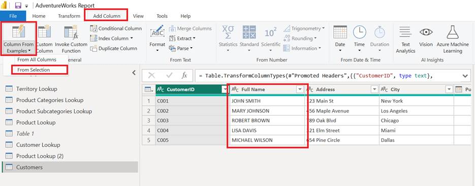
Go to the Add Column tab.
Click Column From Examples.
Choose:
From All Columns – Suggests transformations using all available columns.
From Selection – Suggests based on only the columns you select beforehand.
In the new interface, type the expected output (your example values) row by row.
Power BI will detect the pattern and generate the formula automatically.
From Selection
✅ Example Use Case:
You have a Full Name column like:
"JOHN SMITH"
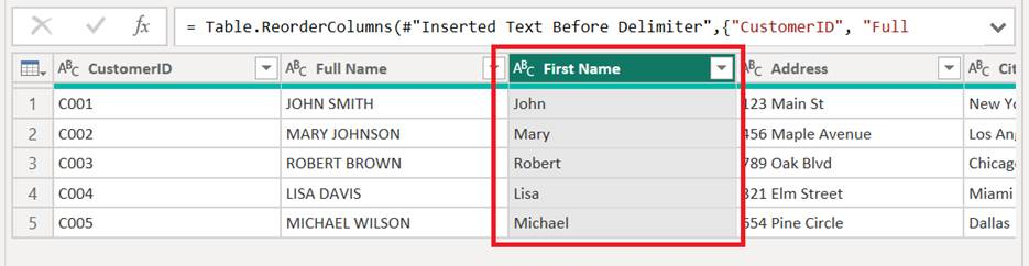
You want to create a column with just the first name in proper case:
Type "John" in the first row → Power BI auto-detects you want the proper-case first name and generates the logic for it.
Result
From all columns
Real-World Use Case: Create a Personalized Email Greeting
You want to generate a personalized greeting line for each customer that looks like this:
"Hello Mary, your can collect your Power Bank from New York."
This output depends on multiple columns:
First name → from Full Name
Product → from Product
City → from City
🛠 Steps to Perform This in Power BI:
Go to:
Add Column > Column From Examples > From All ColumnsIn the new column (right side), type:
Hello JOHN SMITH, you can collect your Power Bank from New York.
As soon as you start typing, Power BI tries to detect which columns you're using and auto-fill the rest.
Check if Power BI got the pattern right for rows 2 and 3:
Hello JOHN SMITH, you can collect your Power Bank from New York.
Hello MARY JOHNSON, you can collect your Wireless Mouse from Chicago.
- Click OK to confirm.
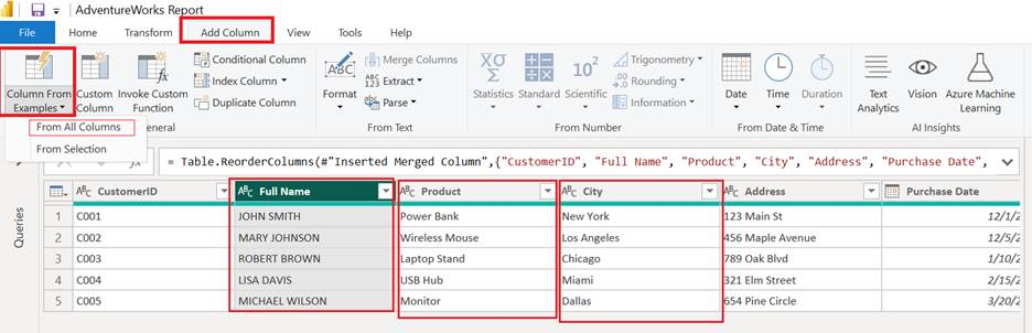
Result

2 Custom Column
The Custom Column tool in Power BI (under the Add Column tab) allows you to write a formula using M language to define a new column based on logic, math, string operations, or conditions using existing columns.
Unlike Column From Examples (which infers logic based on what you type), Custom Column gives you full control by letting you write the logic manually.

📌 How to Use It
Go to Add Column > Custom Column.
A dialog box opens where you:
Give your new column a name.
Write a formula using Power Query M Language.
Click OK — a new column is added based on your logic.
💡 Why Use Custom Column?
Precise control over logic and output.
Write complex conditions and calculations.
Handle text, numbers, dates, or even conditional logic like
if...then...else.
💡 Explanation:
[Full Name]: Refers to the original uppercase name.Text.Proper(...): Capitalizes each word (e.g., JOHN SMITH → John Smith)." - ": Adds a separator.[City]: Gets the city name.Text.Upper(...): Converts city to all caps (e.g., New York → NEW YORK).
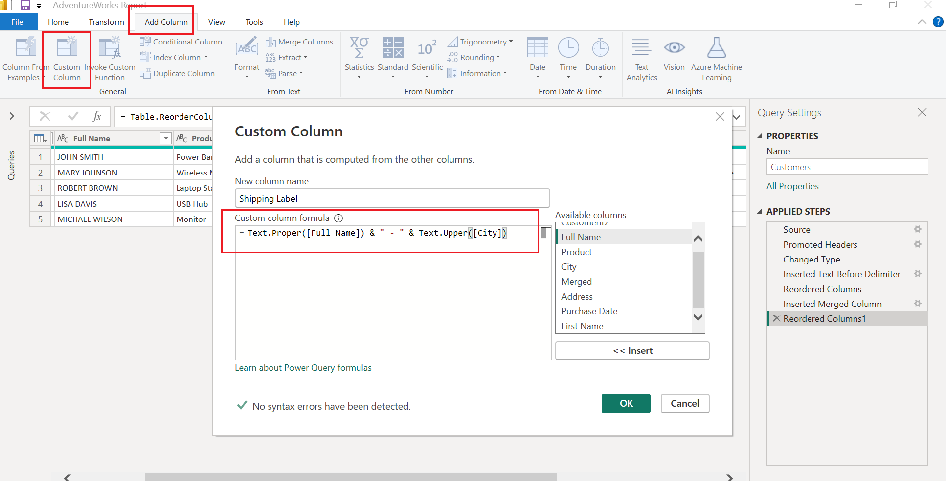
Result

3 Invoke Custom Function
Invoke Custom Function allows you to call (or "invoke") a custom Power Query function on a row-by-row basis, using values from your existing table as inputs.
Think of it like applying a mini-program (function) to each row of your table — just like using a formula in Excel, but written in M language and reusable across queries.

📌 When to Use It:
You’ve created a custom function in Power Query (like a reusable step).
You want to apply that logic across a dataset using different input values from your columns.
✅ Real Example: Add Sales Tax Based on City
🎯 Scenario:
You’ve written a custom function that calculates tax based on city name (e.g., different cities have different tax rates).
You want to apply this function to each customer row based on the City column.
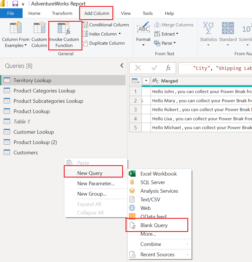
Create a New Blank Query
In the Queries pane (left side):
Right-click anywhere in the blank space or on any query name.
Select New Query > Blank Query.
Open the Advanced Editor
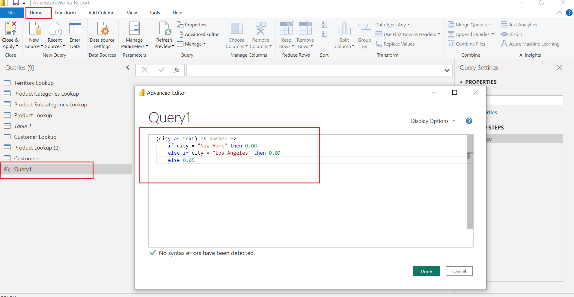
With the new blank query selected, go to Home > Advanced Editor.
Replace the placeholder code with your custom function.
✏️ Sample Function: Get Tax Rate by City
(city as text) as number =>
    if city = "New York" then 0.08
    else if city = "Los Angeles" then 0.09
    else 0.05
This function takes a city as input and returns the applicable tax rate.
Rename It as a Function
- In the Properties pane (right side or via right-click), rename the query to something meaningful like:
GetCityTaxRate
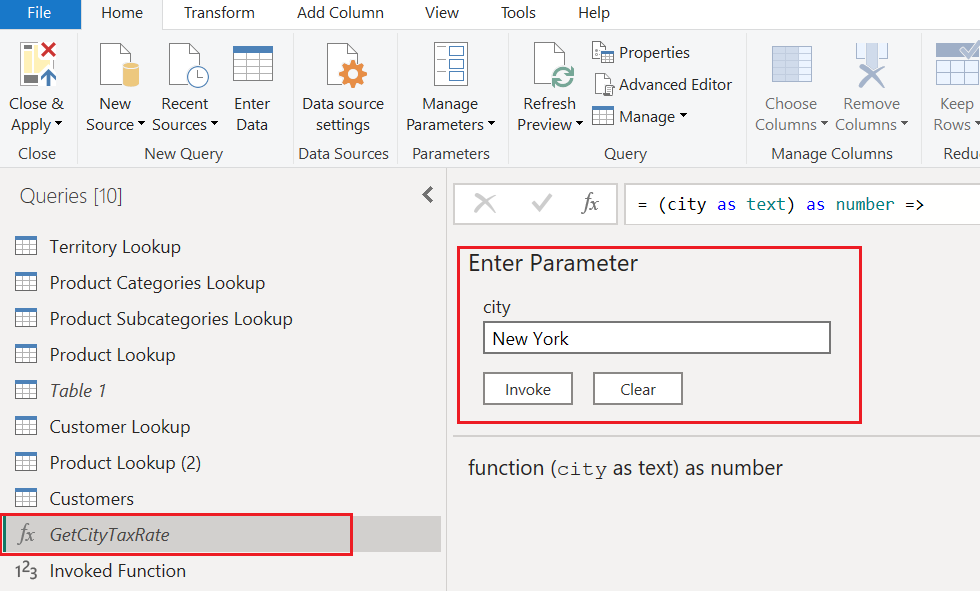
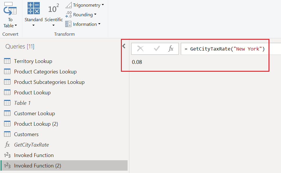
🧪 How to Test It (Optional Step):
- You can type a city like
"New York"into the input box and click Invoke to manually test it.
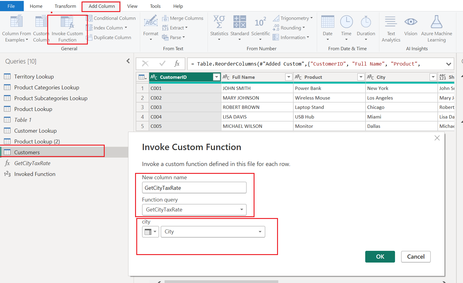
Invoke the Function on a Table
Go back to your main table (e.g.,
Customers).Go to Add Column > Invoke Custom Function.
In the dialog:
Name your new column.
Choose the function you just created (
GetCityTaxRate).Map the
Citycolumn as the input.
Click OK.
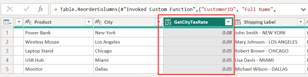
Result
4 Conditional Column
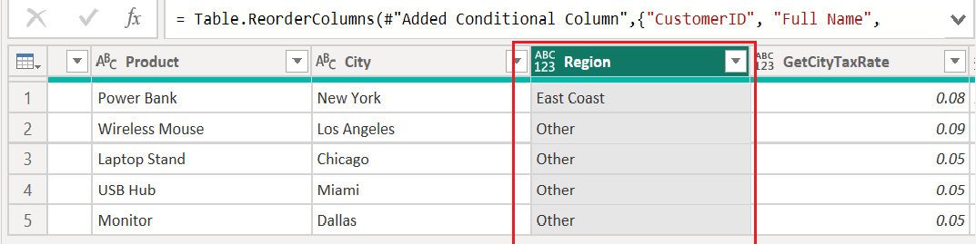
📌 What it does: “If this, then that” logic
Adds a new column where the value is based on conditions you define — similar to Excel’s IF statements.
🛠 Example Use Case:
You want to label customers based on city:
If the
Cityis"New York"then label them as"East Coast", otherwise"Other".
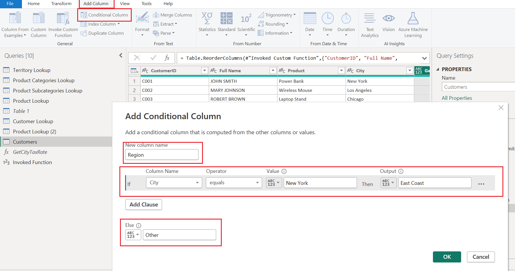
🔁 How to Use:
Click Add Column > Conditional Column.
Name the new column (e.g.,
Region).Set your condition:
If
Cityequals"New York"→ then"East Coast".Else →
"Other"
Click OK.
Power BI adds a new column with your defined labels.
Result
5 Index Column
📌 What it does:
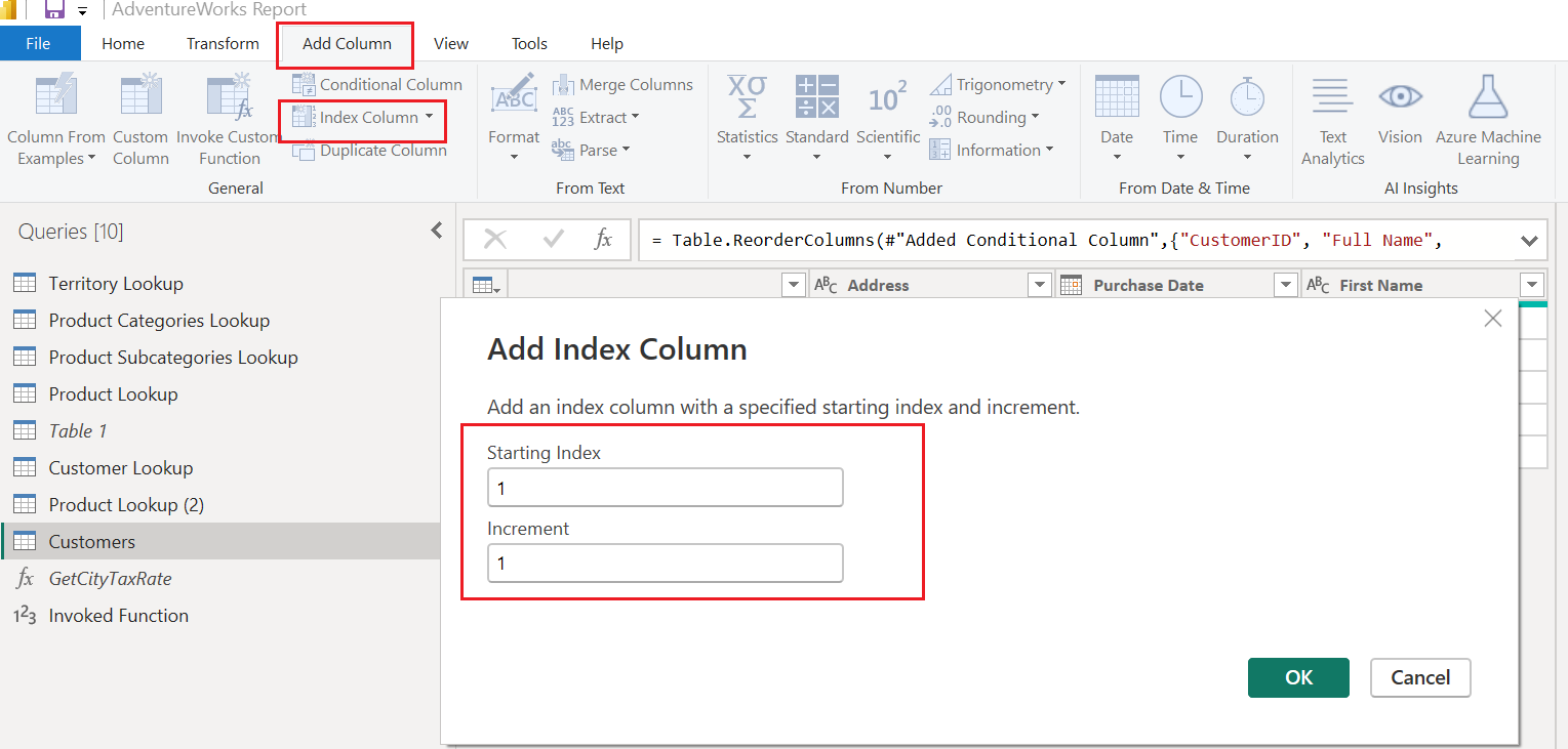
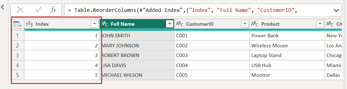
Index Column adds a sequential number column to your table — basically assigning a row number to each record.
Think of it as “Row ID” — it starts from 0 or 1 and increases by 1 (or any custom step you define).

🛠 Where to find it:
Add Column > Index Column
You’ll see a dropdown with:
From 0 → Starts numbering at 0
From 1 → Starts numbering at 1
Custom → You choose both start value and step size
Result
6 Duplicate Column
📌 What it does:
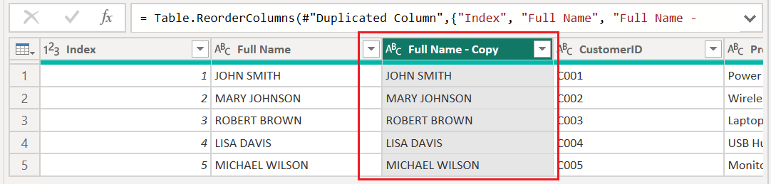
Duplicate Column makes an exact copy of the selected column and adds it to your table. The new column is named OriginalName - Copy by default.

🛠 Where to find it:
Add Column > Duplicate Column
✅ Why It’s Useful:
You can safely apply transformations (e.g., formatting, splitting, cleaning) to the copy without changing the original data.
| Use Case | Benefit |
| Keep original data untouched | For auditing or backup |
| Test transformations on a copy | Try proper case, splits, trim, etc. |
| Run comparisons | Before/after logic, detect changes |
7 Format (ABC)
📌 What it does:
The Format tool applies text-based transformations to a column (like changing case or cleaning up characters). It's especially useful when working with messy or unstructured data.
Each option creates a new column (because you’re in the Add Column tab) with the applied formatting.
🛠 Options Explained:
| Option | What It Does | Example |
| lowercase | Converts all text to lowercase | "JOHN DOE" → john doe |
| UPPERCASE | Converts all text to uppercase | "John Doe" → JOHN DOE |
| Capitalize Each Word | Proper case — capitalizes the first letter of each word | "john DOE" → John Doe |
| Trim | Removes leading and trailing spaces | " John " → John |
| Clean | Removes non-printable/invisible characters like line breaks or hidden symbols | "Jo\u0003hn" → John |
| Add Prefix | Adds text at the start of each value | "Name :" + JOHN SMITH- → Name : JHON SMITH |
| Add Suffix | Adds text at the end of each value | "@hotmail.com" + JOHN SMITH → JOHN SMITH@hotmail.com |
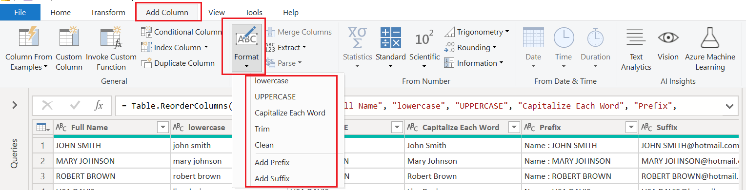
Result

8 Merge Columns
📌 What it does:
Merge Columns lets you combine the values of two or more columns into a single column — with or without a separator (like space, dash, or custom text).
It's useful for creating full names, addresses, product codes, or any custom labels from multiple fields.

💡 Tip:
Column order matters — Power BI merges values in the order you selected them.
So:
Select
Prefix, thenFirst Name, thenLast Name→ gets you:Mr. John SmithSelect in reverse → gets:
Smith John Mr.
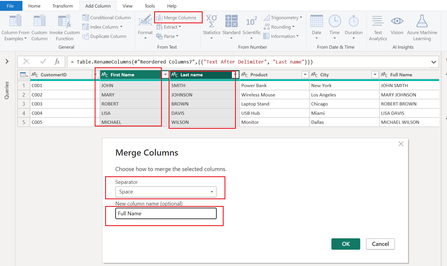
Result

9 Extract
📌 What it does:
The Extract tool allows you to pull out parts of a text string — such as:
First characters
Last characters
Substrings before/after a delimiter
This is useful when you're working with compound strings like "CUST-123" or "john.doe@example.com" and want to isolate a portion of it.
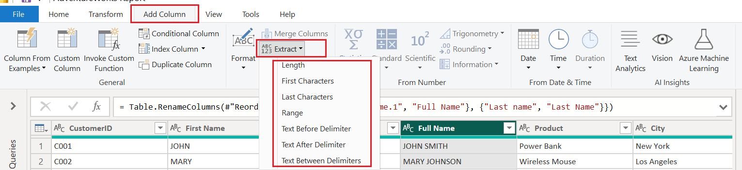
🧰 Options in the Extract Menu:
| Option | What it Does | Example |
| First Characters | Extracts the first N characters | ABC123 → ABC |
| Last Characters | Extracts the last N characters | ABC123 → 123 |
| Range | Extracts characters from a specific start position and count | From position 2, extract 3 → ABC123 → BC1 |
| Text Before Delimiter | Gets all text before a specified character or symbol | john.doe@example.com → john.doe (before @) |
| Text After Delimiter | Gets all text after a specified character or symbol | CUST-123 → 123 (after -) |
| Text Between Delimiters | Extracts the text between two delimiters | Hello [World]! → World (between [ and ]) |
Result

10 Parse (XML / JSON)
📌 What it does:
The Parse tool allows you to convert a column containing XML or JSON text into a structured record or table format that you can work with in Power BI.

🔍 When to Use:
Use Parse when you have:
A column with XML or JSON text strings
Embedded structured data inside a single column
Output from APIs, logs, nested exports, or IoT sensors
📂 Parse Options:
| Option | Purpose | Example |
| XML | Converts XML-formatted text to a hierarchical record | <customer><name>John</name></customer> |
| JSON | Converts JSON-formatted text to records/tables | { "name": "John", "city": "New York" } |
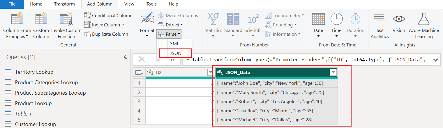
Result JSON

Result XML

11 Statistics Tool
📌 What it does:
The Statistics tool allows you to generate basic statistical summaries from numeric columns — like mean, min, max, standard deviation, and more — on a row-by-row basis or across the entire column (depending on context).
In Power Query, it is mainly used to create a new column that contains a calculated value based on existing numeric data.
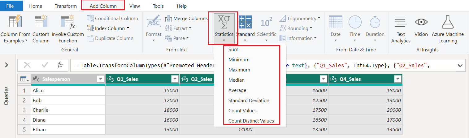
📂 Common Options in the Dropdown:
| Option | What it Calculates |
| Minimum | The smallest value in the column |
| Maximum | The largest value in the column |
| Average | The mean of the values |
| Median | The middle value |
| Standard Deviation | Spread of the values from the mean |
| Count Values | Number of non-null values |
| Sum | Total of all values |
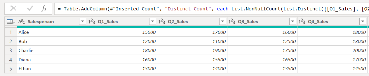
Result

12 Standard (Math Operations)
📌 What It Does:
The Standard dropdown lets you apply row-level mathematical operations on numeric columns like:
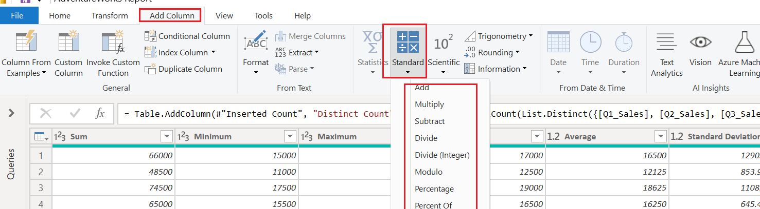
| Operation | What It Does |
| Add | Sums selected columns row-by-row |
| Multiply | Multiplies selected column values |
| Subtract | Subtracts one column from another |
| Divide | Divides one column by another |
| Divide (Integer) | Integer division (no decimal) |
| Modulo | Remainder after division |
| Percentage | Calculates percentage of one column to another |
| Percent Of | Same as percentage, phrased differently |
13 Scientific Operations
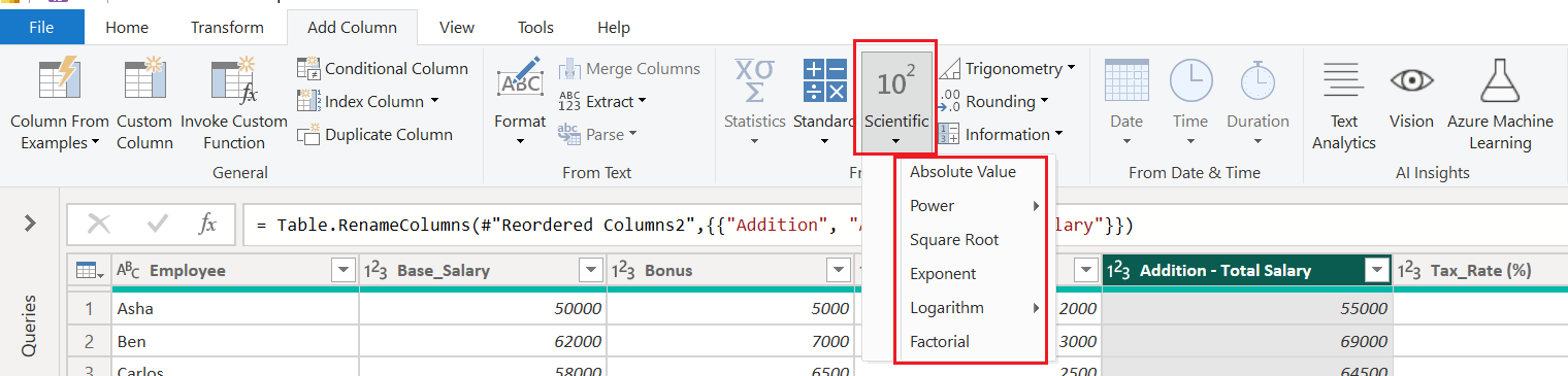
📌 What It Does:
The Scientific dropdown lets you apply scientific and mathematical functions (like powers, roots, logs, etc.) on numeric columns — row by row — and adds the result as a new column.
🧰 Available Options & What They Do:
| Operation | Description | Example |
| Absolute Value | Removes minus sign (converts to positive) | -500 → 500 |
| Power > Power of N | Raises each number to a given power | 2^3 = 8 |
| Square Root | Calculates square root of each value | √9 = 3 |
| Exponent | Calculates e^x for each value | e^2 ≈ 7.39 |
| Logarithm > Base 10 / Base e | Calculates the log of each value | log10(1000) = 3 |
| Factorial | Computes factorial n! for each value | 5! = 120 |
⚠️ Caution:
Only works on numeric columns.
Factorial is best used for small whole numbers (it grows very fast!).
Logarithms and roots of negative numbers or zero will throw errors.
14 Trigonometry Functions
📌 What it does:
The Trigonometry menu allows you to apply trigonometric functions (like sine, cosine, tangent, etc.) to numeric columns. These are applied row-by-row, and a new column is added with the results.

🧮 Available Functions:
| Function | Description |
| Sine | Returns the sine of the input (in radians) |
| Cosine | Returns the cosine of the input (in radians) |
| Tangent | Returns the tangent of the input (in radians) |
| Arcsine | Returns the angle (in radians) whose sine is the input |
| Arccosine | Returns the angle whose cosine is the input |
| Arctangent | Returns the angle whose tangent is the input |
📘 Practical Usage:
| When it's useful | Example |
| Geometry modeling | Map GPS, shapes, or trajectories |
| Engineering data | Use sine/cosine for waveform signals |
| Scientific research | Perform angle-based calculations |
15 Rounding Functions
📌 What it does:
The Rounding tool lets you control how numeric values are rounded by creating a new column with the adjusted values.

🧰 Options Explained:
| Option | What it Does | Example (Input = 12.76) |
| Round Up | Rounds up to the nearest integer (ceiling) | 13 |
| Round Down | Rounds down to the nearest integer (floor) | 12 |
| Round... | Opens a dialog box where you can specify the number of decimal places to round to | Round to 1 decimal = 12.8 |
🧪 Example Use Case:
You have a column: Bonus % = 12.76489
You want to:
Round to 2 decimal places → Use Round…
Round up to nearest whole number → Use Round Up
Round down to nearest whole number → Use Round Down
16 Information Functions
📌 What it does:
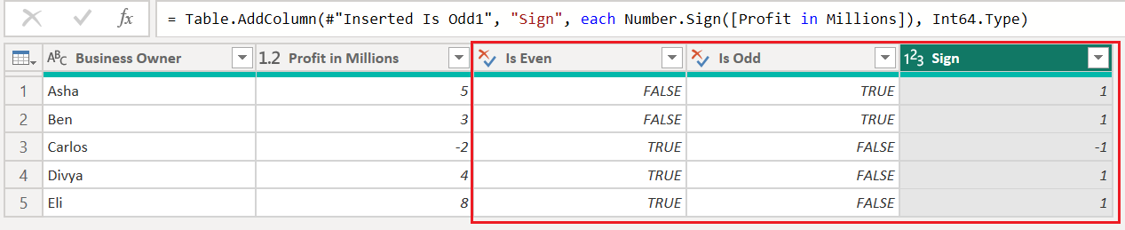
The Information tool helps you create new columns that evaluate properties of numeric values — like whether they’re even, odd, or what their sign is (positive/negative/zero).

🔍 Options in the Menu:
| Option | Description | Example Input | Output |
| Is Even | Returns true if the number is even | 4 | true |
| Is Odd | Returns true if the number is odd | 3 | true |
| Sign | Returns: 1 (positive), -1 (negative), 0 (zero) | -5 | -1 |
17 Date Transformations
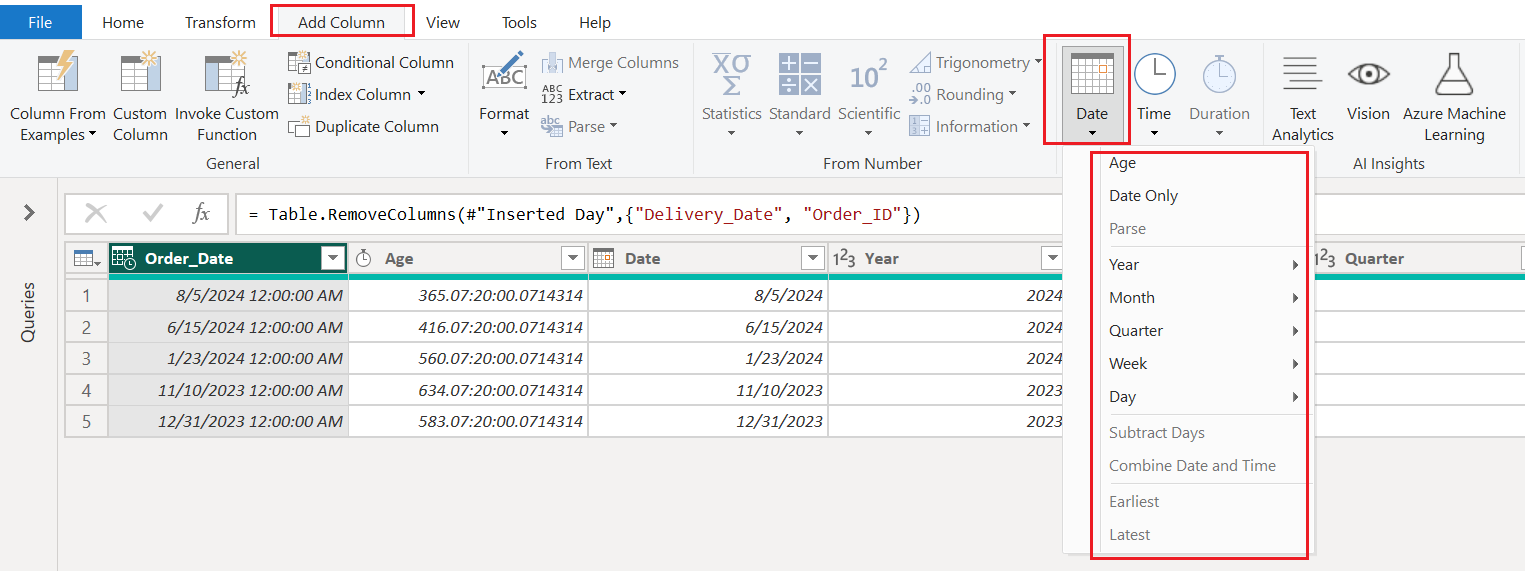
Power BI's Power Query Editor offers powerful tools to analyze and manipulate dates. One of the most essential menus under the Add Column tab is the Date dropdown. This guide walks you through every option available, using real-world scenarios to help you transform your date columns into insights.
📒 Real-World Use Cases
Example Table
| Order_ID | Order_Date |
| ORD100 | 8/5/2024 |
| ORD101 | 6/15/2024 |
| ORD102 | 1/23/2024 |
| ORD103 | 11/10/2023 |
| ORD104 | 12/31/2023 |
📅 Full Reference: Date Menu Options with Examples
| Group | Option | Description | Example Date (2024-08-05) | Result |
| General | Age | Calculates duration from the date to today. | 2024-08-05 | 365.07:00:00 |
Date Only | Removes time, keeping only date. | 2024-08-05 12:00:00 | 2024-08-05 | |
| Parse | (Grayed out) | Used to convert text to date format. | (text) | N/A |
| Year | Year | Extracts the year. | 2024-08-05 | 2024 |
Start of Year | First day of the year. | 2024-08-05 | 2024-01-01 | |
End of Year | Last day of the year. | 2024-08-05 | 2024-12-31 | |
| Month | Month | Returns the numeric month. | 2024-08-05 | 8 |
Name of Month | Returns full month name. | 2024-08-05 | August | |
Start of Month | First day of the month. | 2024-08-05 | 2024-08-01 | |
End of Month | Last day of the month. | 2024-08-05 | 2024-08-31 | |
| Quarter | Quarter | Returns quarter name. | 2024-08-05 | Q3 |
Start of Quarter | First day of the quarter. | 2024-08-05 | 2024-07-01 | |
| Week | Week of Year | ISO week number of the year. | 2024-08-05 | 32 |
Week of Month | Which week of the month it falls in. | 2024-08-05 | 1 | |
Start of Week | First day of the current week. | 2024-08-05 | 2024-08-05 (Monday) | |
| Day | Day | Day of the month. | 2024-08-05 | 5 |
Name of Day | Full weekday name. | 2024-08-05 | Monday | |
Day of Week | Number representing day of week (0 = Sunday). | 2024-08-05 | 1 | |
Day of Year | Day number of the year. | 2024-08-05 | 218 | |
| Calculation | Subtract Days | Subtracts fixed number of days. | 2024-08-05 - 3 days | 2024-08-02 |
| Combine | Combine Date and Time | Merges date and time columns into DateTime. | 2024-08-05 + 10:00 AM | 2024-08-05 10:00:00 |
| Boundary Dates | Earliest | Earliest date from selected column. | ORD104 to ORD100 | 2023-11-10 |
Latest | Latest date from selected column. | ORD104 to ORD100 | 2024-08-05 |

🔧 Tips for Best Use
Always convert your date/time fields to the correct type (
DateorDate/Time).Use "Add Column" if you want to keep the original column.
Use "Transform" if you want to overwrite the column with a new result.
Use Age and Subtract Days together to calculate delivery duration, account age, or follow-up time.
🌟 Final Thoughts
The Date menu in Power BI unlocks deep time-based insights with just a few clicks. Mastering these transformations empowers you to build powerful date intelligence, seasonal analysis, and time-driven dashboards.
18 Time Functions
Working with time data in Power BI can unlock deeper insights into customer behavior, event trends, and operational performance. In this post, we'll walk through how to use Power Query Editor's Time tools to extract, calculate, and combine time values using real use cases.
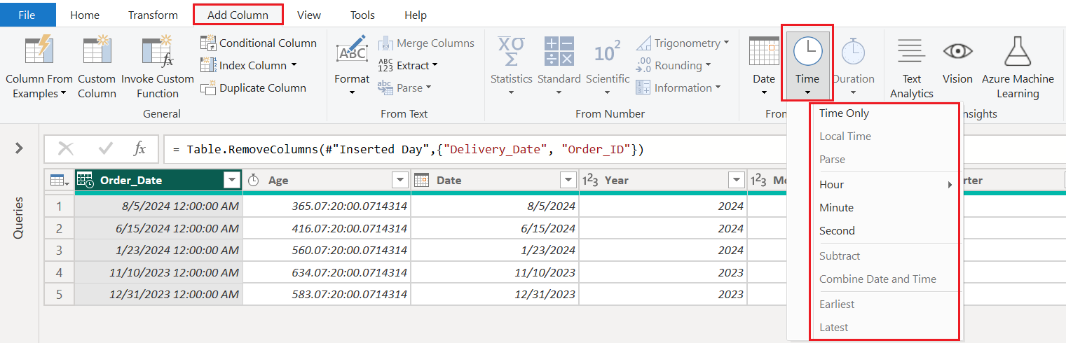
🕐 Extracting Time Parts
You can split a DateTime column into meaningful parts:
✅ Example:
From a column like Event_Timestamp, we can extract:
Hour: e.g., 9:30 AM →
9Minute: e.g., 9:30 AM →
30Second: e.g., 10:10:10 PM →
10
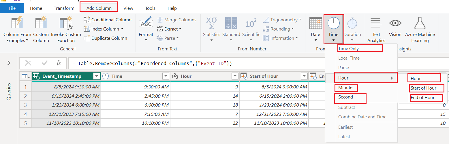
🕓 Start and End of the Hour
You can also extract:
Start of Hour – Trims the time to the beginning of the hour (e.g., 9:30 → 9:00)
End of Hour – Rounds to the next full hour (e.g., 9:30 → 10:00)

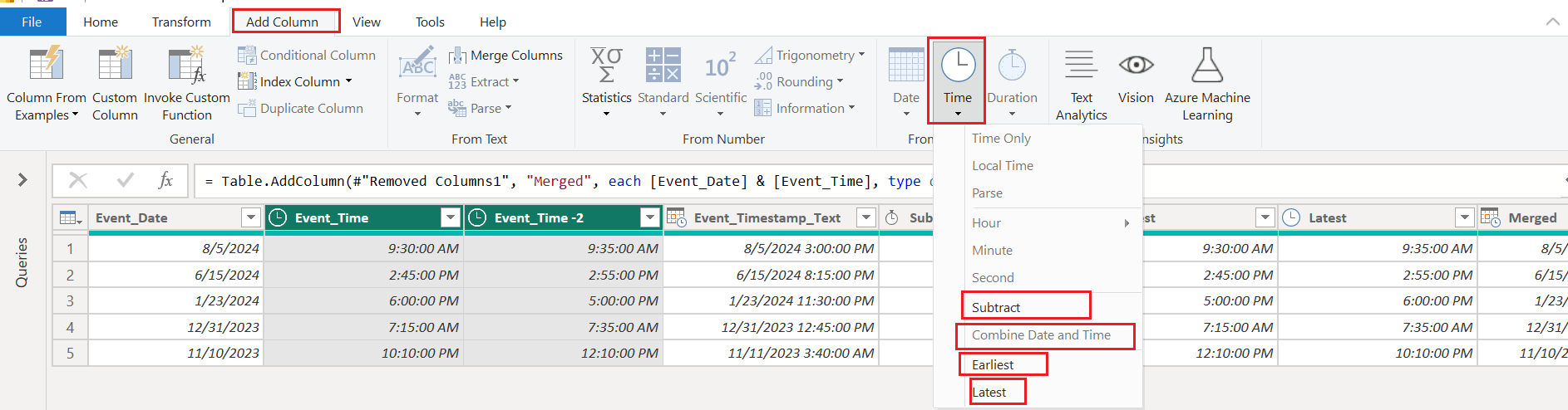
➗ Subtract Time Columns
Calculate the difference between two time columns using Subtract under the Time menu.
✅ Use Case:
If Event_Time is 9:30 AM and Event_Time-2 is 9:35 AM, subtracting gives 00:05:00 (5 minutes).
🔁 Combine Date and Time
Got separate date and time columns? No problem.
Use Combine Date and Time to create a full DateTime field.
✅ Example:
Event_Date: 8/5/2024Event_Time: 9:30 AM
➡️ Combine to get:8/5/2024 9:30:00 AM
This is useful when merging logs or analyzing events by timestamp.
📸 [See Screenshot: Merged DateTime]
🔁 Compare Times: Earliest vs Latest
The Earliest and Latest tools help you pick the first or last time between two values.
✅ Example:
Between Event_Time and Event_Time-2, use:
Earliest→ smaller of the twoLatest→ greater of the two
This is handy when:
Finding the true start time of an activity
Prioritizing log entries

✅ Final Thoughts
Time transformations in Power BI’s Power Query Editor are intuitive and powerful. With just a few clicks, you can:
Break apart timestamps
Calculate durations
Combine or compare moments
Extract insights from raw event logs
These capabilities can turn basic datetime data into actionable intelligence for your dashboards and reports.
19 Duration Tools
Working with date and time in Power BI opens the door to powerful analysis — from customer behavior and system performance to detailed operational timing. In this post, we'll explore Time and Duration tools under the Add Column tab in Power Query Editor, with screenshots to guide you step-by-step.
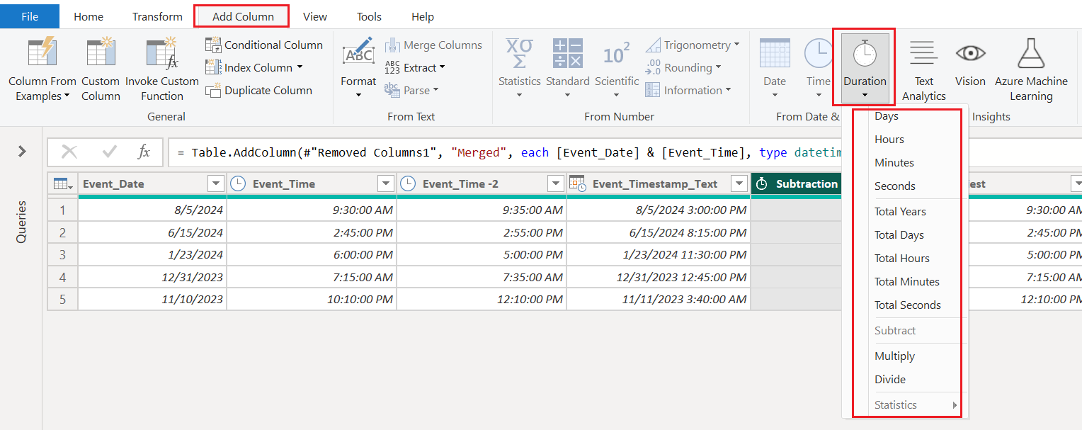
⏳ Duration Functions
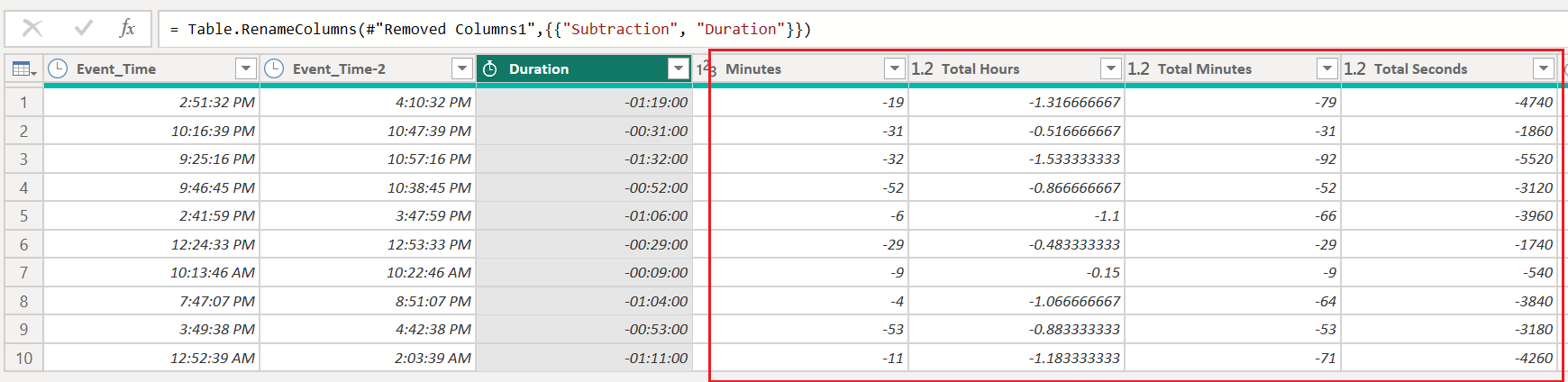
Once you subtract two datetime columns, the result is a duration value. The Duration menu allows further breakdown and manipulation of this value.
🔧 Tools Available:
Breakdown:
Days
Hours
Minutes
Seconds
Total Years, Total Days, Total Hours, etc.
Math Operations:
Subtract
Multiply
Divide
Analysis:
Statistics → Run operations like Min, Max, Median on duration fields
20 Text Analytics
Power BI isn’t just for numbers — it can also make sense of unstructured text data like customer feedback, support tickets, or survey responses. That’s where the Text Analytics feature in the Power Query Editor shines.

The Text Analytics tool leverages Azure Cognitive Services to apply natural language processing (NLP) to your data. With just a few clicks, you can:
✅ Detect Sentiment (Positive, Negative, Neutral)
✅ Extract Key Phrases
✅ Identify the Language
✅ Detect Named Entities (like names, places, and brands)
No need to write code or use external tools — it’s all built right into the Power BI interface under the Add Column > Text Analytics section.
🔐 Do You Need Premium?
Yes. These AI-powered insights require either:
A Power BI Premium or Premium Per User (PPU) license
ORA connected Azure Cognitive Services subscription (with an API key)
Without one of these, the feature will remain inactive or prompt you to upgrade.
💡 Real-World Use Cases
📊 Customer Feedback Analysis
See how your customers really feel using sentiment scores.📝 Survey Text Summaries
Extract recurring keywords and themes from open-ended responses.🧾 Support Ticket Triage
Auto-detect language or named entities for better routing.
21 Vision
Power BI isn’t limited to structured data — it can also analyze image files using artificial intelligence. The Vision feature in the Power Query Editor brings computer vision to your BI workflow, powered by Azure Cognitive Services.

🔍 What is the Vision Tool?
The Vision button in Power BI allows you to extract information from images using Azure’s Computer Vision API.
With it, you can:
🆔 Extract Text (OCR) from images like scanned forms or receipts
🧠 Analyze Image Content, identifying objects or tags
🗂️ Describe Images with automatically generated captions
It turns unstructured image files into structured, reportable data.
🔐 Do You Need Premium?
Yes — to use the Vision AI feature, you need:
A Power BI Premium or Premium Per User (PPU) license
ORAn Azure Cognitive Services subscription with a valid key
Without this, the feature remains unavailable or prompts a connection setup.
💡 Real-World Use Cases
📷 Invoice OCR
Extract invoice numbers, amounts, and dates from uploaded scans.🧾 Receipt Processing
Convert photographed receipts into structured datasets for expense tracking.🏷️ Image Tagging
Automatically tag and categorize marketing or product images.
🚀 Final Thoughts
Vision AI in Power BI unlocks the power of image analysis within your data workflows. Whether you're digitizing paper records or analyzing image-heavy datasets, this feature can save time and improve data accessibility.
If you're working with visuals and documents, this is one AI tool worth enabling.
22 Azure Machine Learning
Power BI’s true strength lies in combining business intelligence with artificial intelligence. The Azure Machine Learning button in the Power Query Editor lets you apply trained ML models directly to your data — no coding required.

The Azure Machine Learning option allows you to connect to models built and published in Azure Machine Learning Studio, and apply them to your datasets inside Power BI.
You can use it to:
🧠 Predict churn, customer behavior, or product returns
📈 Score leads using a trained classification model
📊 Apply clustering, regression, or time-series forecasts
It turns Power BI into a real-time model consumer, not just a report viewer.
🛠️ How Does It Work?
You build and train a model in Azure Machine Learning Studio.
Publish it as a web service (API endpoint).
In Power BI:
Click Add Column > Azure Machine Learning
Authenticate with your Azure credentials
Choose the model and map the input columns
Power BI sends your data to the model and retrieves predictions
🔐 Do You Need Premium?
No, this feature does not require Power BI Premium.
However, you do need:
An Azure subscription
A deployed machine learning model in Azure Machine Learning Studio
💡 Real-World Use Cases
🏦 Finance: Predict loan default risk
🛒 Retail: Forecast sales volume or demand
📞 Customer Support: Predict ticket escalation
🌐 Web Analytics: Classify visitor intent
VIEW
1 Query Settings
🔧 Power BI Power Query Editor: Understanding the Query Settings Panel
When working in Power BI's Power Query Editor, one of the most important tools you’ll use is the Query Settings pane. This panel appears on the right-hand side of the screen and is essential for tracking and managing your data transformation steps.
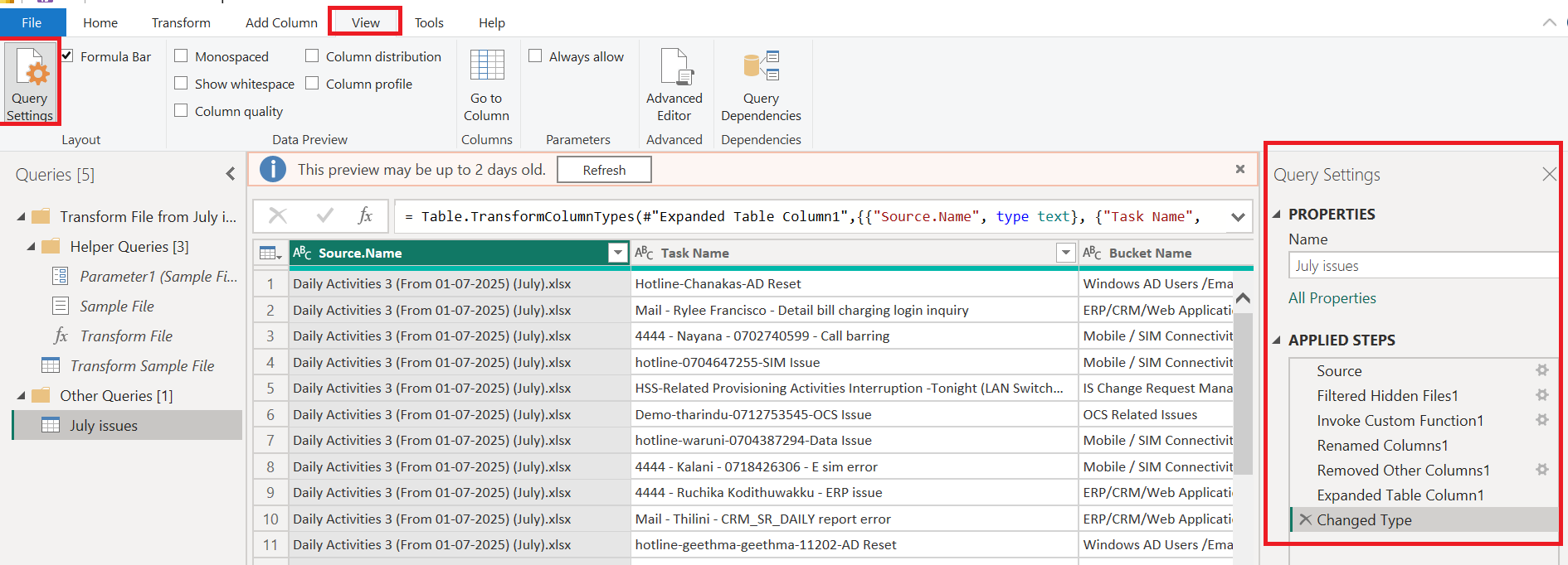
📌 What is the Query Settings Panel?
The Query Settings panel allows you to:
🔍 Rename and manage the current query
🧾 View and edit all transformation steps applied to the data
📋 Access properties like table name, data source, etc.
🛠️ Two Key Sections:
1️⃣ PROPERTIES
Name: This is the name of the query/table.
You can rename it here to something meaningful like
"July Issues"instead of a generic name.Click "All Properties" to edit advanced settings like descriptions or annotations.
2️⃣ APPLIED STEPS
This is where all the data transformation steps are listed in order. Each time you:
Filter rows
Rename columns
Change data types
Remove columns
…Power BI records that action here as a step.
Each step can be:
Edited (by clicking the gear icon ⚙️ if available)
Reordered or deleted (via right-click)
Used for debugging if something breaks
💡 Why Is This Useful?
The Query Settings panel acts like a history log of your data cleaning process. It’s helpful for:
Undoing mistakes
Documenting your steps
Ensuring consistency and repeatability
Debugging broken queries
🧠 Pro Tip:
If the Query Settings pane is missing, go to the View tab and make sure the Query Settings checkbox is ticked ✅.
2 Formula Bar
✍️ Power Query Editor: Understanding the Formula Bar
One of the most powerful tools in Power BI’s Power Query Editor is the Formula Bar — yet it's often overlooked by beginners. This simple-looking input field holds the key to understanding and customizing the transformations you're applying to your data.
🔍 What is the Formula Bar?
The Formula Bar displays the M code (short for Power Query Formula Language) that Power BI uses behind the scenes for each transformation step.
🧠 Why is it called M Code?
The name "M" in M Code stands for "Mashup" — because it was originally designed as the Mashup language used in Microsoft’s data integration tools to "mash up" data from multiple sources.
In your screenshot, it shows this formula:
=Table.TransformColumnTypes(#"Expanded Table Column1",{{"Source.Name", type text}, {"Task Name", type text}})
This line tells Power BI to convert the "Source.Name" and "Task Name" columns into text type — a transformation applied during the "Changed Type" step.
✅ Key Features:
✏️ View and edit transformation steps in raw M code.
🛠️ Allows you to customize or fine-tune Power BI’s automatic transformations.
🔄 Enables better control, especially when modifying logic that isn't easily handled through the ribbon UI.
🧠 Great for learning M code and developing advanced queries.
🧠 Why It's Useful for You
You can quickly correct or optimize a transformation.
Helpful for copying steps to reuse in another query.
Lets you understand exactly what Power BI is doing behind the scenes.
Ideal when working with complex steps like merging, expanding records, or conditional logic.
💡 Pro Tip:
Use the Advanced Editor (next to the formula bar in the ribbon) when you want to see or modify the entire query script at once.
3 Monospaced
🖋️ Power Query Editor: What Does the Monospaced Option Do?
Inside the View tab of Power Query Editor, there’s a small but useful checkbox labeled "Monospaced". While it may look like a simple font setting, it plays a helpful role when reading or editing code in the Formula Bar or Advanced Editor.

🔤 What is a Monospaced Font?
A monospaced font (also called a fixed-width font) means every character takes up the same amount of space — unlike regular fonts where an “i” is narrower than a “w”.
Examples of monospaced fonts:
Courier New
Consolas
Lucida Console
Before
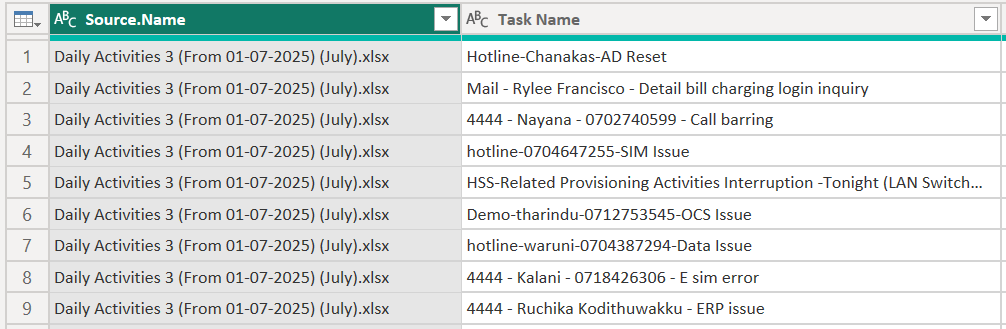
After
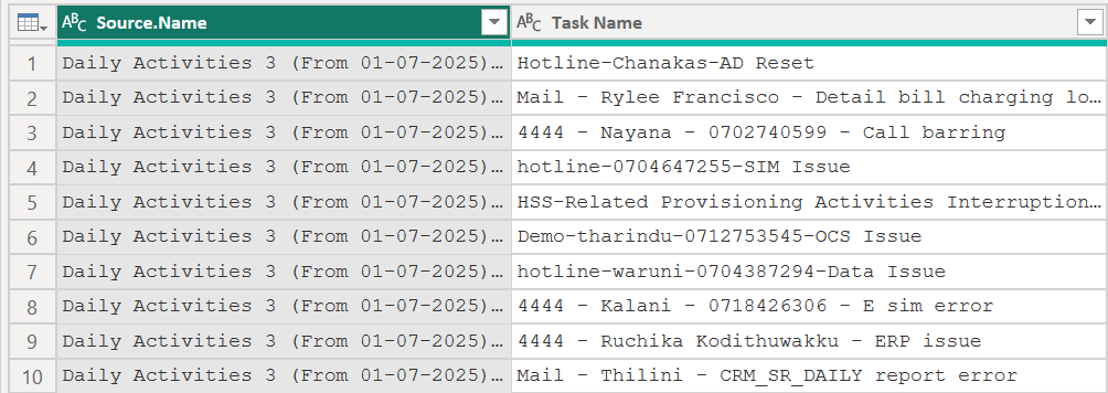
✅ What Happens When You Enable "Monospaced"?
It changes the Formula Bar text to a monospaced font.
This makes the M code easier to read and align — especially for:
Indentation
Nested functions
Multi-line expressions
Editing complex transformations
🧠 Why Use It?
| Without Monospaced | With Monospaced |
| Harder to align or compare code visually | Easy to see structure and spacing |
| Less coding comfort | Familiar coding experience for developers |
| May introduce accidental mistakes in long code | Helps maintain clean and readable format |
4 Show Whitespace
🧾 Power Query Editor: What Does the Show Whitespace Option Do?
When you're editing or reviewing M code in Power BI's Power Query Editor, formatting can make a big difference. The "Show Whitespace" option helps you see hidden formatting characters such as spaces, tabs, and line breaks.
🧱 What is Whitespace?
Whitespace refers to invisible characters like:
Spaces
Tabs
New lines
These characters don’t appear by default, but they can impact how your code is read or copied, especially in:
Multi-line logic
Indented transformations
Pasted code from external sources
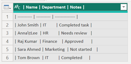
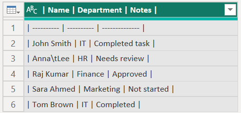
✅ What Happens When You Check “Show Whitespace”?
It reveals hidden characters like spaces (·) and tabs (→) inside the Formula Bar or Advanced Editor.
Helps you detect:
Unintentional spaces
Misaligned tabs
Extra new lines or spacing errors
🧠 Pro Tip:
Combine Show Whitespace with Monospaced font for a cleaner, developer-friendly editing experience in Power Query.
5 Column Quality
✅ Power Query Editor: What Is Column Quality and Why Is It Useful?
When working with real-world datasets, data quality issues like null values or errors are common. The Column Quality feature in Power BI's Power Query Editor helps you detect and understand these issues visually before loading data into your model.

🧪 What Does "Column Quality" Show?
When enabled, it displays a small bar chart directly beneath each column in the data preview, summarizing:
✅ Valid values (green) – usable data
⚠️ Errors (red) – rows that caused an error during transformation
⬜ Empty (gray) – null or missing values🧠 Why Use Column Quality?
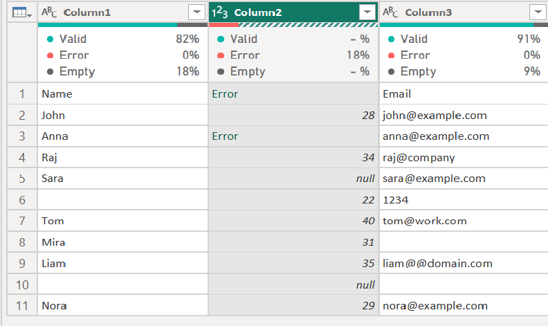
📌 Column 1 (Name)
✅ Valid: 82%
⚫ Empty: 18%
🔴 Error: 0%
✔ This means:
9 out of 11 values are valid text entries
2 are empty (null or blank)
No transformation errors occurred
📌 Column 2 (Age — Numeric Type)
🔴 Error: 18%
✅ Valid: - %
⚫ Empty: - %
❗ This means:
You've converted this column to numeric (
123icon).Some values, like
"twenty-five"or"Error", cannot be parsed as numbers ➡ Power Query marks them as errors.Because of these errors, Power BI can't determine how many are valid or empty, so those percentages are shown as dashes (- %).
🧠 Power BI doesn’t show Valid/Empty stats when errors prevent accurate calculation.
📌 Column 3 (Email)
✅ Valid: 91%
⚫ Empty: 9%
🔴 Error: 0%
✔ Interpretation:
10 values are valid text strings (even if the email format is questionable)
1 is blank or null
No error has been caused yet, because no transformation or validation has been applied on email format
🧠 Key Takeaways
| Concept | Meaning |
Valid | Value type matches the expected data type (e.g., number, text) |
Error | A transformation (e.g., data type change) caused an invalid value |
Empty | Null, blank, or missing entry |
- % (dash) | Cannot calculate due to presence of errors |
💡 Pro Tip:
Use Column Quality along with:
Column Profile (for deeper stats)
Column Distribution (for frequency/count insights)
6 Column Distribution
📊 Power Query Editor: What Is Column Distribution and How Does It Help?
One of the most powerful tools for exploring your data at a glance in Power BI’s Power Query Editor is the Column Distribution feature. It helps you visually understand the spread of values in each column — before you even start analyzing.

📌 What Does "Column Distribution" Do?
When enabled, this option shows a horizontal bar under each column with:
A count of distinct values
A count of unique values
A mini histogram that gives a quick visual preview of how values are distributed in that column
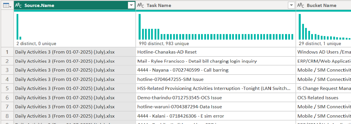
📘 Source.Name
2 distinct, 0 unique
✅ Meaning:
Only 2 different values exist (likely just 2 Excel files used as source).
But none of them appear only once → i.e., every value is repeated.
That's why: 0 unique.
📘 Task Name
990 distinct, 983 unique
✅ Meaning:
There are 990 different task names overall.
Out of those, 983 appear only once (unique).
So, 7 task names are repeated.
💡 Use case:
You can use this to identify repeated tasks or duplicates.
🧠 What Insights Can You Get?
| Insight | Example |
| Are there duplicates? | Low unique count = possible duplicates |
| Are values evenly spread? | Histogram bar shows frequency |
| Are values consistent? | One dominant value = skewed data |
| Is the column worth analyzing? | High uniqueness = good candidate for grouping, filtering, etc. |
7 Column Profile
🔍 Power Query Editor: Understanding the Column Profile (with Real Example)
Power BI's Power Query Editor includes several powerful profiling tools that help you inspect your data before you clean or transform it. One of the most informative among them is the Column Profile feature.

📌 What Is Column Profile?
Column Profile provides a detailed statistical summary of any column you select. It appears at the bottom of the Power Query window once enabled.
🧪 Real Example: "Bucket Name" Column
In the screenshot, we selected the “Bucket Name” column, which contains support categories like:
Mobile / SIM Connectivity Issues
OCS Related Issues
ERP/CRM/Web Application Issues
Windows AD Users /Email Issues
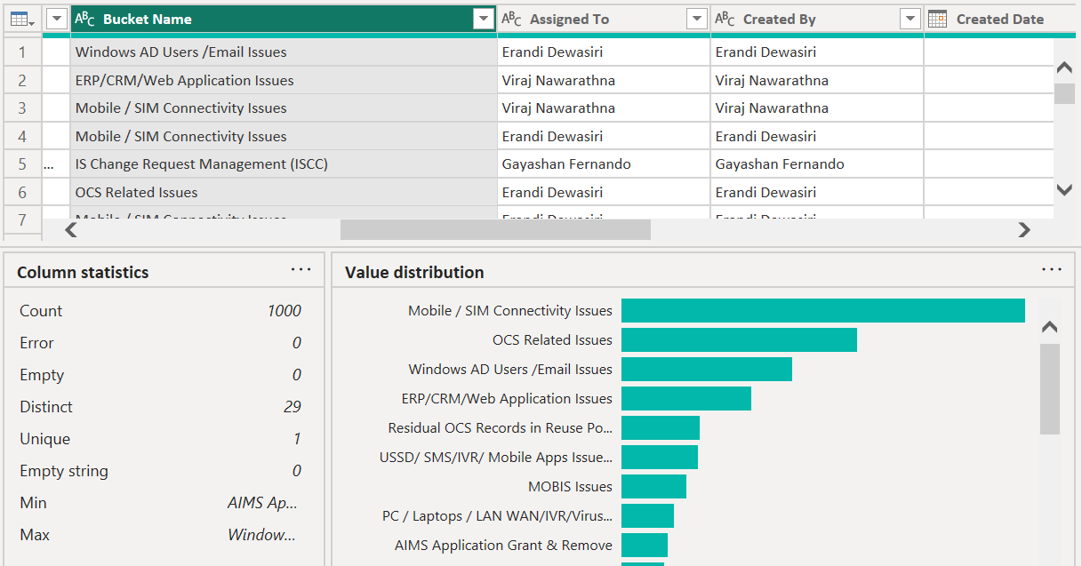
🧾 What You See in Column Profile
1️⃣ Column Statistics (Left Panel)
| Metric | Value | What It Tells Us |
| Count | 1000 | Total rows in the column |
| Error | 0 | No transformation or data type errors |
| Empty | 0 | No null or missing values |
| Distinct | 29 | 29 different category names exist |
| Unique | 1 | Only one value appears once |
| Empty string | 0 | No values are blank strings (“”) |
| Min / Max | A–Z | Alphabetical range of the values |
💡 Insight: While there are 29 categories, only 1 appears only once — suggesting that most values are repeated.
2️⃣ Value Distribution (Right Panel)
This section gives a visual histogram showing how frequently each category appears:
The most common is "Mobile / SIM Connectivity Issues"
Others like "OCS Related Issues", "Windows AD Users", and "ERP/CRM Issues" also occur frequently
Smaller bars indicate rarer categories (e.g., Billing issues, Ownership transfer, etc.)
📊 This helps spot:
Dominant categories
Long-tail items
Data imbalance
✅ Why Use Column Profile?
| Benefit | Description |
| 🔍 Detect issues early | Spot missing, inconsistent, or unexpected values |
| 📉 Understand distributions | Visualize how your data is spread |
| 🧼 Plan better transformations | Focus on cleaning the right areas |
| 📋 Validate data types | Confirm no type mismatches or formatting errors |
💡 Pro Tip:
Combine Column Profile with:
✅ Column Distribution (for distinct vs unique count)
✅ Column Quality (for valid, error, empty percentage)
8 Go to Column
Power Query Editor: What is Go to Column?
When working with wide tables that contain dozens or even hundreds of columns, it can be tedious to scroll horizontally just to find the one you want. That’s where the “Go to Column” feature comes in — a quick navigation tool in Power BI’s Power Query Editor.

📌✨ What Does It Do?
When you click Go to Column, a pop-up appears showing a list of all columns in the current table.
You can:
🔍 Search by column name
✅ Select a column from the list
📍 Click OK to jump directly to that column
🎯 Why It’s Useful
| Scenario | How “Go to Column” Helps |
| Working with wide tables | Jump to the needed column instantly without scrolling |
| Exploring new data | Quickly scan all available column names |
| Debugging or transforming | Navigate straight to a problem column (e.g., with errors) |
| Applying filters or renames | Find and select columns faster in large datasets |
9 Always Allow
🔐 Power Query Editor: What Does the “Always Allow” Option Do?
While working in Power Query, especially with external files, web sources, or dynamic content like parameters and functions, you may encounter a “Permission Required” prompt asking you to approve access each time. The “Always allow” checkbox helps streamline that process.

🧭 What It Does
When enabled, the “Always allow” option:
Automatically grants permission to evaluate preview queries for things like:
Parameters
Custom functions
Dynamic file paths
Reduces the number of prompts asking if you're okay to run them
🎯 Why Use It?
| Scenario | Benefit |
| You use parameter-driven queries | Prevents repeat permission prompts every time you apply changes |
| You connect to external files or APIs | Allows smooth refreshing and previewing |
| You're developing multiple queries using functions | Avoids constant confirmation interruptions |
💡 Pro Tip:
If Power BI prompts you too often while developing parameterized reports or using custom functions, enable “Always allow” temporarily, then disable it before publishing.
10 Advanced Editor
🧠 Power Query Editor: What Is the Advanced Editor?
If you're ready to go beyond the visual interface and directly manipulate the logic behind your transformations, the Advanced Editor is your secret weapon. It's where you can view and edit the M code (Power Query Formula Language) that powers your query steps.

🛠️ What Can You Do in the Advanced Editor?
✍️ View the full M code generated by your transformations
🧾 Modify or write custom queries manually
📑 Copy/paste queries between files or projects
🧩 Create dynamic queries using variables and parameters
🐞 Debug errors by analyzing step-by-step M logic
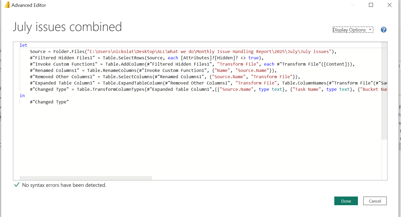
🔤 Example: A Simple M Code
let
    Source = Excel.Workbook(File.Contents("C:\Data\Sales.xlsx")),
    SalesData = Source{[Name="Sales"]}[Content],
    ChangedType = Table.TransformColumnTypes(SalesData,{{"Amount", type number}})
in
    ChangedType
This query:
Loads data from an Excel file
Selects the Sales worksheet
Changes the Amount column to numeric
🔒 Why Use Advanced Editor?
| Use Case | Benefit |
| Complex transformations | More control and flexibility |
| Copying steps between reports | Reusable, portable code |
| Performance tuning | Optimize query logic |
| Learning M language | Great for deeper Power BI skills |
⚠️ Tips for Beginners
Don’t worry if it looks scary — Power BI writes this code for you.
Start by reading the M code of existing transformations.
Use the Formula Bar for small changes, and Advanced Editor for full overview.
11 Query dependencies
🔗 Power BI Query Dependencies – Understand Your Data Flow at a Glance
In Power BI's Power Query Editor, the Query Dependencies view is like your data map. It helps you see how different queries are connected, where the data flows from, and which tables depend on which others.

📘 Use Case: Sales Performance Reporting
Suppose you're building a sales report based on quarterly sales data and regional targets. You’ve structured your queries like this:
| Query Name | Purpose |
Sales_Q1 | Raw sales data for Quarter 1 |
Sales_Q2 | Raw sales data for Quarter 2 |
All_Sales | Combined Q1 + Q2 data |
Region_Targets | Monthly sales targets per region |
Sales_vs_Target | Final output comparing actual sales vs. target |
🔍 What is Query Dependencies?
The Query Dependencies view provides a visual representation of how your queries are related.
You can access it via:
📍 View tab ➜ Query Dependencies
📊 Diagram Example
Here’s how the dependencies appear for our sales project:
Sales_Q1       Sales_Q2
   \             /
    \           /
     \         /
     →   All_Sales   ← Region_Targets
                \
                 → Sales_vs_Target
This view tells us:
All_Salesis built from Sales_Q1 + Sales_Q2Sales_vs_Targetis built from All_Sales + Region_TargetsQuery1(if seen separately) is not connected — possibly unused or for staging
🎯 Why is Query Dependencies Useful?
✅ Track Data Lineage
See exactly where your final report values are coming from.🪛 Troubleshoot Quickly
If a value is wrong, trace back through the query chain to find the root cause.🧹 Clean Unused Queries
Spot disconnected queries that aren't needed and safely remove them.🚦 Optimize Performance
Understand how transformations cascade and avoid unnecessary recalculations.
💡 Final Thought:
As your report grows complex, Query Dependencies becomes your navigation compass. Whether you’re building staging tables, merging sources, or building a final dashboard — it’s always worth checking your data flow map.
Tools
1 Diagnose Step
🛠 Power Query Diagnostics – Track Performance Step by Step
As your Power BI transformations grow in complexity, so does the need to monitor performance. That’s where the Diagnostics tools in the Tools tab come into play.
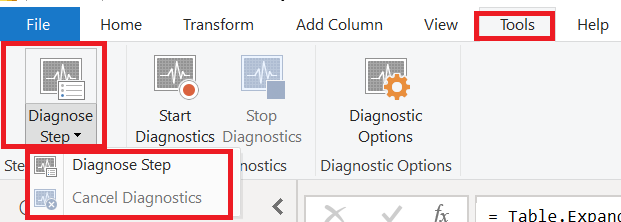
⚙️ What Does “Diagnose Step” Do?
The Diagnose Step feature measures how much time a specific step in your query takes — and how much of that time is spent on external sources or downstream dependencies.
💡 This is particularly useful when you're not sure:
Which transformation is slowing you down
Whether slowness comes from your data source or your logic
If you're over-using merge/join/custom functions
🧪 How to Use It
Step-by-step:
Open Power Query and go to the Tools tab.
Click Start Diagnostics.
Perform the actions or refresh the steps you want to diagnose.
Click Stop Diagnostics.
You’ll now see diagnostics tables automatically created.
Alternatively, for more control, use Diagnose Step to focus on only one specific transformation step.
📊 What Output Do You Get?
After diagnosing, Power BI gives you two tables:
| Table | Purpose |
| 🧱 Diagnostics_Partitions | Shows the total and exclusive duration of each query partition |
| 🧪 Diagnostics_Detailed | Breaks down step-by-step query execution, source type, rows processed, and time taken |
These tables help you answer:
Which step took the longest?
Was it the actual transformation or a data source delay?
Is my data source (e.g., Excel, SQL, Web) slow?
🕵️ Pro Tips for Interpreting Results
High Exclusive Duration (%) = That step is your main bottleneck
Low Exclusive but High Total = The problem is further downstream
Web or Excel source with high duration = Try optimizing or replacing the source
Custom column with long duration = Consider rewriting logic or using native functions
🧹 Clean Up
To exit or reset diagnostics:
Use Cancel Diagnostics if you no longer want to trace the step
Delete diagnostics tables if not needed for long-term tracking
📌 When to Use This
Power BI reports are slow to refresh
Query performance is getting worse with more data
You're dealing with multiple merged queries
You want to prove to your team where time is spent
✍️ Final Thoughts
Diagnosing performance in Power Query used to feel like guesswork — now, with Diagnose Step, it's a science.
Use this tool as part of your Power BI performance optimization workflow, and you’ll not only speed up your reports, but also learn to write cleaner, faster queries.
2 Start/Stop Diagnostics
🔍 Power Query Performance Tuning with Session Diagnostics
In Power BI, slow refreshes and laggy data loading can frustrate even the most experienced analysts. Thankfully, Power Query's Diagnostics Tools give us a way to inspect what’s really going on — especially through Session Diagnostics.
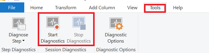
🧪 What Is Session Diagnostics?
Unlike Diagnose Step (which looks at one step), Session Diagnostics captures the entire refresh session, tracking every step you perform from start to finish.
It gives a full picture of what Power Query is doing behind the scenes:
Data source access times
Time spent on transformations
Resource usage
Number of rows processed
Query execution sequence
🧰 How to Use Session Diagnostics
Step-by-Step:
Go to the Tools tab ➜ Click Start Diagnostics
Perform your refresh or query steps (you can add new steps, filter, sort, or apply transformations)
Click Stop Diagnostics when done
Power BI will create two new tables in your Queries pane:
Diagnostics_Partitions_...Diagnostics_Detailed_...
📊 What Do the Tables Show?
🧱 Diagnostics_Partitions
Shows the partition-level breakdown — think of this as the “summary” view.
| Column | Meaning |
| Partition Key | Which query step or source |
| Start/End Time | Timestamps of execution |
| Duration | Total time taken |
| Exclusive Duration | Time taken only by this part (excluding child steps) |
🔬 Diagnostics_Detailed
Gives you a step-by-step analysis of every operation.
| Column | Description |
| Step | Name of the step |
| Category | Source / Transformation / Evaluation |
| Row Count | Number of rows processed |
| Data Source Kind | e.g., Excel, SQL, Web |
| Exclusive Duration (%) | Bottleneck indicator |
| Path | The sequence of step execution |
🧠 How to Interpret Results
🟥 High exclusive duration = bottleneck
🟨 High row count = might need optimization
🟦 Source queries slow? Try reducing data or filtering early
🟩 Nested joins or custom columns slow? Replace with native transformations
✅ Use Cases
| Scenario | Use Diagnostics |
| Refresh taking too long | ✔️ Identify which query or source is slow |
| Merged queries feel heavy | ✔️ Spot joins with high durations |
| Curious how transformations flow | ✔️ Understand the execution path |
💡 Bonus Tips
Delete the diagnostics tables when done (to avoid clutter)
You can compare different sessions side-by-side
Combine with Query Dependencies for a full visual map of your model
✍️ Final Thoughts
Session Diagnostics is your Power BI X-ray machine.
Instead of guessing why your report is slow, use diagnostics to see the exact steps, analyze durations, and optimize intelligently.
By leveraging this tool, you gain visibility into Power Query’s engine and can confidently build faster, more efficient reports.
3 Diagnostic Options
⚙️ Power BI Diagnostic Options – Fine-Tune What You Trace
As part of Power Query’s powerful diagnostic toolkit, the Diagnostic Options button gives you granular control over what Power BI captures during a Session Diagnostics run.
If you've ever wanted to reduce clutter or focus only on specific performance bottlenecks, this is where you configure your tracing behavior.
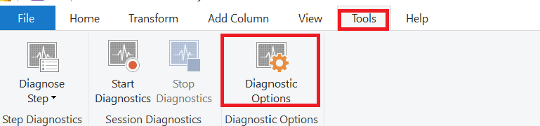
🧰 What Is It For?
When you click Diagnostic Options, Power BI opens a settings window where you can:
✅ Enable or disable detailed traces
🎯 Focus on specific categories like:
Evaluation steps
Cache hits
Background refresh
Diagnostics related to specific data sources
📉 Reduce the amount of captured data if you only want the essentials
✨ Why Use Diagnostic Options?
| Use Case | Why It Helps |
| You only care about slow queries | Exclude unnecessary trace categories |
| Your diagnostics table is too large | Disable low-priority events |
| You're troubleshooting a specific data source | Filter to focus only on that connector |
🧪 Tip for Power Users
When running diagnostics on large models, the default settings can generate huge logs.
To stay efficient:
✅ Use Diagnostic Options to reduce noise
🔍 Focus on transformation steps, refresh durations, or custom connectors
🔚 Wrapping It All Up
The Diagnostic Options panel is like your filter lens. It helps you:
Target the root cause more effectively
Reduce distractions from irrelevant trace data
Control performance impact during diagnostics
When used in combination with:
Start/Stop Diagnostics
Query Dependencies
Diagnose Step
👉 It gives you a complete control center for performance tuning in Power BI.
Help
1 Guided Learning
🎓 Power BI Guided Learning – Your Built-in Learning Path
When starting with Power BI, it’s easy to feel overwhelmed by all the features, menus, and tools. That’s why Microsoft includes Guided Learning right inside Power BI Desktop — a direct link to a structured, official learning resource that takes you step-by-step from beginner to confident report builder.
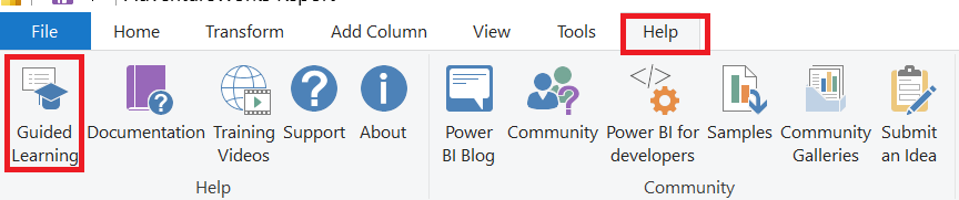
📌 What is Guided Learning?
The Guided Learning button in the Help tab is a shortcut to Microsoft’s Power BI Learning Path on their official website. This path is broken into clear, progressive lessons, designed for self-paced learning.
https://learn.microsoft.com/en-gb/power-bi/fundamentals/desktop-getting-started
🧭 What’s Inside Guided Learning?
The learning path covers:
Getting Started with Power BI
Understanding the purpose of Power BI and how it works in business intelligence.Connecting to Data
Step-by-step tutorials on importing data from Excel, SQL Server, the web, and other sources.Transforming Data
Learn how to clean, reshape, and prepare data using Power Query before building visuals.Data Modeling
Create relationships, calculated columns, and measures for better analysis.Creating Reports & Dashboards
Build interactive visuals and design engaging dashboards.Publishing & Sharing
Share your work securely through the Power BI Service.
✅ Why Use Guided Learning?
Structured & Beginner-Friendly – Ideal for those new to Power BI.
Official & Up-to-Date – Content is maintained by Microsoft.
Free – No subscription required to access learning materials.
Self-Paced – Learn when and where you want.
💡 Tip: Even experienced users can use Guided Learning to explore new features or refresh core skills. It’s more than a beginner’s tool — it’s a reference you can revisit anytime.
2 Documentation
📚 Power BI Documentation – Your Complete Technical Guide
When working in Power BI, there’s often a moment where you think:
"I wish I had a detailed explanation of this feature."
That’s exactly where the Documentation button in the Help tab comes to the rescue.
📌 What is the Documentation Option?
The Documentation button is a quick link to the official Microsoft Power BI documentation site. It provides detailed, authoritative guidance on every tool, feature, and function in Power BI.
🧭 What You’ll Find in the Documentation
The site includes:
Getting Started Guides
Learn the basics of installing and using Power BI Desktop.Connecting to Data Sources
Instructions for importing data from Excel, SQL Server, SharePoint, APIs, and more.Power Query Transformation Guides
Detailed steps for cleaning and reshaping data.Data Modeling & DAX Reference
Learn how to create relationships, measures, calculated columns, and master DAX formulas.Visualization Guides
Best practices for designing reports, customizing visuals, and telling data stories.Publishing & Collaboration
How to share your reports securely through the Power BI Service.Admin & Governance
Manage security, compliance, and organizational settings.
✅ Why Use the Documentation?
Official & Accurate – Maintained by Microsoft’s product team.
Searchable – Quickly find step-by-step instructions.
Always Updated – Reflects the latest features and changes.
Great for All Levels – Useful for both beginners and advanced users.
💡 Pro Tip: Bookmark the Power BI Documentation site — it’s an invaluable reference you’ll use often, especially when troubleshooting or exploring advanced features.
3 Training Videos
🎥 Power BI Training Videos – Learn by Watching
Sometimes reading through guides isn’t enough — you need to see how things are done in action. That’s exactly why Microsoft includes Training Videos in the Help tab of Power BI Desktop.
📌 What is the Training Videos Option?
The Training Videos button opens Microsoft’s official Power BI video library in your browser. These videos provide visual, step-by-step demonstrations of key Power BI features, making it easier to follow along and learn.
🧭 What You’ll Find in the Training Videos
The video library includes:
Getting Started Tutorials
Learn the basics of connecting to data, creating visuals, and publishing reports.Data Preparation
Step-by-step videos on using Power Query to clean and transform data.Data Modeling
How to set up relationships, use DAX, and design effective data models.Visualizations & Report Design
Best practices for creating interactive charts, maps, tables, and dashboards.Advanced Features
Tips on parameters, bookmarks, drillthrough, and custom visuals.Collaboration & Sharing
Learn how to share reports via the Power BI Service and collaborate with others.
✅ Why Use Training Videos?
Learn Visually – See each step in action for better understanding.
Official & Up-to-Date – Created by Microsoft’s Power BI team.
Beginner to Advanced – Suitable for all skill levels.
Self-Paced – Watch anytime and replay as needed.
tutorials💡 Pro Tip: Keep a second monitor (or split screen) open so you can follow along in Power BI Desktop while watching the training videos. This hands-on approach helps you learn faster.
4 Support
❓ Power BI Support – Get Help When You Need It
Even experienced Power BI users sometimes face technical issues, unexpected errors, or questions about best practices. The Support option in the Help tab is your direct link to Microsoft’s official assistance channels.
https://support.fabric.microsoft.com/support/
📌 What is the Support Option?
Clicking Support in the Help tab opens Microsoft’s Power BI Support page in your browser. From here, you can:
Search the knowledge base for solutions to common issues.
Access troubleshooting guides for errors and performance problems.
Open a support ticket with Microsoft’s technical team.
🧭 What You’ll Find in the Support Page
The Power BI Support hub provides:
Troubleshooting Articles
Step-by-step solutions for known errors and feature issues.Service Status Updates
Check if an outage or maintenance is affecting Power BI services.Community & Forums
Post questions and get answers from other Power BI professionals.Contact Microsoft Support
If you have a paid Power BI subscription, you can log a support ticket for one-on-one help.
✅ Why Use Power BI Support?
Fast Problem Resolution – Find official fixes or workarounds.
Up-to-Date Information – Stay informed about outages or known issues.
Access to Experts – Connect with Microsoft engineers for complex problems.
Community Input – Learn from solutions other users have already tried.
💡 Pro Tip: Always check the Power BI Service Status before spending time troubleshooting — sometimes the issue is due to a temporary service outage.
5 About
ℹ️ Power BI About – Version & Information Hub
Knowing exactly which version of Power BI Desktop you’re using is more important than it might seem — especially when troubleshooting issues or checking feature compatibility. The About option in the Help tab gives you all this information in one place.
📌 What is the About Option?
The About button opens a dialog box with key information about your Power BI Desktop installation, including:
Version Number – Helps you confirm if you have the latest release.
Build Number – Useful when reporting bugs or issues to Microsoft.
License Information – Shows your license type and terms.
Copyright & Legal Details – Microsoft’s usage rights and policies.
🧭 Why the About Section Matters
Troubleshooting
When contacting support or searching the documentation, version numbers help ensure you’re looking at the right instructions.Feature Availability
Some new Power BI features are only available in recent updates. Checking your version tells you if you need to update.Security & Stability
Running the latest version ensures you benefit from the newest security fixes and performance improvements.
✅ Benefits of Using the About Option
Quick access to version & build details.
Essential for technical support requests.
Ensures you’re aware of update needs.
💡 Pro Tip: Make it a habit to check the About section after installing an update — that way, you can confirm you’re running the latest build.
6 Power BI Blog
📰 Power BI Blog – Stay Updated with the Latest from Microsoft
Power BI is constantly evolving, with new features, updates, and best practices released almost every month. The Power BI Blog in the Help tab is your direct gateway to staying informed and ahead of the curve.
📌 What is the Power BI Blog Option?
The Power BI Blog button opens Microsoft’s official Power BI blog in your browser. This blog is maintained by the Microsoft Power BI team and includes:
Monthly feature summaries.
Announcements of new tools and updates.
Real-world use cases and success stories.
Tips, tricks, and how-to guides from Power BI experts.
🧭 What You’ll Find in the Power BI Blog
Monthly Feature Updates
Detailed breakdown of the latest Power BI Desktop and Service updates.New Feature Announcements
Learn about upcoming capabilities before they’re widely rolled out.Tutorials & Tips
Step-by-step guidance to make the most of new and existing features.Community Highlights
Showcases dashboards, reports, and creative uses of Power BI from around the world.
✅ Why Visit the Power BI Blog?
Stay Current – Be the first to know about new features.
Learn Best Practices – Direct from Microsoft and the Power BI community.
Find Inspiration – See how other users are building impactful reports.
Plan Ahead – Prepare for features in preview or on the roadmap.
🚀 How to Access It in Power BI Desktop
🌐 https://powerbi.microsoft.com/blog/
💡 Pro Tip: Bookmark the blog and check it at the start of every month — that’s when Microsoft typically posts the Power BI Desktop Monthly Update.
7 Community
👥 Power BI Community – Learn, Share, and Collaborate
Sometimes the fastest way to solve a problem or discover a new trick isn’t through official documentation — it’s by connecting with people who’ve been there before. That’s where the Power BI Community comes in.

https://community.fabric.microsoft.com/t5/Power-BI-forums/ct-p/powerbi
📌 What is the Community Option?
The Community button in the Help tab opens Microsoft’s official Power BI Community site, a hub where Power BI users from around the world share knowledge, ask questions, and collaborate.
🧭 What You’ll Find in the Power BI Community
Discussion Forums
Post questions, get answers, or help others with their Power BI challenges.Knowledge Base Articles
Community-created solutions and how-to guides.Events & Webinars
Join live or recorded sessions to learn from experts and peers.Showcase & Inspiration
View creative dashboards, reports, and data stories shared by the community.User Groups
Connect with Power BI users in your region for networking and collaboration.
✅ Why Join the Power BI Community?
Get Quick Help – Tap into the knowledge of thousands of experienced users.
Learn Best Practices – Discover efficient solutions and workflows.
Stay Engaged – Keep up with feature discussions and upcoming changes.
Give Back – Share your own insights and help others grow.
💡 Pro Tip: Create a free account in the Power BI Community — it lets you post questions, track responses, and even earn badges for contributions.
8 Power BI for Developers
Power BI for Developers – Overview
The Power BI for developers feature in the Help tab is designed for technical users who want to extend Power BI’s capabilities beyond its standard drag-and-drop interface. It provides resources, documentation, and tools that allow developers to:
https://learn.microsoft.com/en-gb/power-bi/developer/?WT.mc_id=PBIService_HelpMenu
1. Build Custom Visuals
Developers can create custom visuals using TypeScript and the Power BI Custom Visuals SDK.
These visuals can be tailored to specific business needs and imported into Power BI reports.
2. Embed Power BI in Applications
Using Power BI Embedded and the REST APIs, developers can integrate interactive reports and dashboards into their own applications or websites.
Supports embedding for both internal (organization) and external (customer-facing) users.
3. Automate & Manage via APIs
The Power BI REST API allows automation of:
Dataset refreshes
Workspace and report management
User access and permissions
Useful for large-scale deployments or automated workflows.
4. Access Developer Documentation
Direct link to the Microsoft Power BI Developer Center where you’ll find:
API references
Sample code
Tutorials for embedding and building custom visuals
GitHub repositories for Power BI development tools
💡 When to Use:
If you are:
A developer integrating Power BI into your apps.
A BI professional who needs custom visuals or automation.
An IT admin building scalable Power BI solutions.
🔗 Quick Path in Power BI Desktop:Help → Power BI for developers → Opens official developer resources.
9 Samples
Samples in Power BI – Learn by Exploring
The Samples option in Power BI Desktop’s Help tab provides ready-made datasets and reports that you can download and explore. These samples are designed to help you quickly understand Power BI’s features, learn best practices in report building, and experiment without needing your own data.
https://learn.microsoft.com/en-gb/power-bi/create-reports/sample-datasets#the-power-bi-samples-as-pbix-files
What You Get in Samples
Pre-built Datasets
Clean, structured data files (Excel, CSV, or .pbix) ready for analysis.Example Dashboards & Reports
Fully designed Power BI reports showcasing:Data modeling
Visual design best practices
Interactive filters and slicers
Variety of Scenarios
Samples include real-world business cases, such as:Retail analysis
Sales performance
Human resources analytics
Financial dashboards
Benefits of Using Samples
Learn Faster – See how professional reports are structured.
Practice Skills – Test Power Query transformations, DAX formulas, and visualization techniques.
Inspire Your Designs – Adapt and customize layouts for your own projects.
Safe Environment – No risk of altering live or sensitive company data.
How to Access
Go to Help tab.
Click Samples under the Community section.
Choose a sample file to download from Microsoft’s official library.
Open it in Power BI Desktop and explore.
💡 Tip:
Use sample data to practice:
DAX calculations
Custom visuals
Page navigation
Report themes
10 Community Galleries
Community Galleries – A Hub of Shared Power BI Creations
The Community Galleries option in Power BI Desktop connects you to Microsoft’s online community space, where Power BI users from around the world share their reports, dashboards, themes, and custom visuals.
It’s a place to learn from others, get inspired, and showcase your own work.
https://community.fabric.microsoft.com/t5/Galleries/ct-p/PBI_Comm_Galleries
What You Can Find
Report Galleries
Explore reports built by other Power BI users. These often demonstrate:Advanced DAX usage
Creative visual layouts
Industry-specific analytics
Data Stories
Real-world applications of Power BI, where users explain the data challenge they faced, their approach, and the results.Custom Themes
Download professionally designed JSON theme files to instantly style your own reports with matching colors and fonts.Custom Visuals
Browse community-created visuals beyond the default Power BI set, adding more variety and interactivity.
Benefits of Using Community Galleries
Learn Best Practices – See how experts handle design, navigation, and interactivity.
Save Time – Download ready-to-use themes and visuals instead of creating from scratch.
Get Inspiration – Discover creative approaches to data storytelling.
Engage with the Community – Ask questions, leave feedback, or share your own work.
How to Access
In Power BI Desktop, go to the Help tab.
Under the Community section, click Community Galleries.
Your browser will open Microsoft’s official Power BI Community Gallery page.
💡 Tip:
If you find a theme or visual you like, save it locally so you can apply it across multiple reports for a consistent brand style.
11 Submit an Idea
Submit an Idea – Shape the Future of Power BI
The Submit an Idea option in Power BI Desktop is your direct link to Microsoft’s Power BI Ideas platform, where users can propose new features, improvements, or changes they want to see in the product.
It’s a way for the Power BI community to collaborate with Microsoft’s development team and influence the tool’s future roadmap.
https://community.fabric.microsoft.com/t5/Fabric-Ideas/idb-p/fbc_ideas
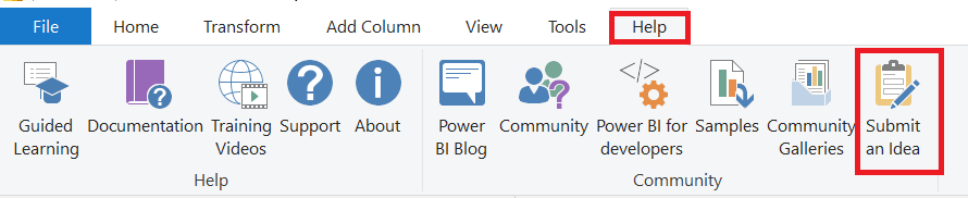
How It Works
Submit Your Idea
Suggest a new feature or enhancement.
Describe the problem it solves or the improvement it brings.
Provide relevant examples or use cases.
Vote for Ideas
Browse through ideas submitted by others.
Vote for the ones you believe should be prioritized.
The more votes an idea gets, the more likely it is to attract Microsoft’s attention.
Track Progress
See whether ideas are under review, planned, or already implemented.
Follow updates and community discussions around the idea.
Benefits
Direct Influence – Your input can help shape Power BI’s features and updates.
Community Collaboration – Engage with fellow users to refine and improve proposals.
Transparency – See how Microsoft responds to community feedback.
How to Access
Go to the Help tab in Power BI Desktop.
Under the Community section, click Submit an Idea.
Your browser will open the official Power BI Ideas website.
💡 Tip:
Before submitting, search existing ideas to see if yours is already listed — if it is, vote for it instead of creating a duplicate. This increases its visibility and impact.